The network for creativity
Join 1.25M professional creatives like you
Connect with clients, get discovered, and run your business 100% commission-free
Creatives on Contra have earned over $150M and we are just getting started
Back to feedPost
Taste Test
Working on a minimalist tech logo concept. It features an edgy, mask-like vibe that fits well with ethical hacking and cybersecurity. Which niche suits it best, and what would be a great name for it?
0 voted
0%
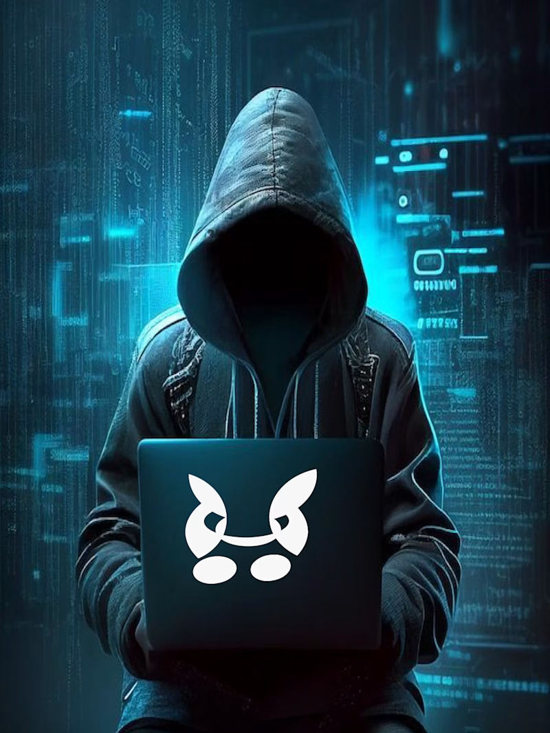
1 voted
100%
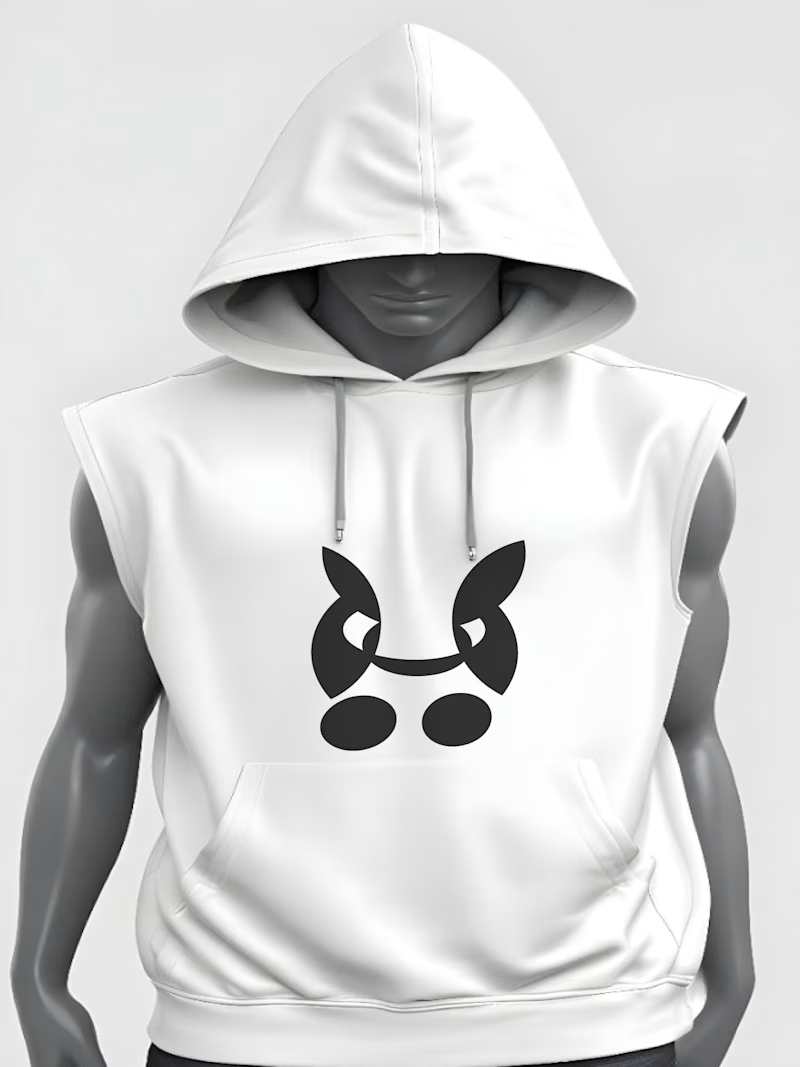
1 vote
Closed

Edgy mask-like vibe is on point for cybersecurity! The hoodie mockup sells it instantly.
For niche: Definitely fits ethical hacking / pentesting brand or even a streetwear-tech crossover. For names: How

Thanks recommended me but i need to given name too i dont know what name is good for matching
For cybersecurity hoodies, try something edgy like CYPHR, NULL, or MASK. Short and memorable names work best. Hope it helps!
Thanks sharing for ideas i will do my best and added this logo with mokcup in my profile work and services
The network for creativity
Join 1.25M professional creatives like you
Connect with clients, get discovered, and run your business 100% commission-free
Creatives on Contra have earned over $150M and we are just getting started



Related posts




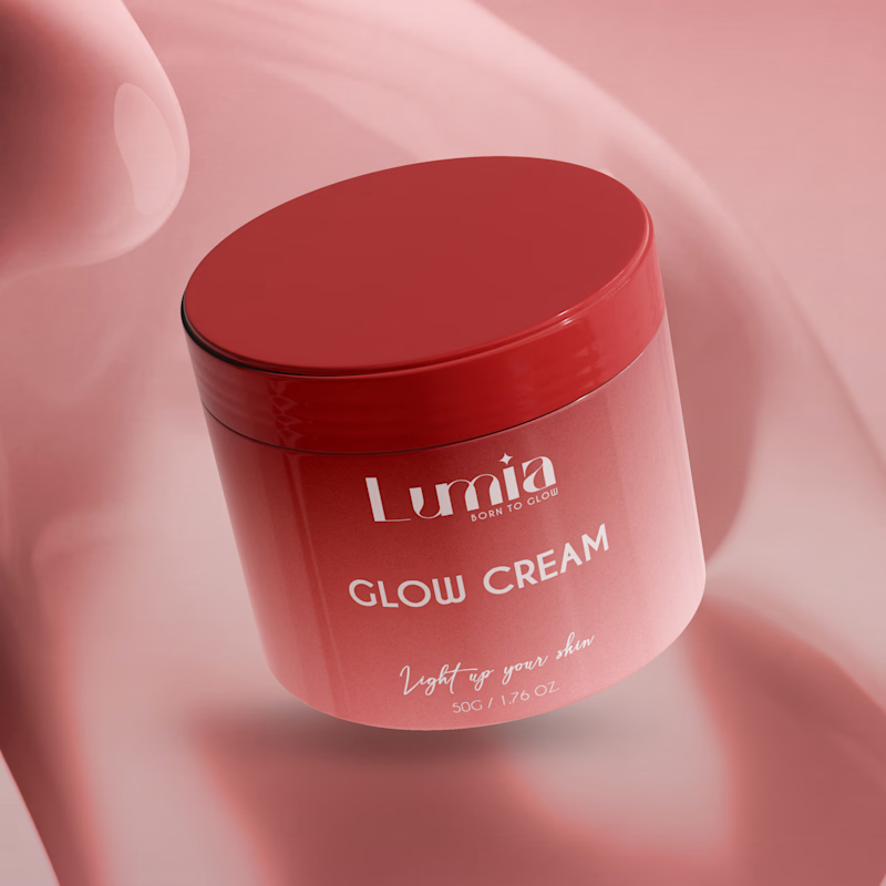
Which packaging color catches your eye first?

6 voted
46%
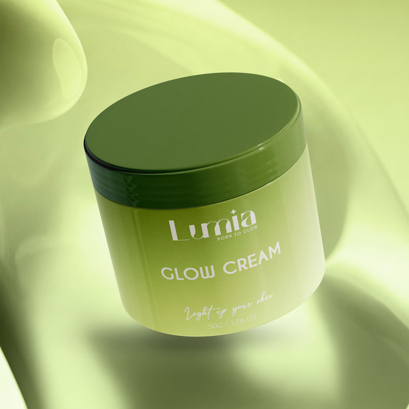
7 voted
54%
13 votes
Closed

The green version catches my eye first: the dark olive lid gives the lighter jar a clear focal point. I would also test the small white label text at thumbnail size, since the soft lighting reduces its contrast in both versions.

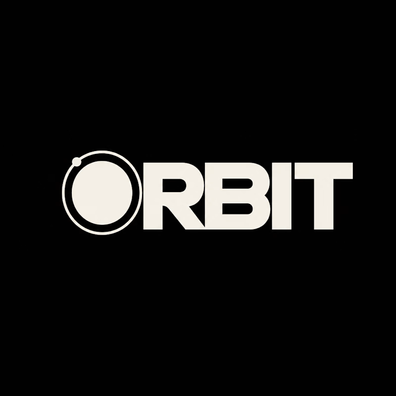
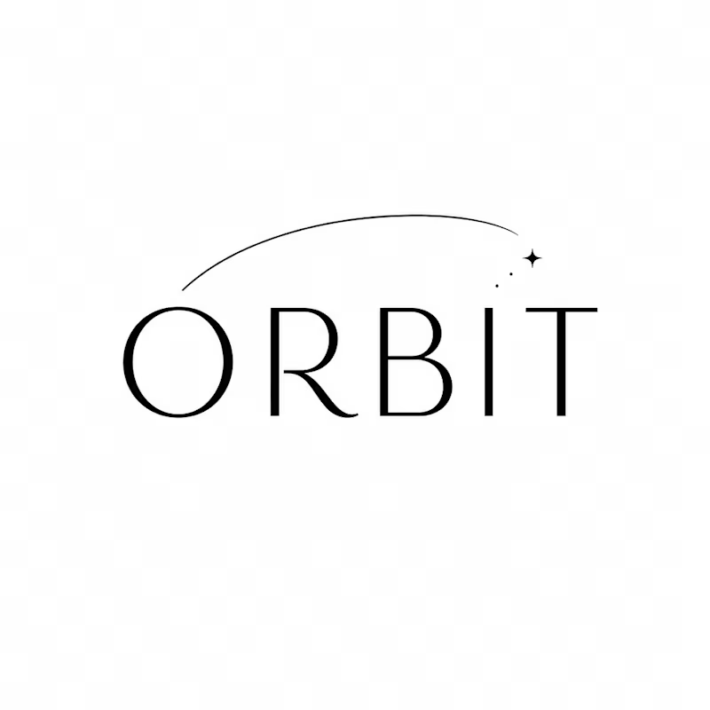
Which ORBIT pulls you in: the quiet one or the loud one? ✨
One name, two directions. Same idea, an object in motion around a center.
A → Heavy extended sans on black. The orbit is built into the O, a ring with a single satellite. Compact, graphic, impossible to ignore.
B → Light, high-contrast serif with a hairline arc and a tiny spark. The orbit is a gesture, a trail you almost miss. Elegant, airy, a little mysterious.
If you ask me, I'd pick A.

36 voted
80%
9 voted
20%
45 votes
Closed
