The network for creativity
Join 1.25M professional creatives like you
Connect with clients, get discovered, and run your business 100% commission-free
Creatives on Contra have earned over $150M and we are just getting started
Back to feedPost

Quick question for local business owners:
Does your website show your prices up front, or do visitors have to call to find out?
I've seen both work. Showing prices filters for serious buyers. Hiding them can drive more calls, but a lot of those are tire-kickers.
Which way has worked better for you? Drop it in the comments — genuinely curious.
PS: if you're in the transparent-pricing camp, I just listed a free Pricing Table Starter Kit in my Products tab — 3 copy-paste pricing sections for your site.

The network for creativity
Join 1.25M professional creatives like you
Connect with clients, get discovered, and run your business 100% commission-free
Creatives on Contra have earned over $150M and we are just getting started

Challenges
View all


Related posts

Designed a clean, modern pricing page focused on clarity and easy decision-making.
The goal was to make plan comparisons simple, highlight the recommended option, and create a consistent experience with clear pricing, feature lists, and calls to action.
Built with a minimal layout, balanced typography, and a simple green accent system.

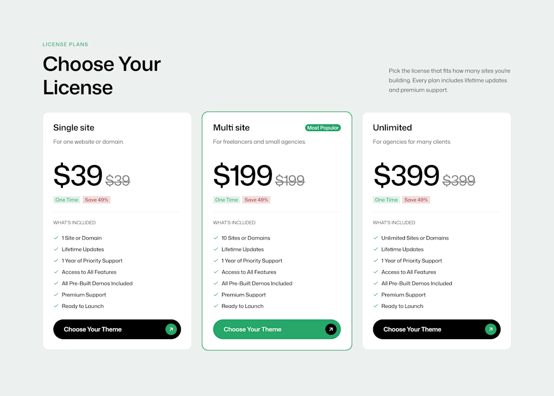

The buttons say ‘Choose Your Theme’, so I'd preserve the selected license while someone browses themes. Does checkout show the theme and license together before payment?

Two pricing scenarios can include the same studio overhead. Adding their break-even volumes together can double-count the costs they are meant to cover.
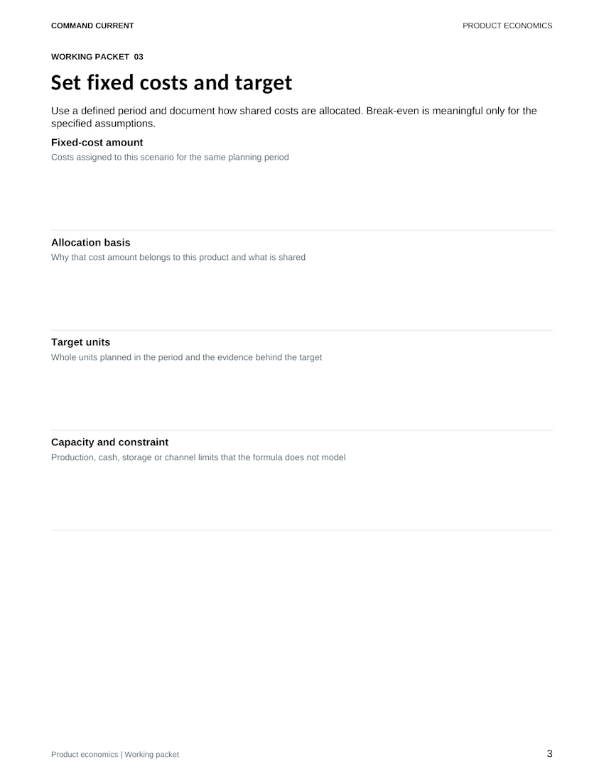
The Product Unit Economics and Break Even Kit keeps one product, channel and planning period per scenario. Its fictional desk-tray example assigns USD 1,800 in monthly studio and operating overhead to a 200-unit planning target.
Before comparing that row with another option, write down:
• Which overhead is assigned, and why
• Whether another scenario includes the same costs
• What supports the target volume
• Which production, cash or storage limits need a separate check
For example, comparing direct online sales with a wholesale option calls for separate price, fee and cost assumptions. Treat them as alternatives until you have a properly allocated combined model. A target entered in a spreadsheet is still a planning input, not evidence of demand.
The preview is the kit's actual fixed-cost and target worksheet. The download includes a five-page editable Word packet, an Excel scenario workbook, printable PDFs, a fictional completed example and a Quick Start. Built for desktop Word and Excel.
The example uses invented inputs. This simplified manual tool doesn't establish taxable profit, cash sufficiency or an appropriate selling price; consequential decisions need relevant professional review.
Get the digital kit: https://contra.com/payment-link/jF9ueVXt-product-unit-economics-and-break-even-kit



Happy Monday!
A business can be doing great work behind the scenes and still struggle to communicate its value online.
Think about it.
You may have an excellent service.
You may deliver real results for your clients.
You may even get referrals from satisfied customers.
But when someone hears about your business and visits your website, can they see why you're worth considering?
Can they understand the value you offer without speaking to you first?
Can they find the information they need to feel confident about taking the next step?
Your website is an opportunity to communicate your business's value, even when you're busy doing the actual work.
It shouldn't just tell people that your business exists.
It should help them understand why your business matters.
As we begin a new week, take a moment to look at your website from the perspective of someone who has never worked with you before.
Does it communicate the value you bring, or does it leave visitors to figure it out themselves?
What is the one thing you want a potential customer to understand about your business within the first few seconds of visiting your website?
I am Michael Adetayo, a Kajabi Expert and course creator who helps startups, organizations, and service-based businesses build and strengthen their online presence through website design, redesign, development, and optimization.
I create clear, responsive, and user-friendly websites that communicate what a business does, build credibility, improve the user experience, and guide visitors to take action. My goal is to help businesses turn their websites into valuable tools that support growth.
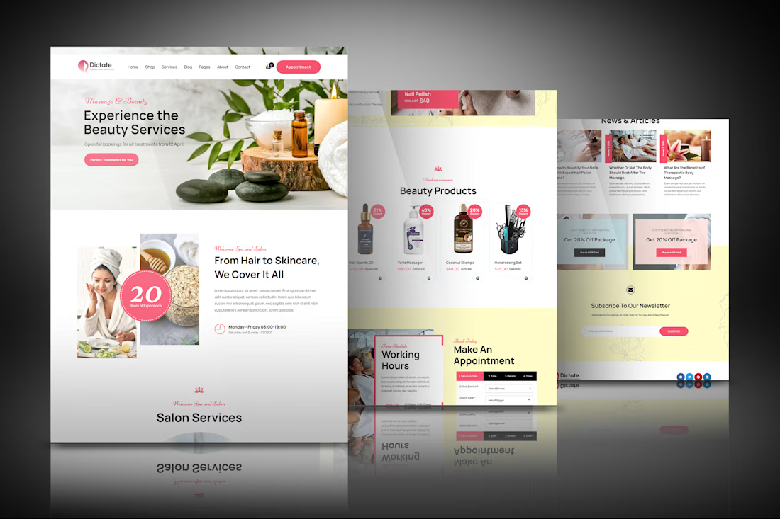

This looks very solid