The network for creativity
Join 1.25M professional creatives like you
Connect with clients, get discovered, and run your business 100% commission-free
Creatives on Contra have earned over $150M and we are just getting started
Back to feedPost


Can you spot the road? 🛣️
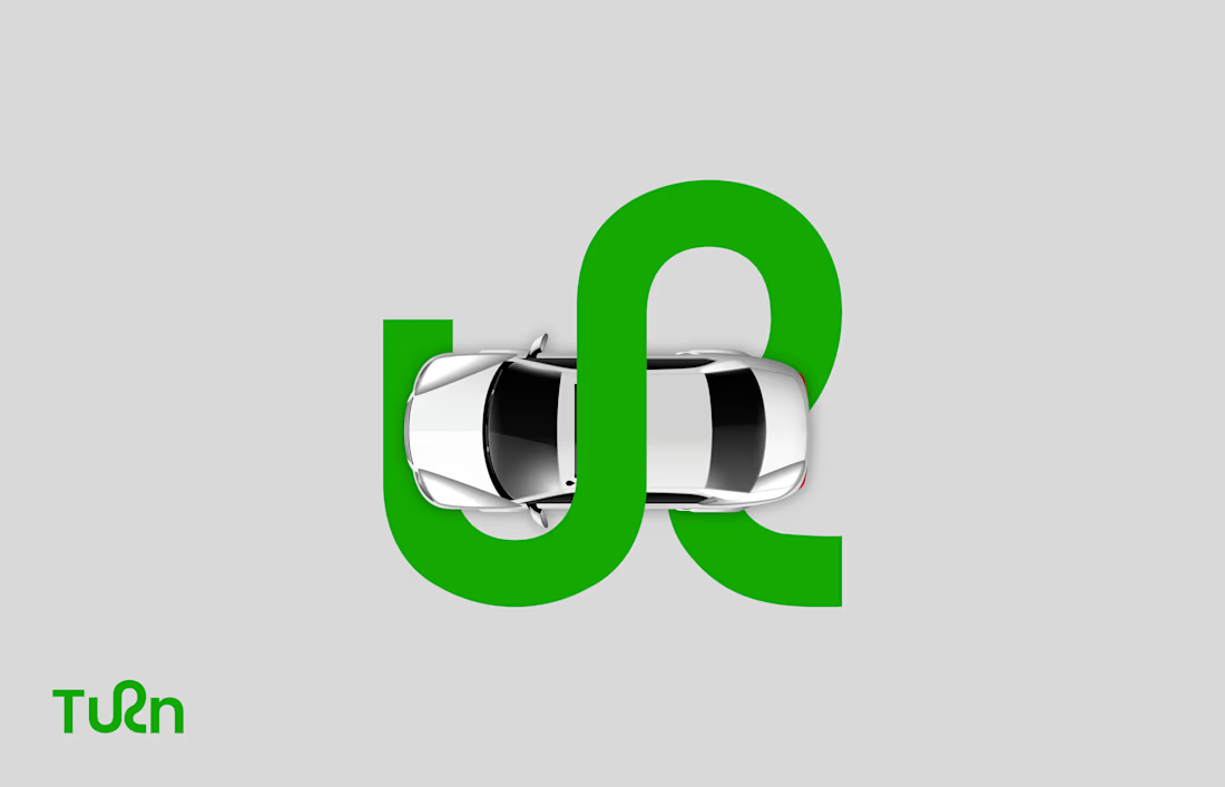
Look at the "r" in Turn. It's not a letter, it's a road.
I designed Turn as a brand for driving schools, so the wordmark had to say one thing at a glance: learning to take the turn.
How it came together:
- One curved line replaces the "r"
- Simple, rounded letters (Poppins) so the curve is the hero
- The same curve runs through the pattern and the vehicle branding
Bright green for go, charcoal for trust.
Brands for schools, training centres and service businesses work best when the idea is clear in one second. If you're building one, my Brand Identity service is on my profile: https://contra.com/s/lsZsolAM-brand-identity-design-brand-guidelines-book
Do you see the road or the letter first? 👇

The network for creativity
Join 1.25M professional creatives like you
Connect with clients, get discovered, and run your business 100% commission-free
Creatives on Contra have earned over $150M and we are just getting started
Related posts

A little behind-the-scenes look at a brand identity coming together.
I'm currently working on a new identity for a coworking space in Austin, TX, with a vintage-inspired direction, warm colors, and a logo that brings a bit of nostalgia into a modern setting.

Carrying the vintage idea onto the coasters and the dot pattern gives the identity somewhere to live besides the logo.

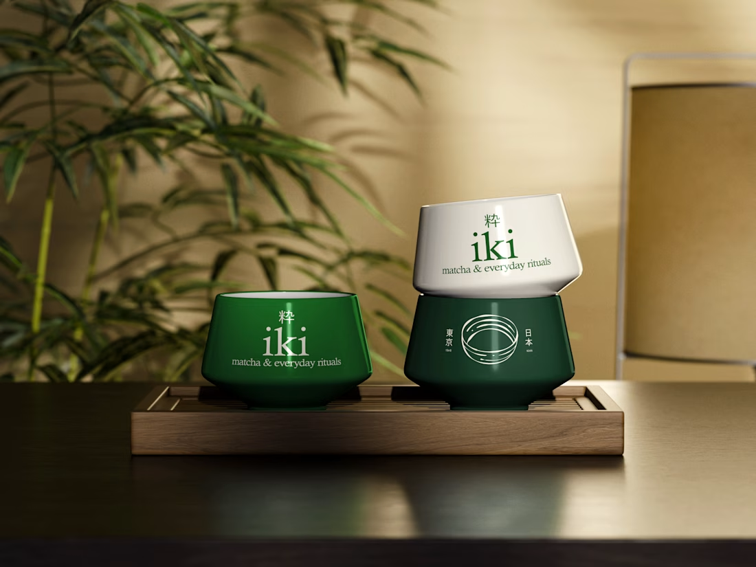
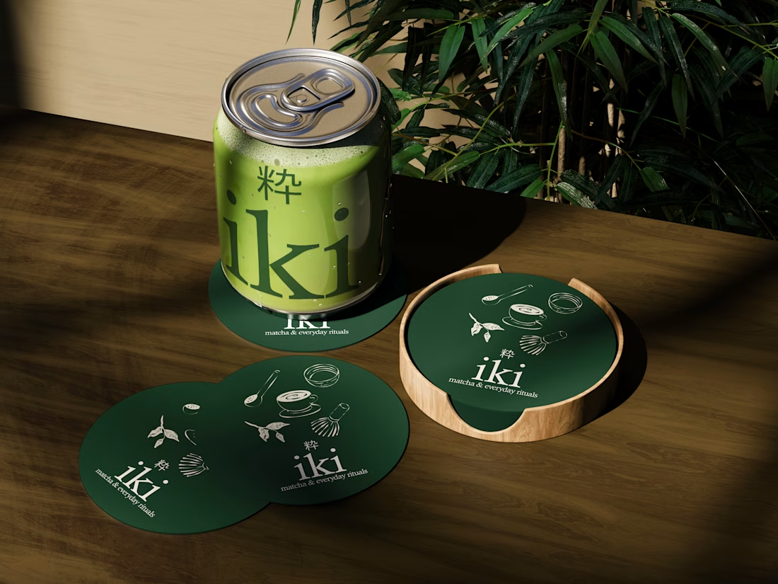
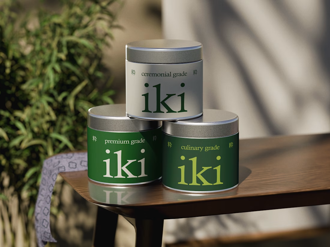
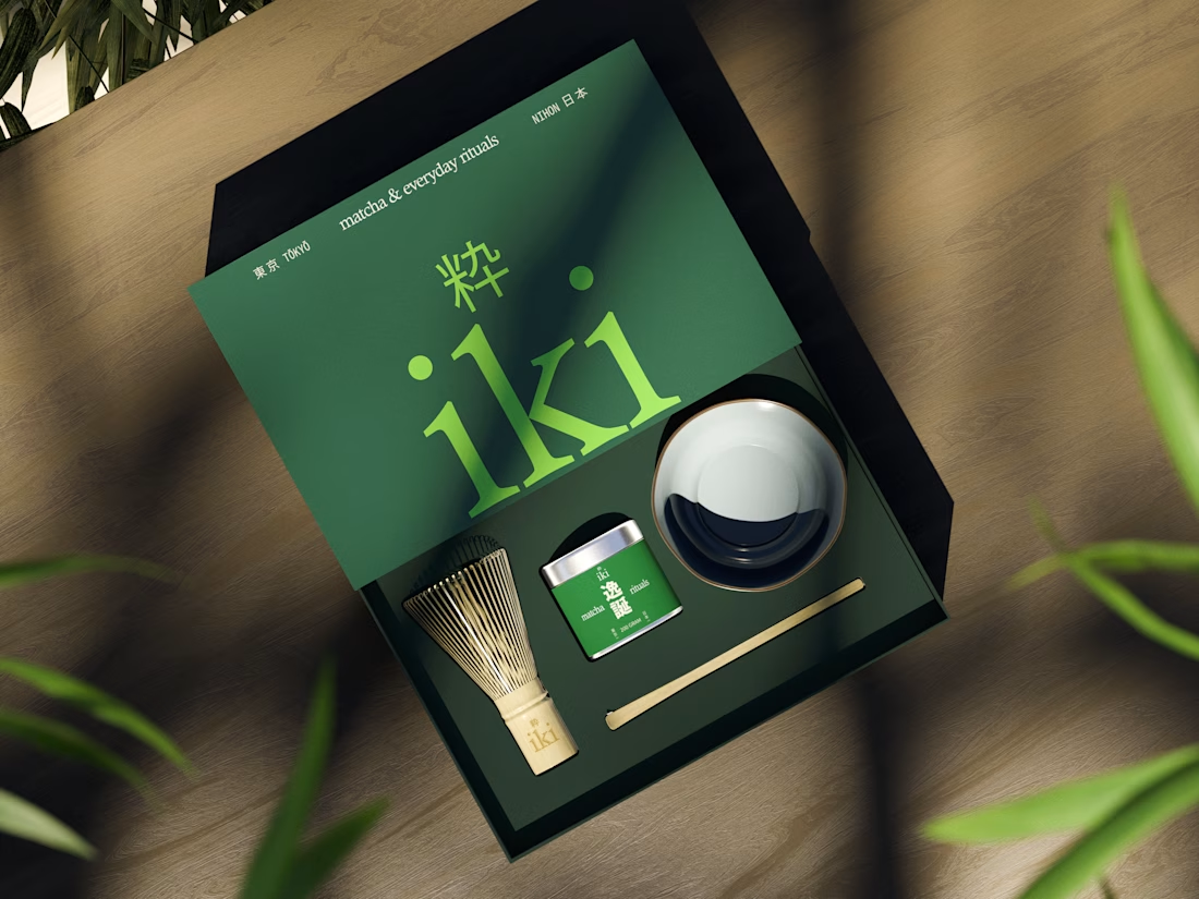
more glimpses of iki 🍵
the project is almost finished, and i should be wrapping everything up next week.
it’s been a fun one to work on, especially seeing how the initial concept has evolved into a complete visual identity.
excited to share the final result soon :)


Looks super polished! love it