The network for creativity
Join 1.25M professional creatives like you
Connect with clients, get discovered, and run your business 100% commission-free
Creatives on Contra have earned over $150M and we are just getting started
Back to feedPost
Three checks I put beside a post-purchase email draft:
Does the main CTA open the exact page the copy promises?
Does the recommendation match the product the customer bought?
What stops a refill message after another order or when a subscription already covers the item?
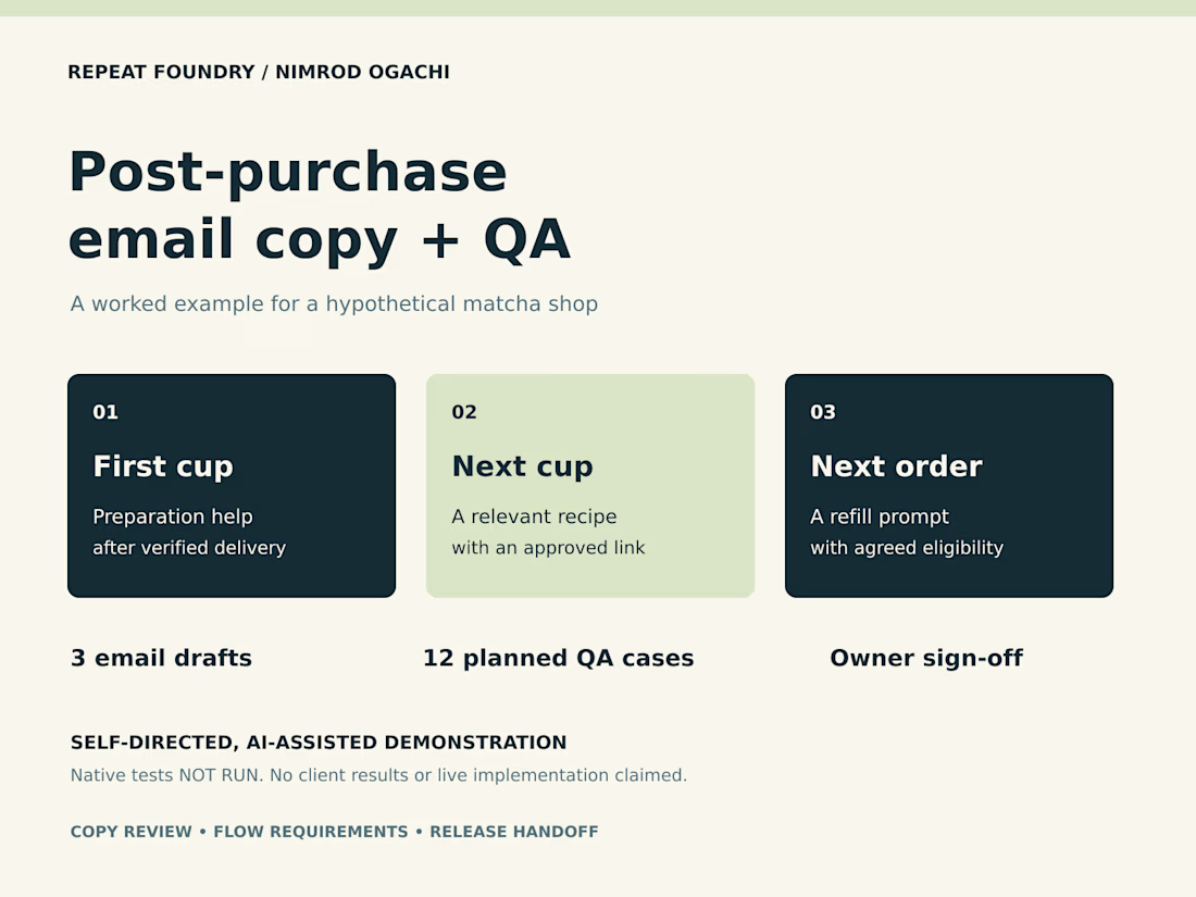
These questions shaped my new matcha-shop demonstration: three email drafts, an evidence-linked review and a 12-case QA plan. The handoff makes the remaining decisions explicit, including delivery evidence and refill timing.
This is self-directed, AI-assisted work for a hypothetical shop. Every native account test is marked NOT RUN, and no client or revenue results are claimed.
The full six-page example is here:
https://contra.com/p/7vFYWm3m-post-purchase-email-copy-review-and-qa-handoff
If your Shopify brand or email team needs a focused copy review, send the email count and the question you want answered.


Great QA approach. Checking the CTA, recommendations, and timing can prevent a lot of post-purchase mistakes.

Thanks, Rasaq. Making those checks explicit gives the person building the flow something concrete to test. I also mark anything not yet verified, so the handoff shows what still needs evidence before sending.
Exactly. Marking what still needs verification makes the handoff much clearer and easier to act on.

One recovery case to add beside those checks: the email provider accepts a message, but the process stops before recording its message ID. A restart must treat that send as uncertain and reconcile the provider’s Sent record before retrying; deduplicating only after a successful...
Thanks, Dylan. The example here is a copy review and QA handoff, with native account tests marked NOT RUN. For that interrupted-send case, I’d add a separate acceptance test for the team configuring the flow: treat the outcome as uncertain, check the provider’s send record, and...
The network for creativity
Join 1.25M professional creatives like you
Connect with clients, get discovered, and run your business 100% commission-free
Creatives on Contra have earned over $150M and we are just getting started






Related posts


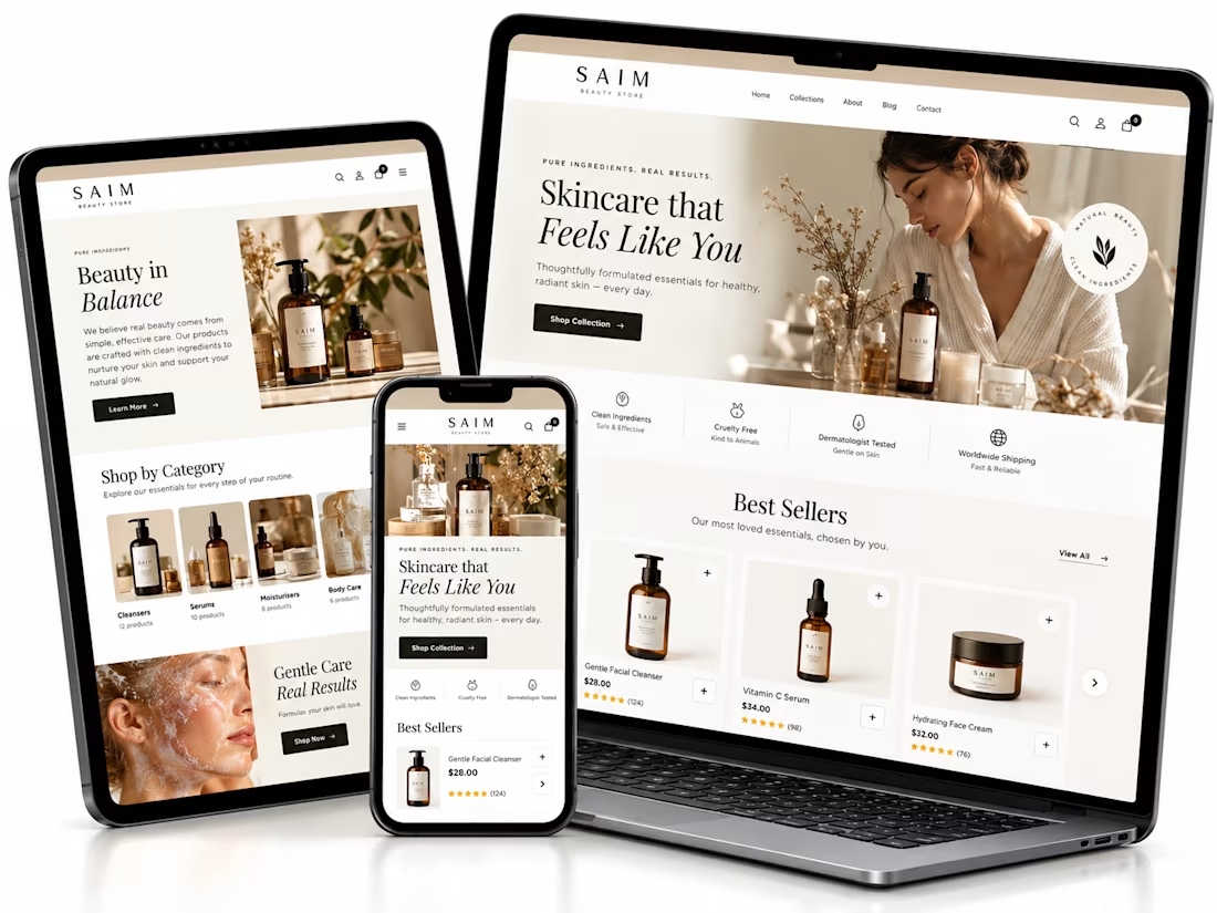
Shopify website setup project, I created a premium eCommerce homepage concept for a startup beauty brand.
Using Lovable, I developed a responsive design framework featuring elegant product showcases, intuitive navigation, clear shopping CTAs, ingredient storytelling, product benefits, customer review sections, FAQs, and email capture.
The goal was to establish a professional brand presence, simplify product discovery, and create a conversion-focused foundation for Shopify development.


The soft neutral palette suits the skincare angle really well, and the best sellers section with the star ratings reads cleanly across all three device mockups. Building the whole concept in Lovable is interesting. Did the generated layout hold up responsively out of the box, or did you rework parts of it by hand?


The lime and purple pairing with the mono type works nicely for Remotlin.

i built this portfolio template in framer a few months ago, and it’s been exciting to see how much traction it’s been gaining lately!
it’s now #81 overall and #25 in the designer category on the framer marketplace, bringing in more views, reach, and commissions along the way.
sharing the case study here if you want to take a closer look at the project and see how it came together! 🙌


Huge congrats Max! #81 overall and #25 in designer category on Framer marketplace is no small feat 🚀 Framer templates that actually get traction + commissions is the dream. Well deserved!