The network for creativity
Join 1.25M professional creatives like you
Connect with clients, get discovered, and run your business 100% commission-free
Creatives on Contra have earned over $150M and we are just getting started
Back to feedPost

Motion Graphics Project - 01 [Launch Film @V21 Studio]
When V21 Studio was getting ready to launch, they didn’t want a typical “we’re live” video.
They wanted something that felt like them, sharp, confident, and serious about design.
So we built a launch film that focuses on restraint and precision. Clean typography. Strong pacing. Controlled transitions. No unnecessary effects, just intentional motion that elevates the brand.
As an agency, we don’t treat motion as decoration.
We use it to position.
The result?
A launch video that doesn’t just introduce the studio, it sets the tone for everything that follows.


The network for creativity
Join 1.25M professional creatives like you
Connect with clients, get discovered, and run your business 100% commission-free
Creatives on Contra have earned over $150M and we are just getting started








Related posts


Recent product update video for a client


Really curious about your process here. Did you start with a storyboard or go straight into motion?

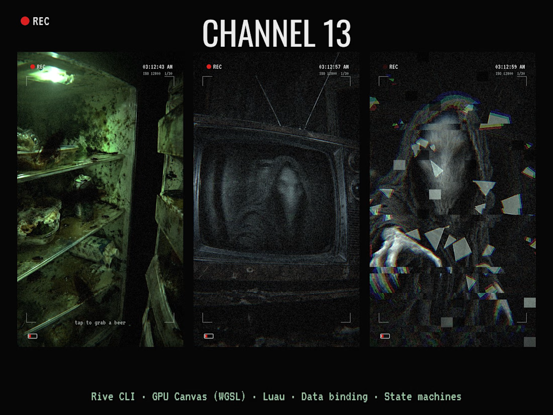
CHANNEL 13 📺👁️ A found-footage horror scene you play through smart glasses.
You open a moldy fridge full of roaches, grab a warm beer, sink into a ruined couch and turn on an old CRT. Every zap, something hooded and faceless gets a little closer in the static. On channel 13 it rushes the glass… and then it comes out. 🎧 Sound on.
How I built it:
• Rive CLI: the whole scene is written in RML with a coding agent (Claude Code), built and checked with rive --verify / inspect / screenshot, then pushed to the Rive editor
• GPU Canvas (WGSL): two shaders. A smart-glasses lens pass over the whole frame (fisheye, chromatic split, low-light grain, light-buzz flicker, digital glitch) and a cursed CRT shader (B/W analog snow, scanlines, rolling bar, vertical-hold slips, the figure bulging the glass, procedural spider-web cracks, power-off collapse)
• Luau scripting: story timing and "dread" level, channels and subliminal flashes, flying glass shards
• Data binding: one Story view model shared across artboards, a Broadcast view model driving the TV
• State machines: beat timelines, roach and bulb loops, 13 channels, all sound cues
• Audio: 22 sound effects, zero music. Fridge hum, buzzing bulb, roaches, footsteps, CRT whine, whispers, heartbeat, screamer, shattering glass
Uses both the CLI and GPU Canvas.



NURV® now has a home on the web 🟠
Same cream canvas, same dot-matrix numerals, same single orange. Scroll it and nine dots in the margin fill up one by one.
Pool to plate to pill, nine scenes, one system.