The network for creativity
Join 1.25M professional creatives like you
Connect with clients, get discovered, and run your business 100% commission-free
Creatives on Contra have earned over $150M and we are just getting started
Back to feedPost

This concept didn't get selected. And that's okay.
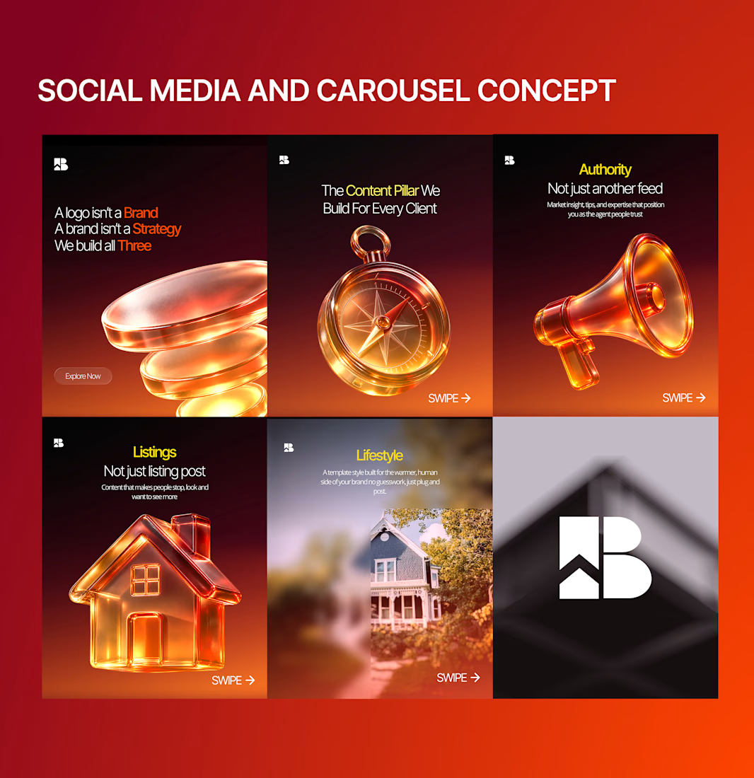
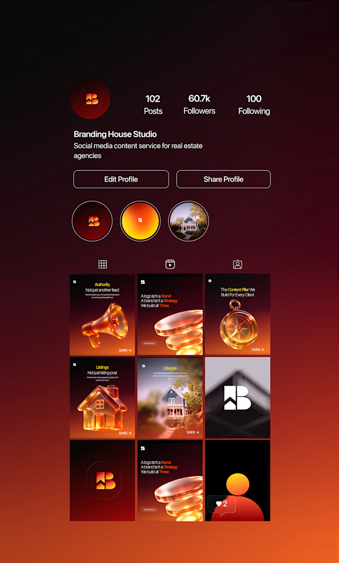
I recently completed a creative direction test for BHS, a French real-estate content brand repositioning itself as a more modern, scalable subscription-based product.
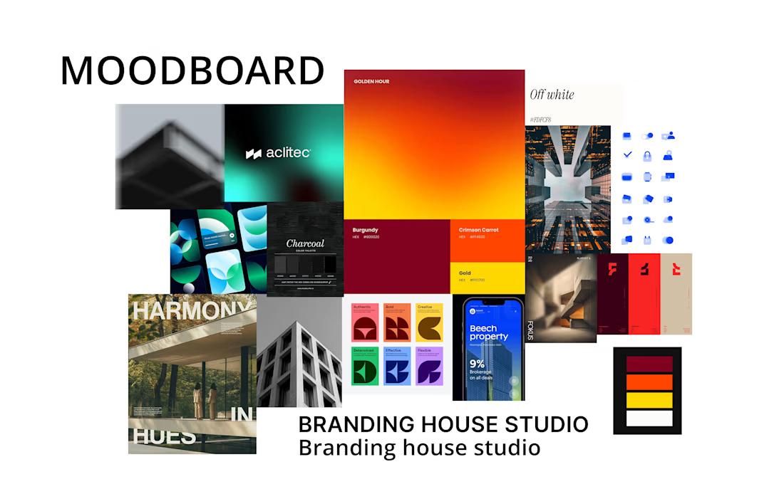
I explored a direction built around:
→ Warm burnt orange and burgundy
→ Bright yellow as an energetic accent
→ Charcoal as the foundation
→ Bold serif typography
→ Minimal, editorial layouts
→ Soft gradients and subtle visual movement
The idea was to create something that felt premium without feeling inaccessible, modern without feeling cold, and distinctive without becoming flash
The direction wasn't selected.
The client ultimately chose another designer whose work felt closer to the real-estate/editorial positioning they had in mind.
And honestly, that's one of the most useful parts of doing creative work.
It reminded me that a strong concept isn't necessarily the right concept for a particular brand.
Looking back, I can see that my interpretation leaned more toward modern, digital and startup-oriented than the editorial real-estate direction the client ultimately wanted.
That distinction is valuable.
Design isn't just about whether something looks good.
It's about whether your creative decisions communicate the right positioning, to the right audience, in the right way.
I'm keeping the work, keeping the lessons, and moving forward.
Not every concept gets chosen.
But every project can make you a better designer
Full case study on behance.
https://www.behance.net/gallery/254734135/BHS-brand-identity-concept


The network for creativity
Join 1.25M professional creatives like you
Connect with clients, get discovered, and run your business 100% commission-free
Creatives on Contra have earned over $150M and we are just getting started











Related posts

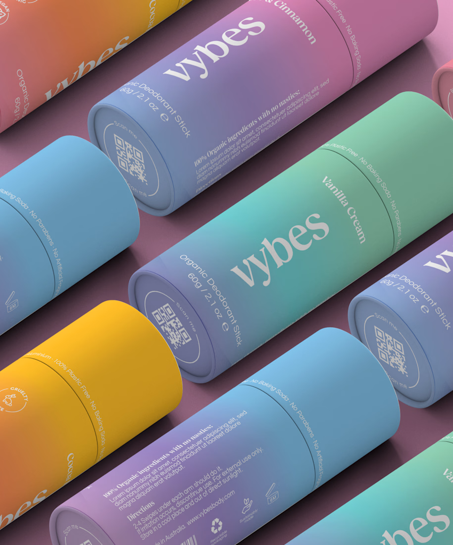
Have you ever designed packaging for a brand that never launched? 👀
Surprisingly, it’s happened to me more times than I expected.
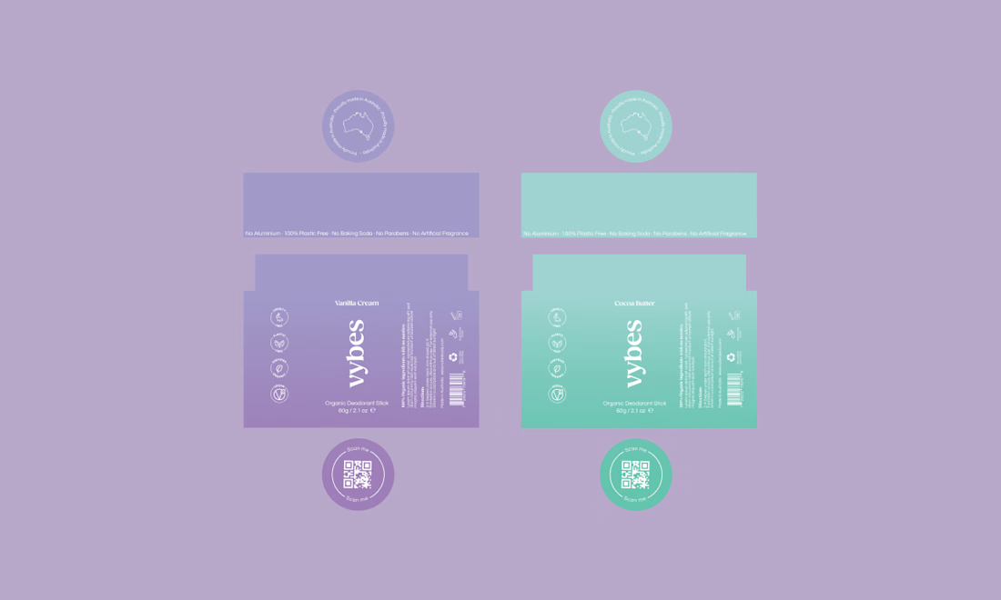
Vybes was an organic deodorant brand from Australia I worked on, designing packaging for a product that, in the end, never made it to market.
It’s a weird feeling putting so much thought into packaging for a product that people will never see on a shelf.
How many unreleased projects are hiding in your folders? 😂



Lovely cohesive work, Alex. The motion is spot on!

15 seconds of smooth UI, editorial layouts, and micro-interactions.
Kept the micro-interactions snappy, typography expressive, and transitions buttery smooth.
Rate this UI animation from 1 to 10 in the comments, or tell me what you’d improve! 😉


Solid 10/10 bro! 🔥 Micro-interactions are super snappy and transitions are buttery smooth indeed. Editorial layout game is strong. Keep it up!