The network for creativity
Join 1.25M professional creatives like you
Connect with clients, get discovered, and run your business 100% commission-free
Creatives on Contra have earned over $150M and we are just getting started
Back to feedPost

I built and customized a responsive restaurant website in HTML and CSS using VS Code. I set up the business name, address, contact details and menu pricing so customers can find everything they need on any device. The site is clean, mobile-friendly and easy to update.

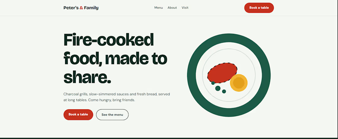

Good call keeping the menu easy to find.
The network for creativity
Join 1.25M professional creatives like you
Connect with clients, get discovered, and run your business 100% commission-free
Creatives on Contra have earned over $150M and we are just getting started



Related posts

A beautiful Shopify store is great. But does it make people want to shop?
Take a look at my latest e-commerce design project for Amora Renae, a luxury hair extension brand.
I wanted the experience to feel as premium as the products themselves.
From the bold pink hero section and elegant product collections to the detailed product pages and responsive layouts, every design decision was made to bring the brand's identity to life while keeping the shopping journey intuitive.
But here's where I need your honest opinion:
If you were the customer visiting this store for the first time, what would catch your attention first?
The homepage and overall visual identity 🎨
The product presentation and collections 🛍️
The product page experience
The mobile shopping experience 📱
And for the designers here, what would you improve?
I genuinely want to hear different perspectives. Let's talk design, user experience, and what makes an online store memorable.
#Shopify #EcommerceDesign #WebDesign #UIDesign #UXDesign


Love the creativity behind this. The visual identity feels consistent and well thought out.


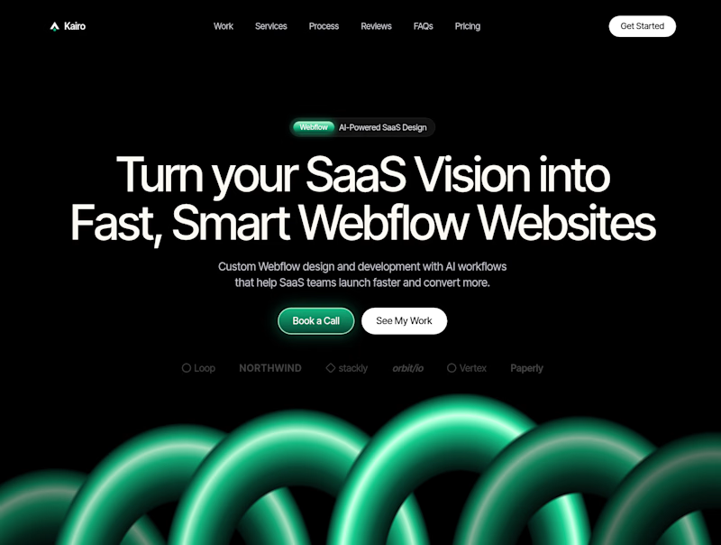
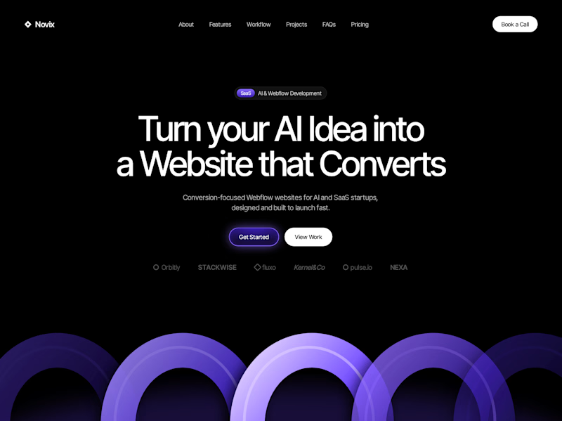

Both look great, but Violet & Black gets my vote! The purple accents give it a more modern, premium feel while keeping the design clean and focused on conversions. Amazing how a color change can create such a different brand personality. Have you tested which version performs better with visitors?


How do you sell houses that are not built yet?
On kalotespusynas.lt people pick their home on a map.
Switch between 3D and a flat 2D plan, zoom in, show only the cottages. Green means free, orange means reserved. Some plots hold two homes, so they split into A and B, each with its own size and plot.
One map instead of a price list PDF. Buyers get it in seconds.

This is so much better than a price list PDF. I build PlotToBuild, a sales tool for real estate firms selling plots in Nigeria, and the free / reserved / sold status is exactly what buyers ask about first. Splitting plots into A and B is a smart touch.