The network for creativity
Join 1.25M professional creatives like you
Connect with clients, get discovered, and run your business 100% commission-free
Creatives on Contra have earned over $150M and we are just getting started
Back to feedPost

Complex FinTech data shouldn’t feel like a spreadsheet.
Most investment apps suffer from two major problems: either the UI is so cluttered that users drop off, or the developer struggles to render real-time interactive charts without frame drops.
As a Mobile App Developer who crafts clean UI/UX, here is how I designed and engineered Aivest—an AI-powered investment & portfolio simulation platform:
🔹 The Product Challenge: Users need to simulate financial futures and track live asset rebalancing without getting overwhelmed by raw numbers.
🔹 The UX & Visual Polish: Designed a high-contrast dark theme using neon accents (#D8FF00) and the clean geometric typeface Lufga to make key data points instantly scannable.
🔹 The Dev Architecture: Engineered custom interactive slider components, dynamic scenario simulations, and smooth 60fps graph renders with optimized state management for real-time portfolio updates.
Great FinTech products require pixel-perfect design built on high-performance, responsive code. 📈⚡
If you are building a FinTech or AI product, let’s build something users actually love using.
What is the hardest part of building data-heavy mobile apps for you? Drop your thoughts below 👇
#FinTech #MobileApp #AppDevelopment #MobileDev #UIUX #FigmaToCode #DataViz


Amazing work!
The network for creativity
Join 1.25M professional creatives like you
Connect with clients, get discovered, and run your business 100% commission-free
Creatives on Contra have earned over $150M and we are just getting started

Challenges
View all


Related posts


A look at the identity we designed for Vetti, a dog health monitoring brand.
There’s a lot of data behind a product like this but the person using it just wants to know their dog is okay.
That’s the balance in the design with a connected dot system that feels precise and warm colors and photography that keep it close to what people care about.
Also, an excellent excuse to spend far too long choosing dog photos.


Engaging website for a New York–based architecture and construction studio, balancing bold typography, immersive imagery and a minimal editorial layout.


Wonder -- Visual Expressions


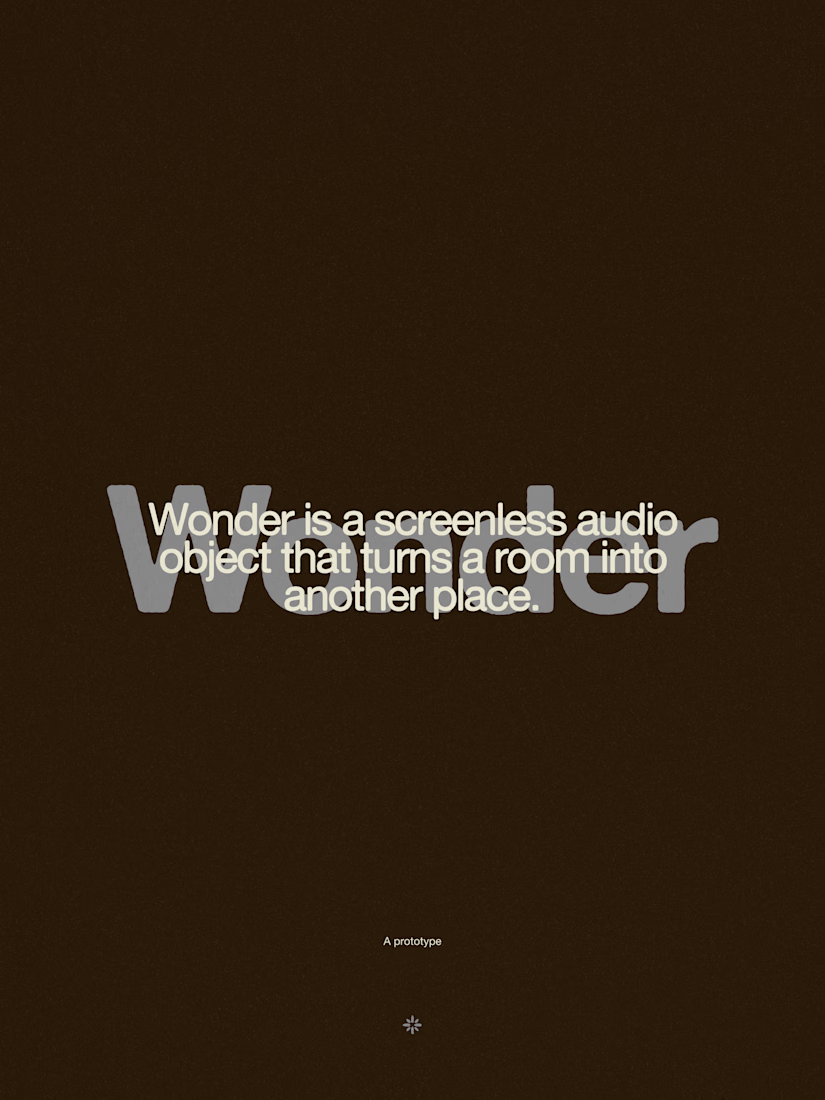




The restraint in the warm palette really lets the sound-object concept breathe—especially that shift from readable type to atmosphere.


