The network for creativity
Join 1.25M professional creatives like you
Connect with clients, get discovered, and run your business 100% commission-free
Creatives on Contra have earned over $150M and we are just getting started
Back to feedPost
Taste Test

Which model rendered the more cinematic driving scene?
Same prompt, two AI video generators: an orange Corvette navigating a mountain road at sunset.
Drop your vote below and share in the comments which one you'd choose for production work!


0 voted
0%
3 voted
100%
3 votes
Closed

The network for creativity
Join 1.25M professional creatives like you
Connect with clients, get discovered, and run your business 100% commission-free
Creatives on Contra have earned over $150M and we are just getting started





Related posts

I went back to some AI-generated packaging images I created one year ago and tried to recreate them using newer AI models.
The difference is honestly wild. The materials, lighting, shadows, reflections, proportions… everything feels significantly more realistic now.
It made me wonder what we'll be recreating with these tools another year from now.
2025 or 2026: which one looks more convincing?

3 voted
11%
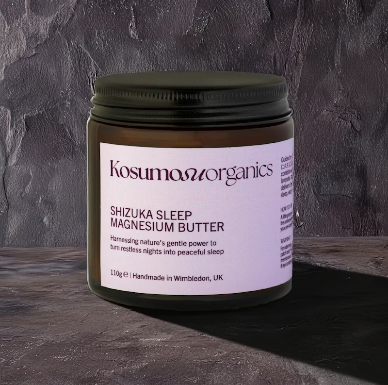
25 voted
89%

28 votes
Closed

"October 2026" looks better. It has better lighting, shadow, material design and it looks more realistic.

Vintage Map Ad — Two Creative Directions
I’ve been testing two ways to reveal the product.
In one version, the space builds around it, creating a more magical feel.
In the other, I went for a more restrained approach — pulling back to reveal the setting without any transformation.
Which one would you go for?
4 voted
44%
5 voted
56%
9 votes
Closed

Pull back has it

Nailing down the final grid for L8.nite coffee bags.
Left or Right?
Look closely at the central spacing and let me know which arrangement feels more balanced.
6 voted
33%
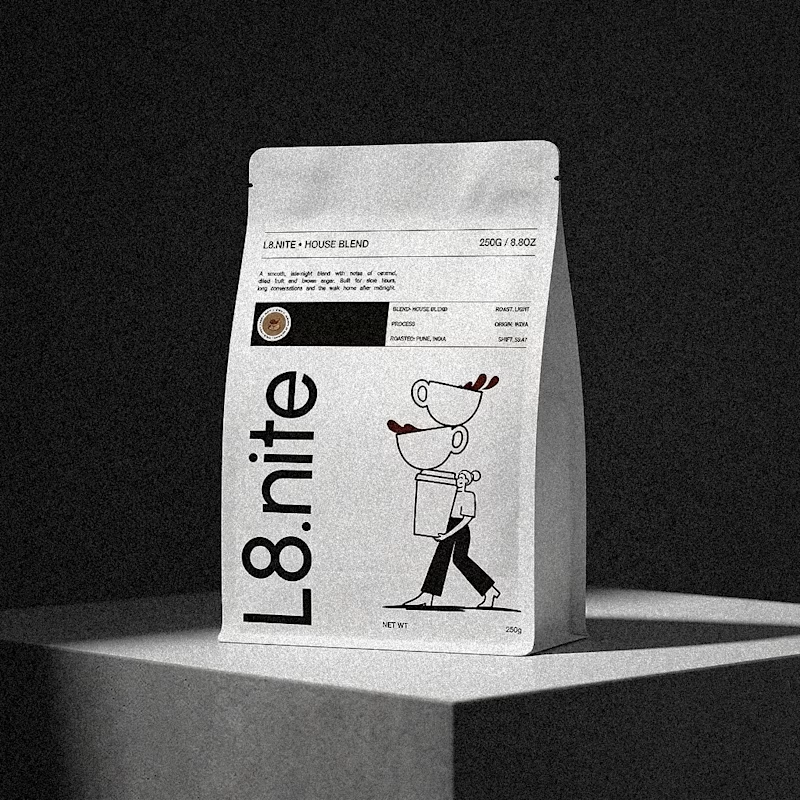
12 voted
67%
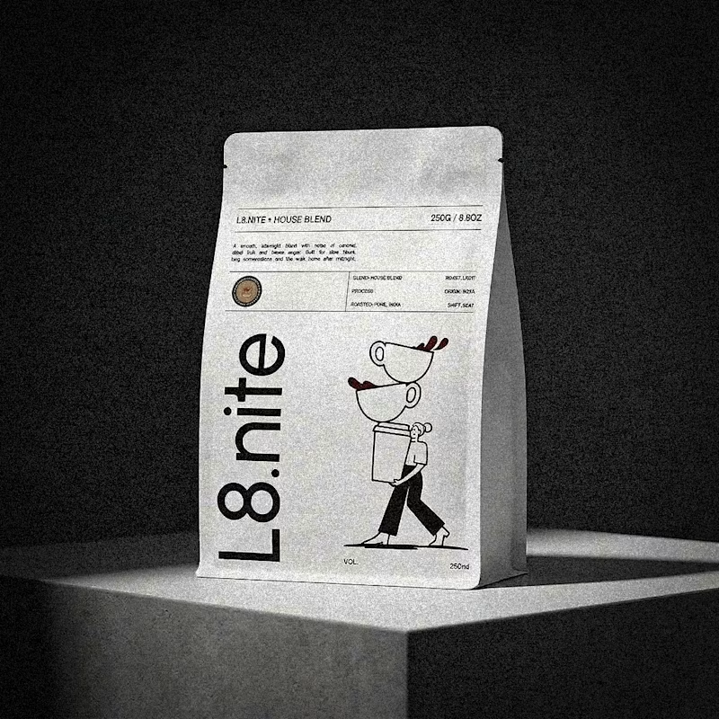
18 votes
Closed