The network for creativity
Join 1.25M professional creatives like you
Connect with clients, get discovered, and run your business 100% commission-free
Creatives on Contra have earned over $150M and we are just getting started
Back to feedPost

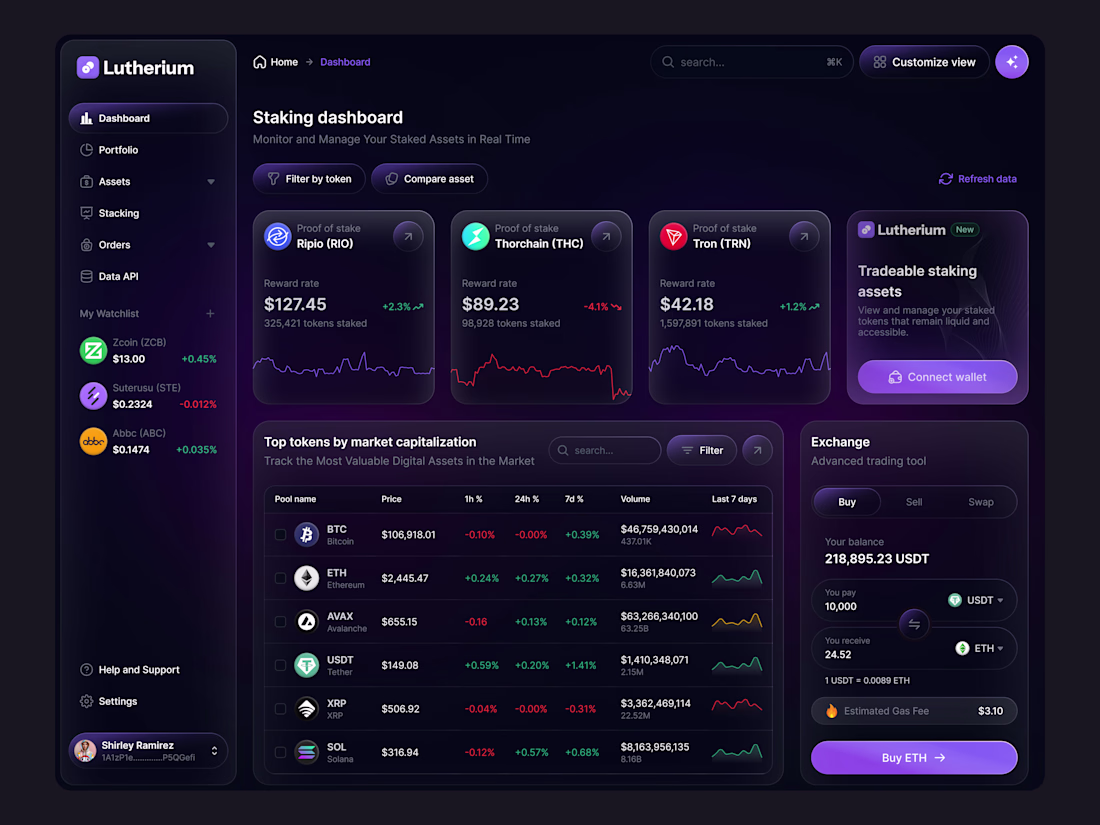
Dark-Mode Depth: Managing 3 Layers of Glassmorphism 🧩
The Design Secret: Z-Axis Hierarchy.
In the Lutherium dashboard, I used three distinct levels of transparency to define hierarchy. The sidebar is the "Foundation," the main cards are the "Content," and the Exchange tool is the "Interaction Layer." This Z-axis depth prevents the dark UI from feeling "flat" and unclickable.
Feedback Request: Does the neon purple accent (Buy ETH button) provide enough contrast against the dark background for accessibility, or should the glow be intensified? 🎨


The network for creativity
Join 1.25M professional creatives like you
Connect with clients, get discovered, and run your business 100% commission-free
Creatives on Contra have earned over $150M and we are just getting started
Related posts


Culturepulse is a marketplace where sports culture, memorabilia, and blockchain technology intersect. The platform allows athletes and creators to release collectible items that exist simultaneously in the physical and digital worlds — a jersey, a sneaker, or a card becomes both a real object and a verified NFT tied to a specific moment in a career.


The concept of physical + digital collectibles is so ahead of its time. And that 3D glass cube render on the orange type? Stunning 👏

Experimenting a lot with AI, one thing became clear: AI can match your design vision, but only if you are specific. Vague prompts = generic results.
So here is my current process using Figma Make, before I build anything, I ask AI to analyze the design language of a screenshot to build a design system first. Think of it as a style guide where colors, typography, and spacing are all locked in. Once that foundation is there, I use that same design system to build my application, website, whatever the project is.
The result? Way more consistent outputs and a lot less back and forth.


Style first, build later, makes total sense. Feels like treating AI as a junior designer instead of a magic box.
Give Cursor AI a shot too


Trending
maxearnings
The next frontier of payments is live on Contra. How are you maximizing revenue?
freelancerlife
Freelancer life is wins, pivots, and everything in between. What’s yours right now?
aidesignflow
AI tools are redefining how designer work. What does your workflow look like?
micrographics
Micrographics started as utility - barcodes, packaging, instruction labels. How would you use them?
aivideo
AI video tools are moving at warp speed. What tools are you using?
