The network for creativity
Join 1.25M professional creatives like you
Connect with clients, get discovered, and run your business 100% commission-free
Creatives on Contra have earned over $150M and we are just getting started
Back to feedPost
Starling Bank — Social Media Reimagining Self-Initiated · Brand Direction · Social Media Design
The Brief
A portfolio exercise with a real-world constraint: design social media assets for Starling Bank that feel native to their brand world while pushing the visual language further than their current content. Built from scratch, entirely speculative, with one clear goal — prove that the same creative thinking that builds culture brands can build fintech brands.
The Visual System
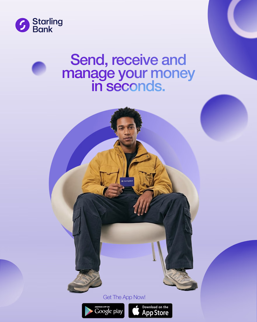
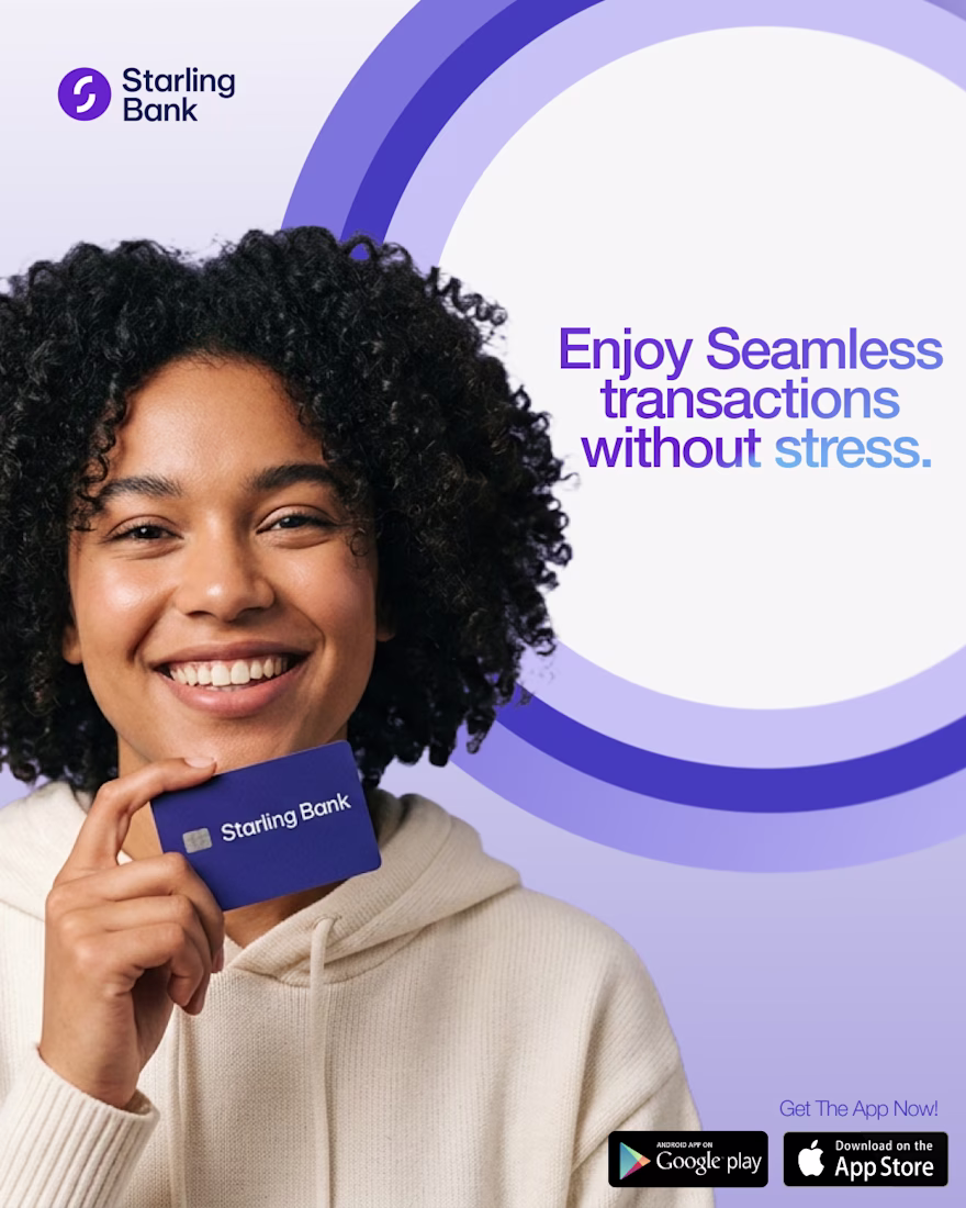
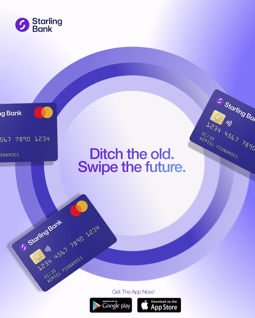
Starling's existing identity is built on purple, circles, and a tone of confident simplicity. Rather than ignoring that or overriding it, the exercise leaned into it and pushed it dimensionally. Concentric circles became the dominant compositional device across all three posts, creating depth, movement, and a sense of things orbiting a centre of gravity. The metaphor fits the product: everything moving around your money, smoothly, reliably, fast.
Photography was cut out and placed deliberately inside the composition rather than used as a background. The result is graphic and editorial at the same time. People holding the card, not modelling it. Confident, casual, in control.
The Three Posts
Each graphic tackled a different message without breaking the system. Speed and utility. Seamless experience. Product upgrade positioning. Three different emotional registers, one consistent visual identity. The copy did its job in a single line each time: "Send, receive and manage your money in seconds." "Enjoy seamless transactions without stress." "Ditch the old. Swipe the future." Short, direct, written to be read mid-scroll not studied.
The Lesson
A strong enough visual system makes every post feel inevitable. When the circle motif, the purple gradient, the cutout photography, and the one-line copy all pull in the same direction, the brand doesn't need to announce itself. It just is.
The network for creativity
Join 1.25M professional creatives like you
Connect with clients, get discovered, and run your business 100% commission-free
Creatives on Contra have earned over $150M and we are just getting started
Related posts
🚀 The new Edge Hound website is live. Not Framer this time, but the dev team did a stellar job with the implementation.
Most AI fintech sites explain the tech. This one had to explain the category.
Decision intelligence for capital markets - agentic AI that replaces the analyst function for brokers, neo banks, and investing platforms.
I think you did the right call by explaining the category here. This whole space is so new and different, and taking advantage of it is definitely the right call from your end.
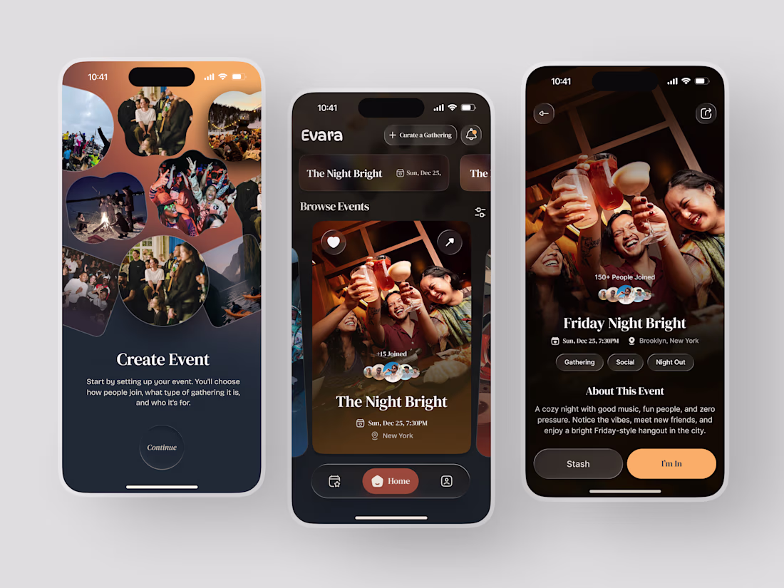
Most event apps help you find something to do. Evara was designed to help you find somewhere to belong.
The brief was a social gathering platform built around intention - not just events, but curated experiences where the host chooses who joins, what kind of gathering it is, and who it's for. The Night Bright. Friday Night Bright. A cozy night with good music, fun people, and zero pressure.
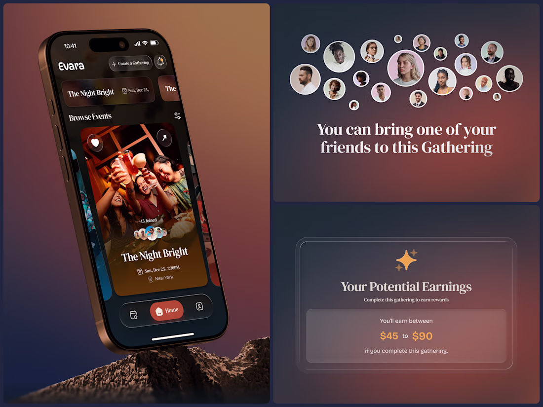
The design reflects that warmth completely. Deep amber gradients, organic photo collages, rich brown surfaces, and an event detail page that feels like a personal invitation rather than a ticket listing. 150+ people joined. Gathering. Social. Night Out. "I'm In" in amber gold is a button that actually feels like a decision worth making.
And then the layer that makes Evara different - hosts earn between $45 and $90 for completing a gathering. The platform rewards the people who create the experience, not just the ones who attend it.
This is what social app design looks like when the product actually cares about connection.
Does this feel like an app worth showing up for? 👇
Tools: Figma
#AppDesign #SocialApp #MobileDesign #UIDesign #DarkUI #ContraFreelance #EventApp #ProductDesign
Clean layout and super intuitive design!
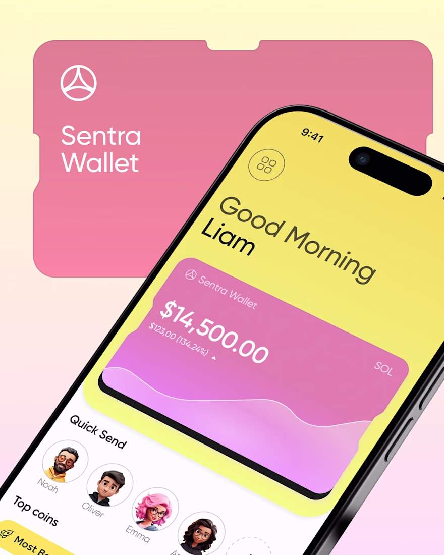
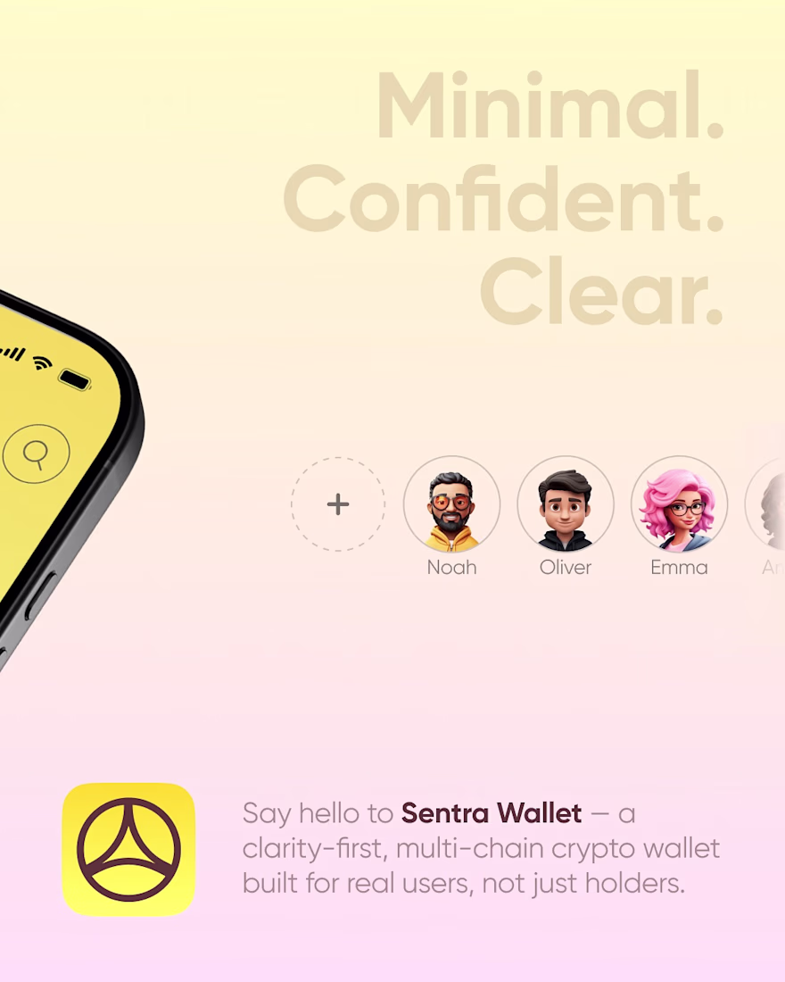
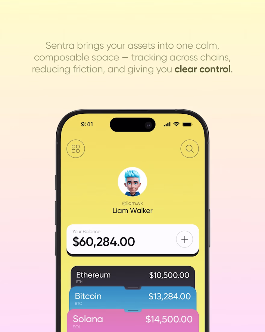
One of our older concepts that still stands out to us is Sentra Wallet.
At the time, most crypto wallets leaned into dark themes and interfaces that felt built for experienced users. We wanted to explore a different direction. Something brighter, friendlier, and easier to navigate without losing the feeling of security or control.
The goal was simple: make managing digital assets feel approachable. We focused on clear information hierarchy, intuitive navigation, and a visual identity that didn't rely on the usual Web3 design trends.
Looking back, we'd definitely refine parts of it today, but the core idea remains the same. Great product design isn't about making crypto look more complex. It's about making it feel easier to use.
Going brighter and friendlier for a crypto wallet is still the harder design problem, most teams default to dark mode because it's easier to fake secure. What was the biggest pushback from users used to the darker wallet convention?
Trending
Claude
Claude has entered the design space. How are you using Claude Design?
Contra University
Learn from expert creatives how to earn more using next-gen AI tools.
creativeaiflow
Creative AI workflows are evolving. What tools do you use, and what are their strengths and weaknesses?
freelancerlife
Freelancer life is wins, pivots, and everything in between. What’s yours right now?