The network for creativity
Join 1.25M professional creatives like you
Connect with clients, get discovered, and run your business 100% commission-free
Creatives on Contra have earned over $150M and we are just getting started
Back to feedPost
Taste Test
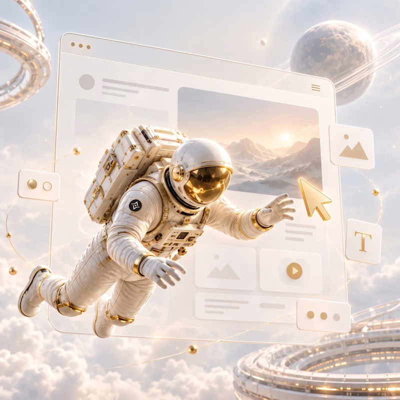
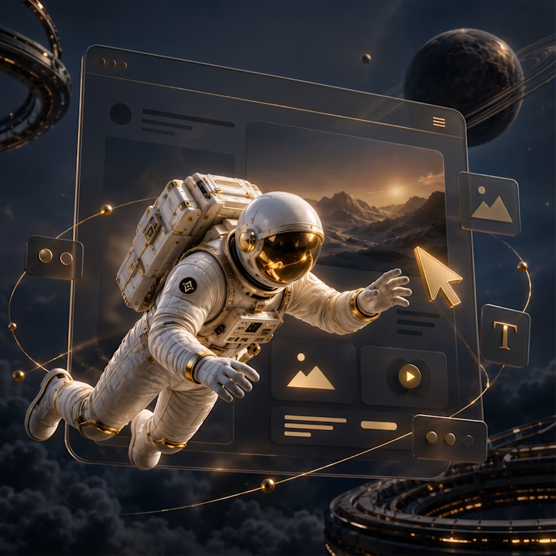
A complete visual direction for Vyomaverse — blending strategy, digital experiences, branding and creative production into one futuristic visual language.
Built a light & dark universe around an astronaut-led concept, with each service getting its own visual story.
5 voted
71%
2 voted
29%
7 votes
Closed

Keeping the astronaut and orbit-ring composition pixel-identical across both moods is what makes this a real test — you're isolating lighting and palette as the only variable instead of letting a different scene sneak in to bias the vote.

yeah that was the whole point actually @Mark Barliet, same astronaut same rings, only thing changing is light and colour. wanted people voting on mood not on "oh this scene looks cooler." good catch though.


The astronaut concept gives each service a clear place in the same universe. Nice way to make a broad offering feel connected.
exactly what we were going for, one universe and every service just gets its own corner of it. means a lot that it came through, thanks @Kabir Ahmed

Tough call for me, but finally the light one 😊
haha yeah it really was a tough call for us too honestly @Leena | UI/UX & Product Design , building this whole concept while making sure light and dark mode both get equal love across the entire site was not easy. anyway we're posting the full website soon, would love for you (and everyone else here) to take a look and tell us how it feels
Oh yesss, a 100%!! I would love to see the full website. I also posted an A/B poll, and would love to see which one you'd pick 🙌


really like the futuristic feel
The network for creativity
Join 1.25M professional creatives like you
Connect with clients, get discovered, and run your business 100% commission-free
Creatives on Contra have earned over $150M and we are just getting started

Challenges
View all


Related posts

I'm working on a store concept mixing art supplies, gifts and tech. I presented two moodboards: one inspired by traditional art supply stores, and another cleaner, modern direction inspired by Japanese gift and tech stores. They chose option 2.
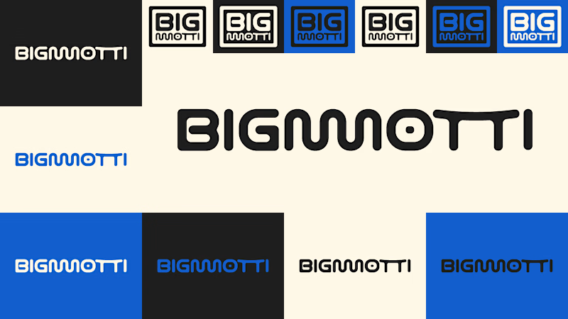
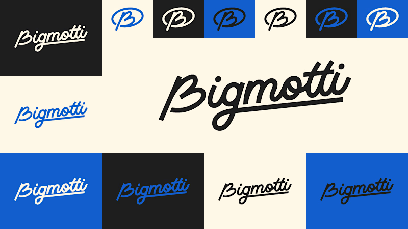
I presented four logo ideas. These two are my favorites and the ones the client liked most.
1_ Based on the second moodboard, with a more neutral and slightly futuristic feel. My favorite detail is the boxed version: its vertical weight balances with the I and O, making it feel tidy and visually appealing.
2_ Inspired by traditional art supply stores, but with a modern, clean style. Handwritten lettering adds a human touch and keeps it timeless.
Which one is your favorite and why?
Which one do you think the client chose?
1 voted
14%
6 voted
86%
7 votes
Closed

I'll guess they picked #1, the boxed Bigmotti reads cleaner next to a gift-and-tech assortment than the handwritten route. That vertical weight balance on the I and O is the kind of detail that's invisible until someone points it out, was there a runner-up logo the client seriously debated before landing on this one?

Looking closer.
What begins as a moth on a piece of bark becomes rivers, stars, mountains, and then ordinary things we usually ignore.
A reminder that wonder is often a matter of perspective.
Created with GPT 2.5 Sunburst and H3


Incredible sense of scale and visual narrative! Using AI tools like GPT 2.5 and H3 to bridge macro textures with cosmic perspectives creates a genuinely hypnotic experience. Beautiful work!

Experimenting with my components to create something special for you :)
A: Hero section created using Dither Engine
B: Pricing section created using Halftone Engine
Which one would you pick? 👀
👇 A or B ?
2 voted
67%
1 voted
33%
3 votes
Closed

Going with B on this. The halftone texture on the pricing section gives it personality without distracting from the conversion goal. Dither on the hero is cool but feels like it competes with the headline.