The network for creativity
Join 1.25M professional creatives like you
Connect with clients, get discovered, and run your business 100% commission-free
Creatives on Contra have earned over $150M and we are just getting started
Back to feedPost
I'm bringing motion into Freeboard, and I'd love your eyes on it.
Freeboard is my finance app for people with irregular income. Its month map is made of water lines: income flows into a lake, spending flows out. Now the water moves. Glints drift downstream, uncertain income falls in drops, and the lake fills when the month arrives.
Small moments speak the same language: a switch that fills with water, a button that draws its check, a logo whose bow rides higher when your buffer grows. With reduced motion on, everything holds still.
Two questions:
1. Does the moving water help you read the map, or does it distract?
2. Which micro-interaction feels right, and which one is too much?
Built in Rive and CSS. Try the pieces live: freeboard.money/rive/water-lines/ and freeboard.money/rive/motion/

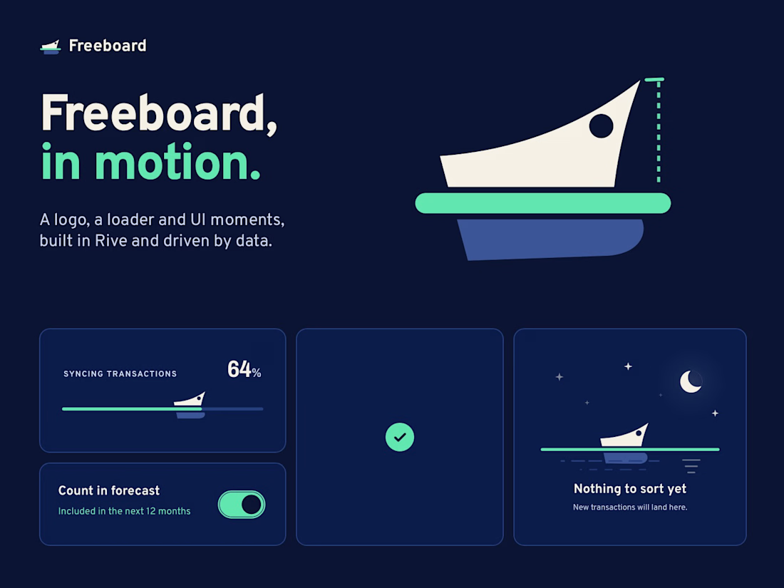


Thanks, that’s exactly the split I was hoping someone would name. The water stays as a data layer, the check button becomes the pattern for every save. And you’re right about the bow: I’m cutting the splash and letting it settle after the entrance, so it reads as a mark, not a mascot.

Great concept.
Thank you, you can check a live demo and join the waiting list here 😊
freeboard.money
Freeboard · Spend smarter, go further
Freeboard tells you every morning how much you can spend without going into the red in the months ahead. For income that arrives irregularly, in several currencies, from clients, platforms and subscribers.
The network for creativity
Join 1.25M professional creatives like you
Connect with clients, get discovered, and run your business 100% commission-free
Creatives on Contra have earned over $150M and we are just getting started








Related posts

Post
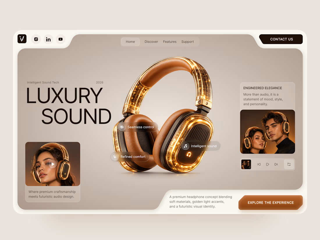
Luxury Sound — Premium Headphones Landing Page 🎧✨
A premium landing page concept for a luxury audio brand, built around a bold headphone design and a refined visual experience
The design combines warm neutral tones, glowing details, oversized product visuals, and minimal typography to create a futuristic yet elegant feel
Special attention was given to:
• Product-first composition
• Premium visual direction
• Feature highlights
• Lifestyle imagery
• Clear CTA placement
• Responsive mobile experience
The result is a clean, immersive product experience that makes the headphones feel like more than tech — they become part of the lifestyle 🔥


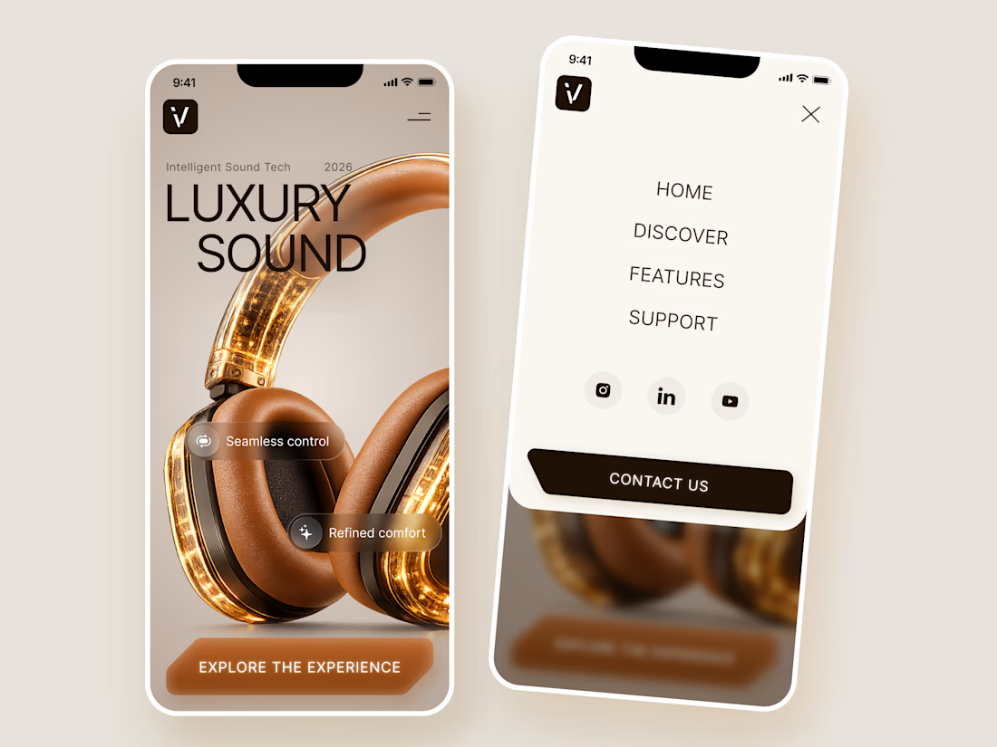
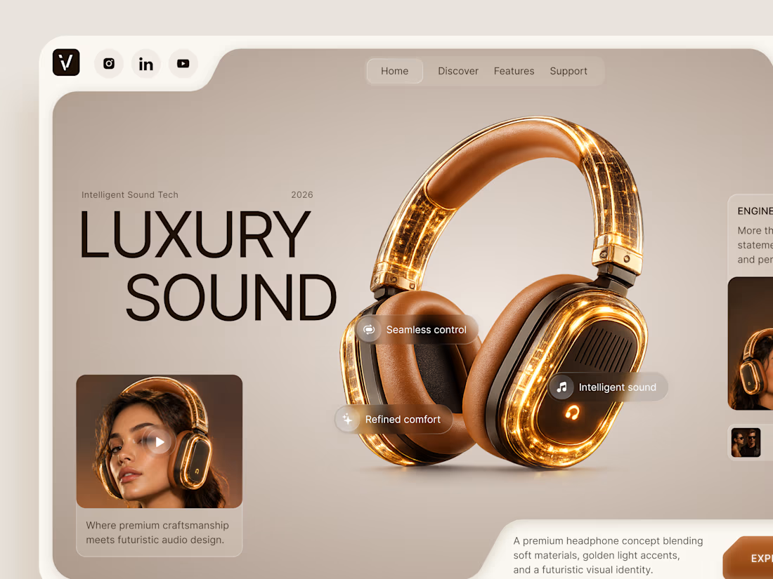

The amber glow on the headphones against that warm beige is lovely. How does the mobile menu handle the product image?

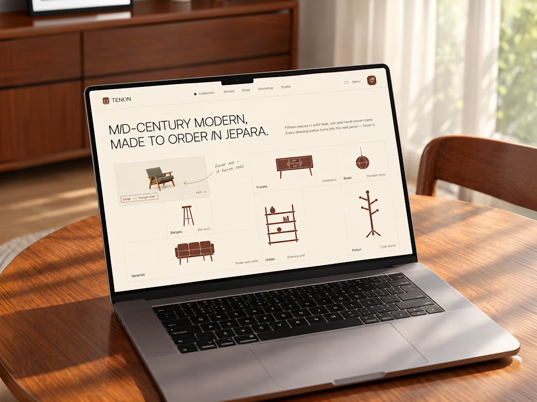
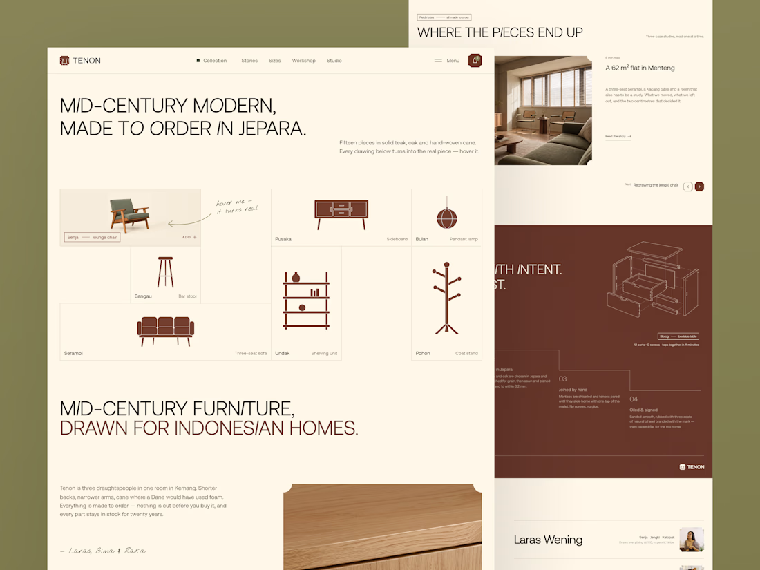
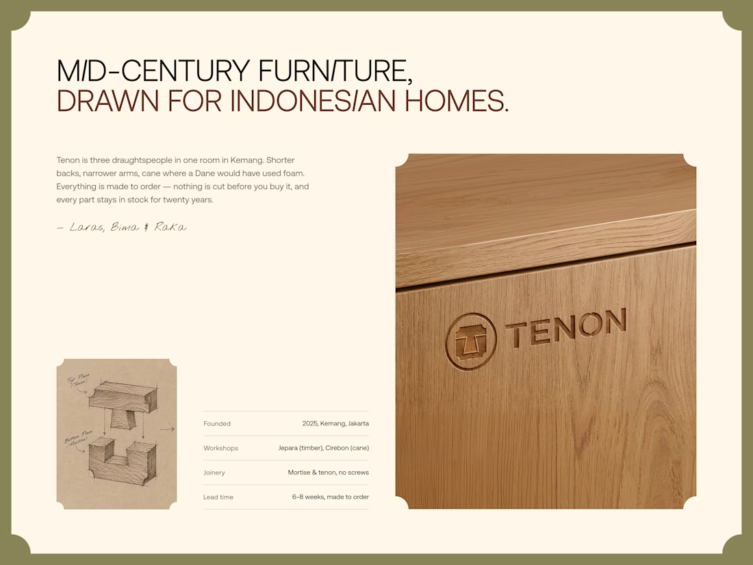
Tenon is Furniture Website Design
Exploring a digital experience for an Indonesian furniture brand inspired by mid-century modern design.
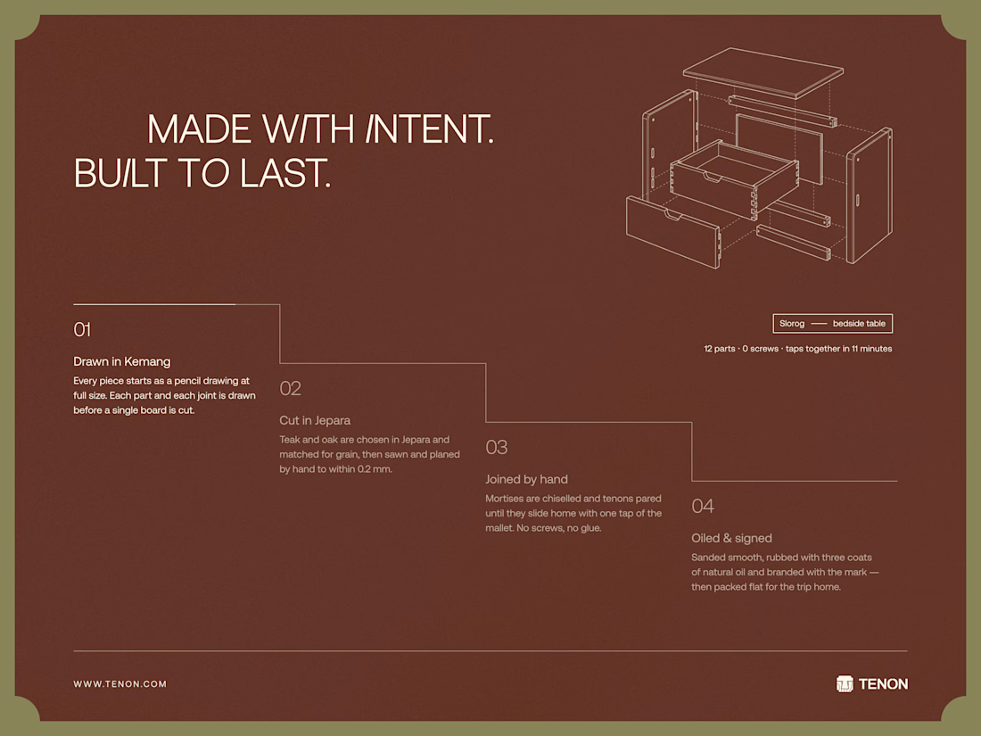
The website brings together product discovery, storytelling, and visual direction to make the digital experience feel as considered as the furniture itself.
Made to order. Made to last.

Love the color choice used


Turning complex AI workflows into a calm, monochrome experience, brought to life with motion. We'd love to hear your thoughts!


