The network for creativity
Join 1.25M professional creatives like you
Connect with clients, get discovered, and run your business 100% commission-free
Creatives on Contra have earned over $150M and we are just getting started
Back to feedPost

Proposal Ping: A Landing Page for a Job Alert Tool Built for Freelancers
Overview
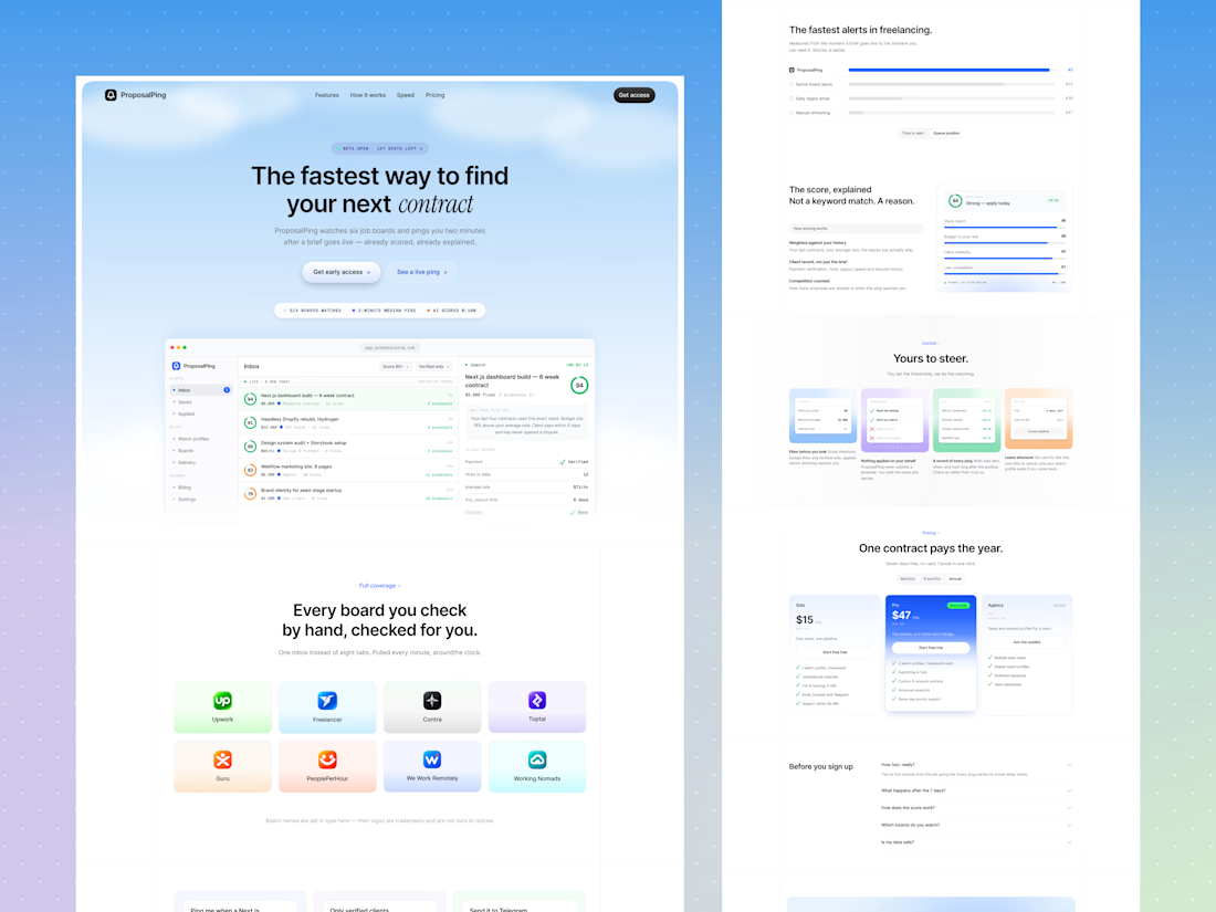
ProposalPing watches job boards like Upwork, Contra, and Toptal, then alerts freelancers the moment a good job appears, already scored and explained. I designed the full landing page in Figma, from layout and structure to the final UI. My goal was to show a busy freelancer why speed matters and make them want to join the beta.
The Problem
Freelancers lose good jobs for a simple reason: they see them too late. By the time they check eight different tabs, a job already has dozens of proposals. The page had to show this pain quickly and prove that ProposalPing solves it.
My Approach
I designed the page for someone who is busy, skeptical, and short on time. It opens with one clear promise, backs it with a product preview, then answers the questions a freelancer would ask next: Which boards? How fast? How does the score work? Am I in control? What does it cost?
Key Design Decisions
1. A hero with a clear promise and a little urgency. The headline “The fastest way to find your next contract” says the benefit in one line, and the italicized word "contract" adds personality. A small “Beta open · 127 spots left” label creates gentle urgency. Below it, “Get early access” is the main action, and “See a live ping” is a softer option for curious visitors.
2. The product in the first screen. A dashboard preview shows a scored job inbox on the left and a job detail panel on the right. Visitors see the product working before they read anything else. A row of small facts (six boards watched, 2-minute median ping, AI scored 0-100) adds quick proof.
3. Every board in one place. The “Every board you check by hand, checked for you” section shows the supported boards as colorful cards, so visitors recognize their own tools. A small note clarifies that board names are set in type and logos belong to their owners.
4. Features shown as real moments. Three cards show real alert examples: “Ping me when a Next.js job over $3k appears,” “Only verified clients, minimum $3,000,” and “Send it to Telegram the moment it lands.” Each card pairs a small interface preview with a short line, so features feel like actions, not a feature list.
5. A comparison that proves the point. “The fastest alerts in freelancing” uses a simple horizontal bar chart comparing ProposalPing with native board alerts, daily digest emails, and manual refreshing. Visitors understand the speed advantage in about two seconds.
6. Explaining the AI score. The score isn’t a black box. The page shows a 94 score broken down into stack match, budget versus rate, client reliability, and low competition, with a short explanation on the left. This builds trust in the AI, and it supports the headline: “Not a keyword match. A reason.”
7. Control and safety. The “Yours to steer” section answers a common worry: Will this tool act without me? Four small cards show filters, “nothing applied on your behalf,” a record of every ping, and the freedom to cancel anytime. The message is clear: you decide, the tool just watches.
8. Simple pricing. Three plans (Solo, Pro, and Agency on a waitlist) sit side by side. Pro is highlighted as “Most popular” with a blue card, and each plan has a short checklist. A monthly/annual toggle and the “Seven days free, no card” note remove hesitation. The headline “One contract pays the year” frames the price as an investment.
9. FAQ and a final push. An accordion FAQ answers common questions without crowding the page. A soft blue closing section repeats the call to action: “Built for the freelancer who would rather be working. Start today.”
10. A light, calm visual style. A soft sky-blue gradient, white cards, thin borders, rounded corners, and small monospace labels give the page a clean, technical feel without being cold. Blue is used mainly for actions, green for good scores, and grey for supporting details, so the most important things stand out.
The Result
A clear, modern landing page that explains a technical product in plain language, shows the speed advantage visually, builds trust in the AI scoring, and keeps the sign-up step visible from the top to the bottom.
Tools Used
Figma
Let’s Work Together
Building a product that needs a clear, trustworthy website? Message me and let’s design something your users will understand in seconds.


The network for creativity
Join 1.25M professional creatives like you
Connect with clients, get discovered, and run your business 100% commission-free
Creatives on Contra have earned over $150M and we are just getting started






Related posts


Very juicy. Didn't you feel like having some berries while working?


Love the attention to detail! The smooth scrolling, subtle animations, and interactive elements make the mobile experience feel clean, modern, and engaging. Great work! 👏


would you let people record a little voice intro before each track?