The network for creativity
Join 1.25M professional creatives like you
Connect with clients, get discovered, and run your business 100% commission-free
Creatives on Contra have earned over $150M and we are just getting started
Back to feedPost

The network for creativity
Join 1.25M professional creatives like you
Connect with clients, get discovered, and run your business 100% commission-free
Creatives on Contra have earned over $150M and we are just getting started







Related posts

How do you brand a business that doesn’t fit into one box?
Dario Nuzzarello built a Studio that works across engineering, IT, strategy, and software. The challenge was creating a typographic identity that could bring all those disciplines together without limiting the brand to just one.
I wanted to avoid making it feel overly technical or cold. Since Dario’s work is highly custom and interdisciplinary, the identity needed to feel precise and structured while still being human and approachable.
Sometimes, the best solution is finding the right type, proportions, and details to make a name stand on its own.
What do you think about the final result?

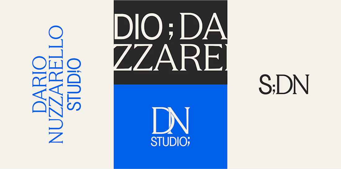

A studio that spans engineering, IT, strategy and software is a naming and typography problem more than a logo problem, so leading with type was the right call. Precise but human is a hard line to walk. Did Dario push for a symbol at any point?

Two Color Directions. One Brand Identity.
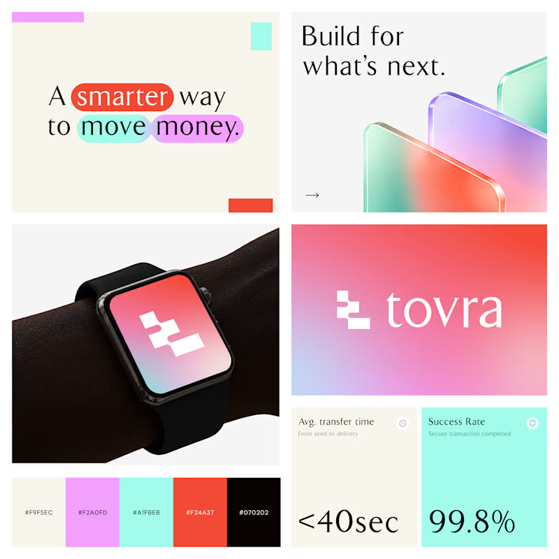
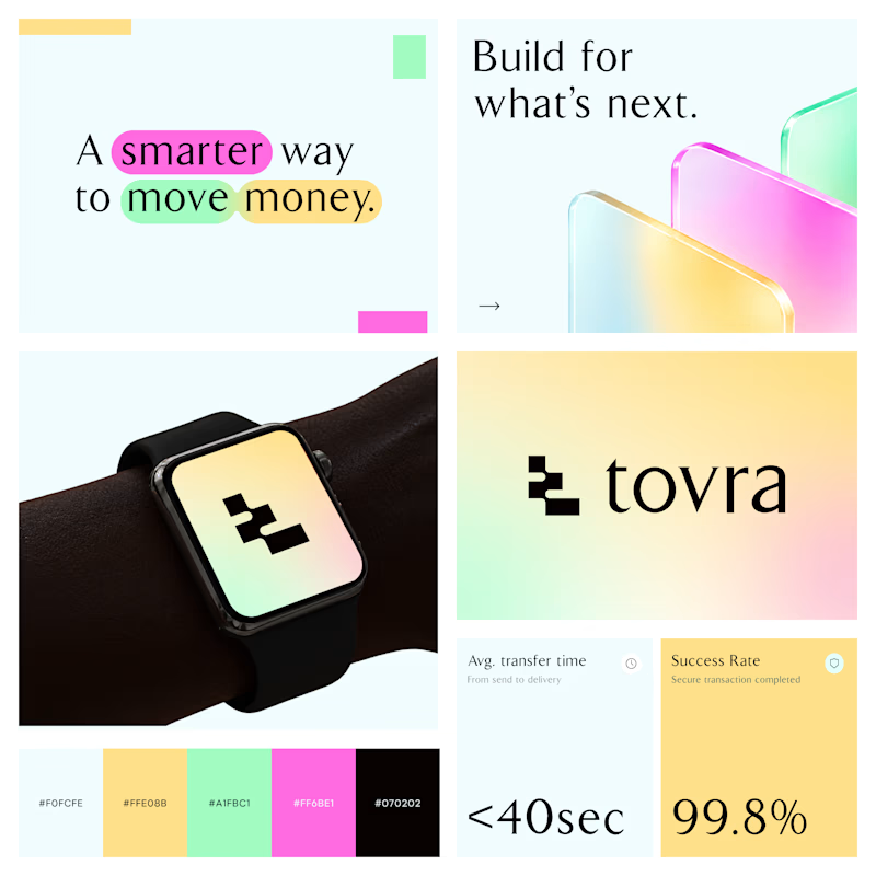
Exploring two visual directions for Toyra, a modern fintech brand focused on making money movement smarter and simpler.
Both concepts feature bold typography, vibrant colors, playful gradients, and a clean visual identity.
Which color direction works better for Brand Option A or Option B? 👀
19 voted
40%
29 voted
60%
48 votes
Closed



Visual identity revision for a psychology and management consulting firm



handsome works! anyway did you use any ai to generate mockups on that? or you did manual