The network for creativity
Join 1.25M professional creatives like you
Connect with clients, get discovered, and run your business 100% commission-free
Creatives on Contra have earned over $150M and we are just getting started
Back to feedPost
Aura Peace Core App Design
An advanced wellness platform transitioning seamlessly from a light-themed workout planner to a dark-themed health telemetry dashboard.
Key Highlights
AI & Figma Make: Used to rapidly iterate responsive layouts and complex component states.
UX Architecture: Clean visual hierarchy optimized for quick readability during active training sessions.
Data Visualization: Custom UI components designed for high data-density without cluttering the screen.
Future Scope for Personalization
Adaptive Themes: Light/dark modes that automatically trigger based on your workout environment or ambient light.
Modular Dashboard: Drag-and-drop widgets so users can prioritize the exact bio-metrics matching their fitness goals.
AI Personal Insights: A smart summary card translating raw telemetry into actionable recovery and breathing tips.


The light-to-dark theme transition for a wellness app makes a lot of sense from a UX perspective. Morning workout planning in light mode, nighttime biometric review in dark, that context-awareness is good product thinking.

So beautiful design!

Thank you for feedback!

This feels like a thoughtful direction for a wellness app. I like how the AI-driven part seems focused on making the experience feel more personal and supportive, not just adding technology for the sake of it.

it looks wonderful
The network for creativity
Join 1.25M professional creatives like you
Connect with clients, get discovered, and run your business 100% commission-free
Creatives on Contra have earned over $150M and we are just getting started





Related posts




Option B feels nothing but premium


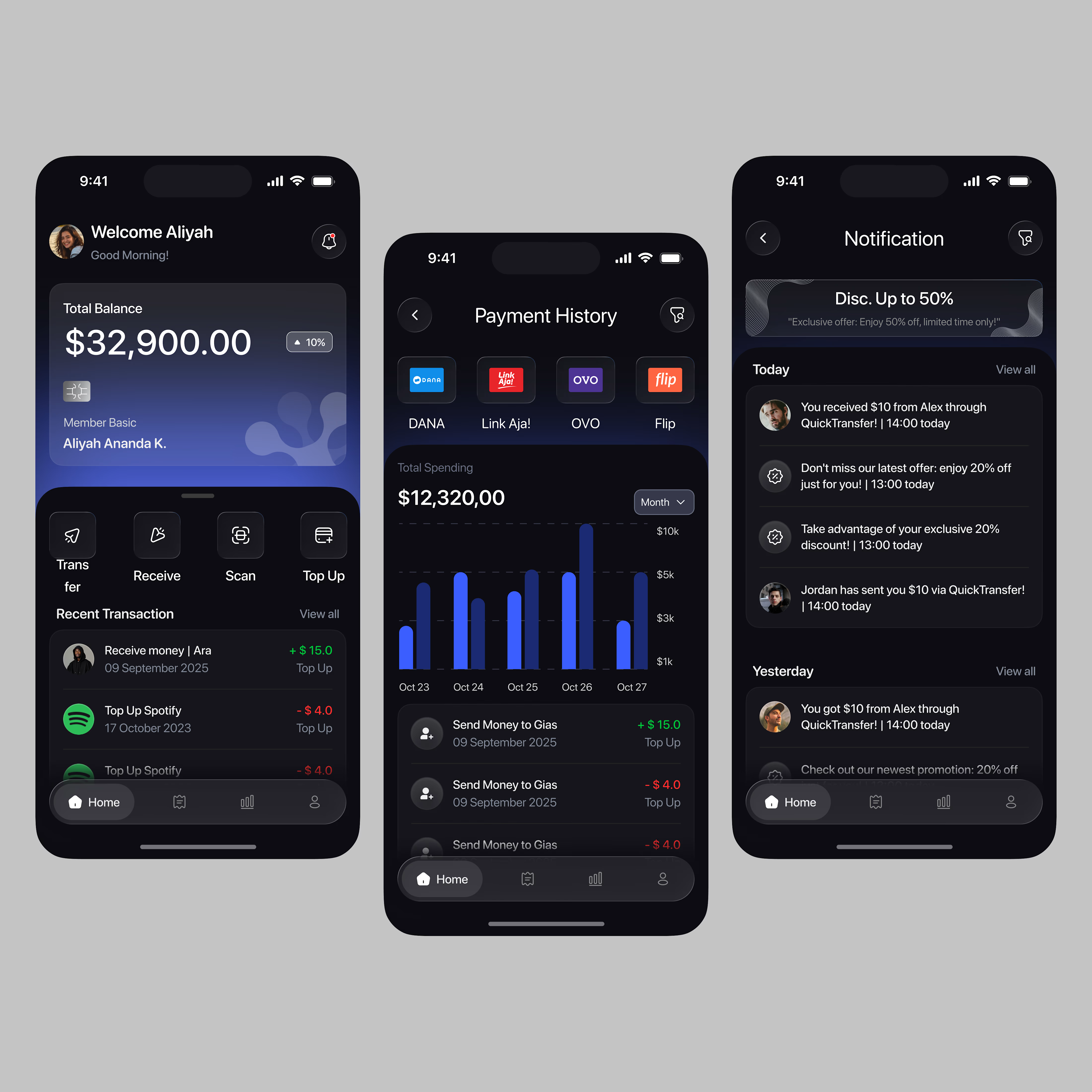
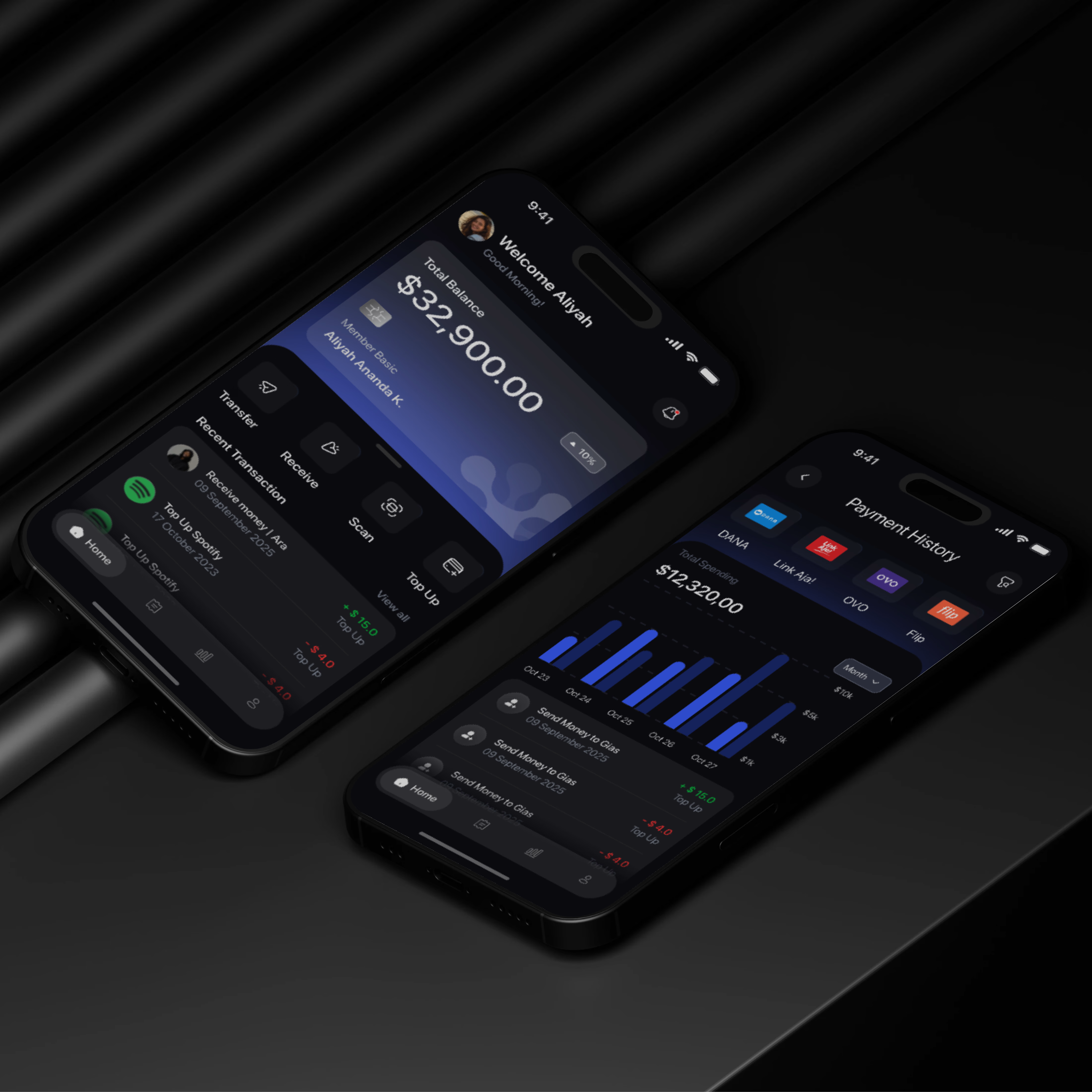

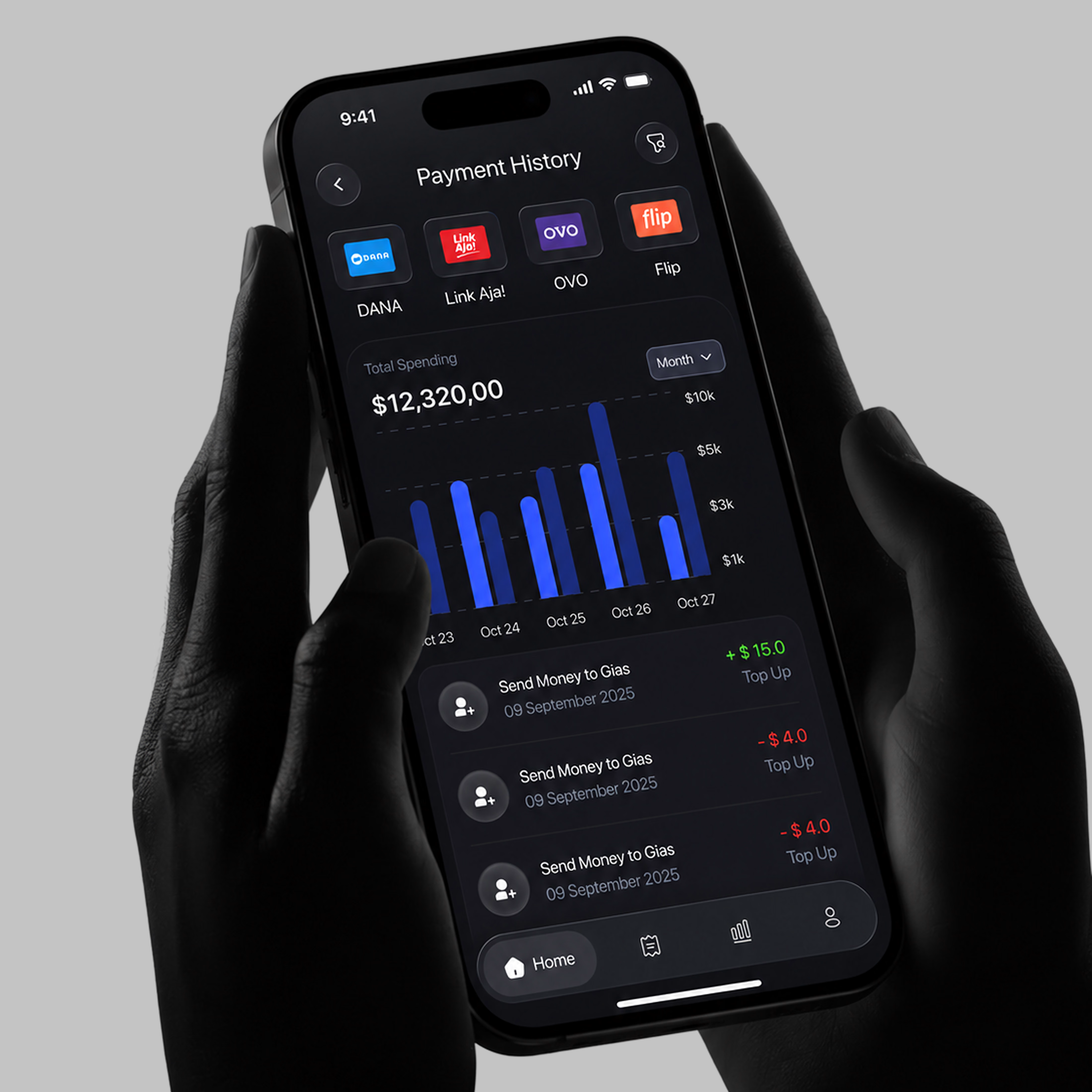

A little sneak peek at what I’ve been working on!


