The network for creativity
Join 1.25M professional creatives like you
Connect with clients, get discovered, and run your business 100% commission-free
Creatives on Contra have earned over $150M and we are just getting started
Back to feedPost

Cobot is a contemporary conversational AI brand identity designed to make human interaction with technology feel simpler, friendlier, and more approachable.
The visual identity centers around a distinctive speech-bubble symbol featuring three dots that represent an ongoing conversation. Combined with a rounded, minimalist wordmark, the logo creates a recognizable visual language for an AI-focused digital brand.
A vibrant violet, soft lavender, and off-white color palette communicates innovation while maintaining a welcoming personality. Avenir Next and Helvetica Neue establish a modern typography system across brand communications.
The complete branding concept explores logo design, symbol construction, color identity, typography, website applications, mobile interface mockups, advertising campaigns, stationery, stickers, and branded merchandise.
Cobot demonstrates how a scalable visual identity can create consistency across digital platforms, physical applications, and marketing experiences.
Creative Services: Brand Identity, Logo Design, AI Branding, Technology Branding, Visual Identity, Graphic Design, Typography, Brand Guidelines, Digital Branding, Advertising Design, and Merchandise Design.
Industry: Artificial Intelligence, Technology, Conversational AI, Digital Products.


The network for creativity
Join 1.25M professional creatives like you
Connect with clients, get discovered, and run your business 100% commission-free
Creatives on Contra have earned over $150M and we are just getting started











Related posts

Logos & Marks — Volume 12
A curated selection of recent logo and identity work.
This collection brings together commissioned projects, unused concepts, and exploratory directions across technology, AI, finance, sports, retail, and other industries.
The work explores geometric symbols, custom typography, monograms, and abstract forms, with a focus on clarity, distinction, and strong visual character.
Selected marks are available for acquisition.
For licensing, customization, or brand identity inquiries, feel free to get in touch.
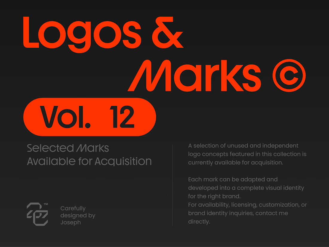


Holding the whole volume to one hot orange on charcoal makes the marks easy to compare, and the Otima symbol stacking a gate shape over the wordmark is my favorite of the set.

A product design project focused on creating a distinctive visual identity and a clear, professional presentation for the Agroxim brand.
Product and visual design
Layout and composition
Color palette and typography selection
Visual consistency and attention to detail
Preparing the final design for presentation
Tools & Software:
Adobe Illustrator · Adobe Photoshop · Adobe After Effect · Adobe Indesign
Focus:
Creating a visually appealing, professional design that communicates the brand's identity and helps the product stand out.

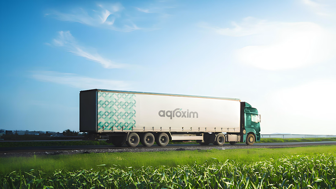
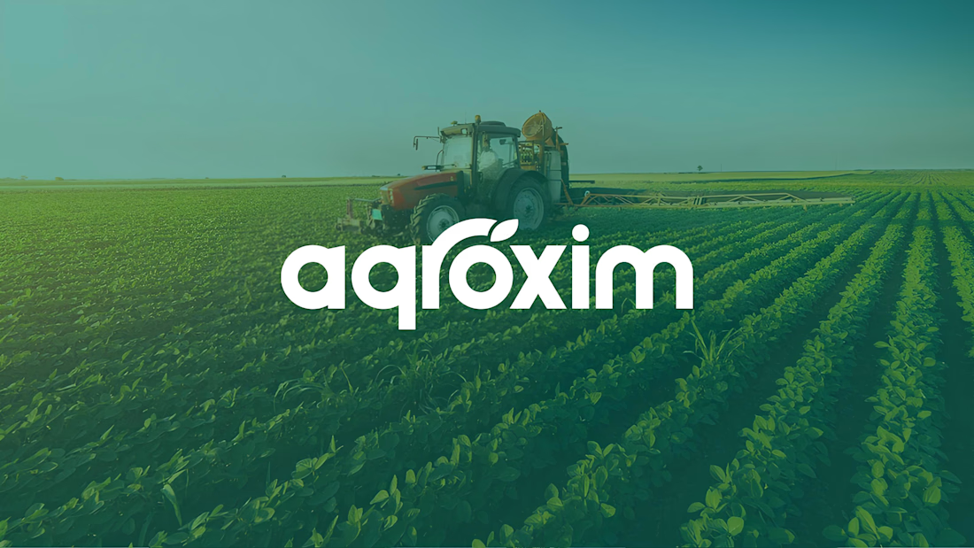

The agroxim wordmark sitting over that field photography is a lovely pairing, Sahib. Fresh greens really do the heavy lifting for an ag brand. Strong identity work.


Fresh case study 🚀🚀🚀
Brand identity for Peak, an all-in-one website builder for WordPress that I design and build. A four-letter mark, a warm paper-and-ember palette and one system that runs from the favicon to the packaging.


A four-letter mark that has to hold from favicon to packaging is a tough constraint. Did you draw one letterform first and build the other three from it, or design them together as a set from the start?


