The network for creativity
Join 1.25M professional creatives like you
Connect with clients, get discovered, and run your business 100% commission-free
Creatives on Contra have earned over $150M and we are just getting started
Back to feedPost

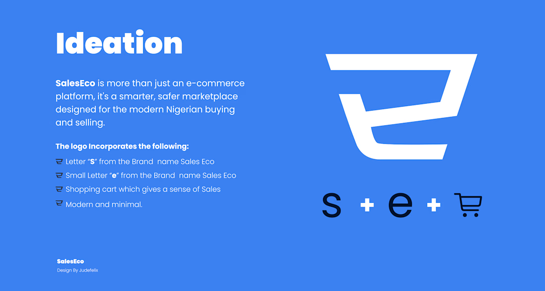
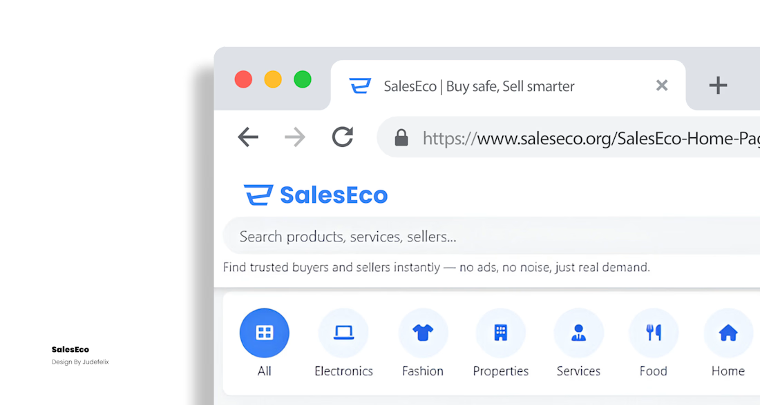
Brand design is more than making a logo look good.
A logo can grab attention, but a brand is built through the experience people have with it.
The colors, typography, visual language, tone, consistency, and even the smallest design details all work together to answer one important question:
“What should people remember about this brand?”
As designers, our job isn’t just to make things beautiful.
It’s to create identities that communicate, connect, and remain memorable.
That’s what makes brand design interesting to me.
You’re not just designing visuals—you’re giving an idea a personality.
Good design gets attention. Great branding gets remembered.


The network for creativity
Join 1.25M professional creatives like you
Connect with clients, get discovered, and run your business 100% commission-free
Creatives on Contra have earned over $150M and we are just getting started
Challenges
View all


Related posts

slightly exhausting personality trait: I need every new project to be the best thing I've ever designed.
14 years of doing this and somehow the obsession is only getting worse.
constantly learning, getting better, changing my mind, finding new things I want to try.
god I love design.


Another exciting project wrapped up! ✨
This time, we worked on Olympian by Design – a premium one-on-one coaching brand focused on personal transformation and high performance.
Our goal was to create more than just a beautiful website. We wanted the entire client journey to feel connected – from the first landing page visit to purchasing the program and going through the coaching experience.
We designed three custom pages from scratch, built them in Kajabi, created a branded member area, set up the coaching program, and refreshed the app with new onboarding screens.
All wrapped in a bold, dark, luxury-inspired design.
Because great design shouldn't stop at checkout. It should follow the client through the entire experience.

Great project

1286 CRAFT | Design in Motion
From bold typography and experimental print textures to organic paper-cut compositions, this motion showcase explores how static graphic design transforms through movement.
Each animation brings a different visual language to life while preserving its original creative identity.
Three visual styles. One creative vision.
#1286CRAFT #MotionDesign #GraphicDesign #KineticTypography #VisualStorytelling #CreativeDirection


