The network for creativity
Join 1.25M professional creatives like you
Connect with clients, get discovered, and run your business 100% commission-free
Creatives on Contra have earned over $150M and we are just getting started
Back to feedPost

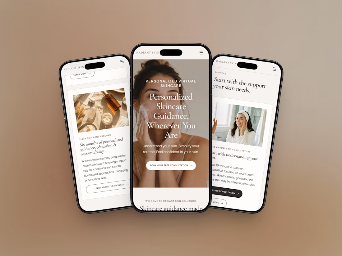
Just shipped a marketing site for Radiant Skin Solutions.
Focus:
• make the offer obvious on mobile
• free consult + 6-month program
• simple structure, booking on the key pages
Live site: https://www.yourvirtualestiemma.com

Making the free consult obvious on mobile is the right call. Booking on the key pages keeps the path short.


the middle phone is so good. that headband shot works
The network for creativity
Join 1.25M professional creatives like you
Connect with clients, get discovered, and run your business 100% commission-free
Creatives on Contra have earned over $150M and we are just getting started
Related posts

I migrated Pi-lit's site from WordPress to a custom-coded, AI-native website with its own hosting. The result:
-A scalable design system that also supports their ecommerce
-30+ pages with consistent branding throughout
-Animated illustrations of their scenes and products that bring the roadway safety story to life
See Full Case Study


Lovely work


We’re testing two filtering layouts for a template library.
Top Filters
The filters are placed above the content. This option feels lighter, leaves more space for the cards, and works well when there are only a few main categories.
Sidebar Filters
The categories remain visible in the sidebar. This makes the available options easier to scan and works better for more complex filtering, but takes up some of the content space.
Which layout would help you find the right template faster?

24 voted
39%
37 voted
61%
61 votes
Closed

Such a clean presentation. You can tell a lot of thought went into this.

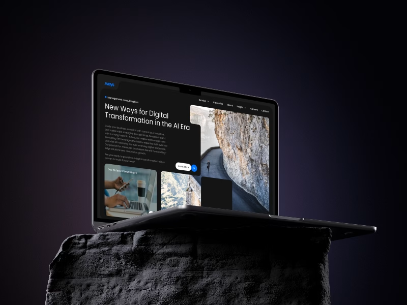
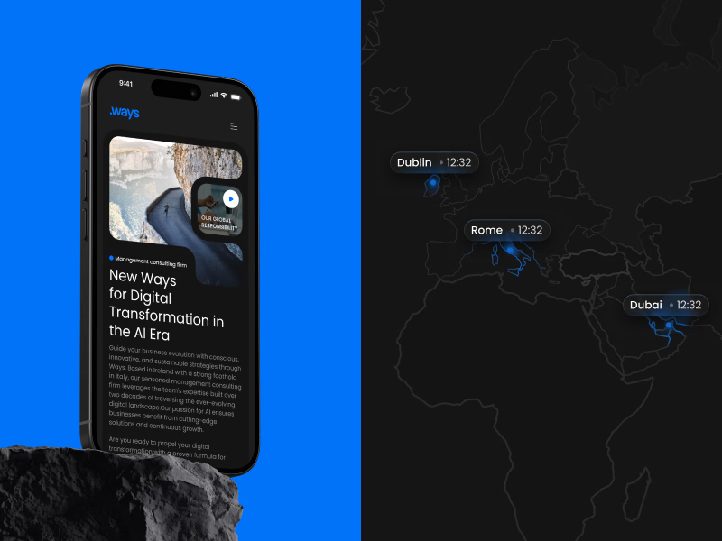
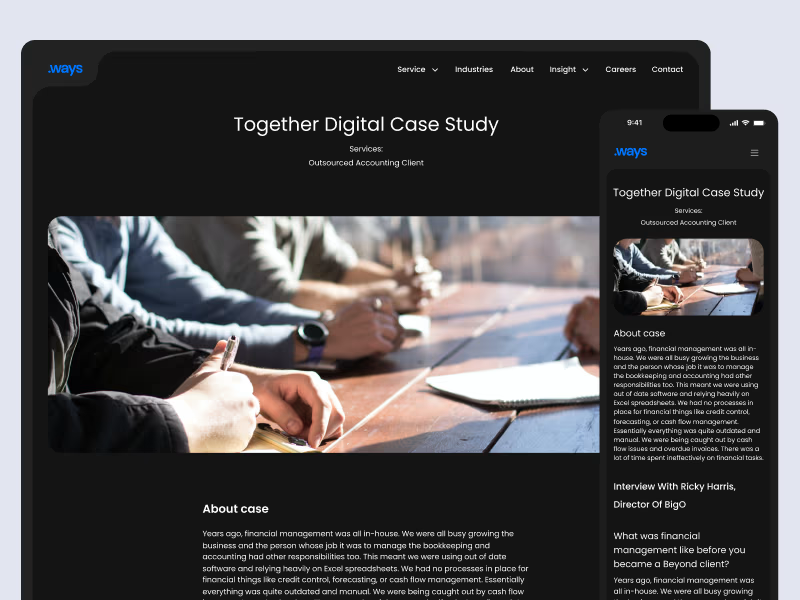
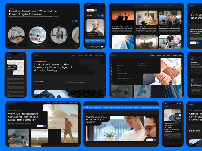
A closer look at one of our recent web design projects - Ways.
For this management consulting firm, we created a bold digital experience built around a dark visual direction, strong typography, and a bright blue accent.
The goal was to keep a professional, business-focused feel while making the website look modern, distinctive, and easy to explore across desktop and mobile.
Really happy with how this one came together.
Open to new collaborations, DM me if you have a project in mind!