The network for creativity
Join 1.25M professional creatives like you
Connect with clients, get discovered, and run your business 100% commission-free
Creatives on Contra have earned over $150M and we are just getting started
Back to feedPost

Nexus Club - Building a Startup Ecosystem Through Strategic Partnerships


The network for creativity
Join 1.25M professional creatives like you
Connect with clients, get discovered, and run your business 100% commission-free
Creatives on Contra have earned over $150M and we are just getting started






Related posts

Tandem brings two different worlds together and unlocks new opportunities for both.
If I had to describe this project in one line, that's what I'd say.
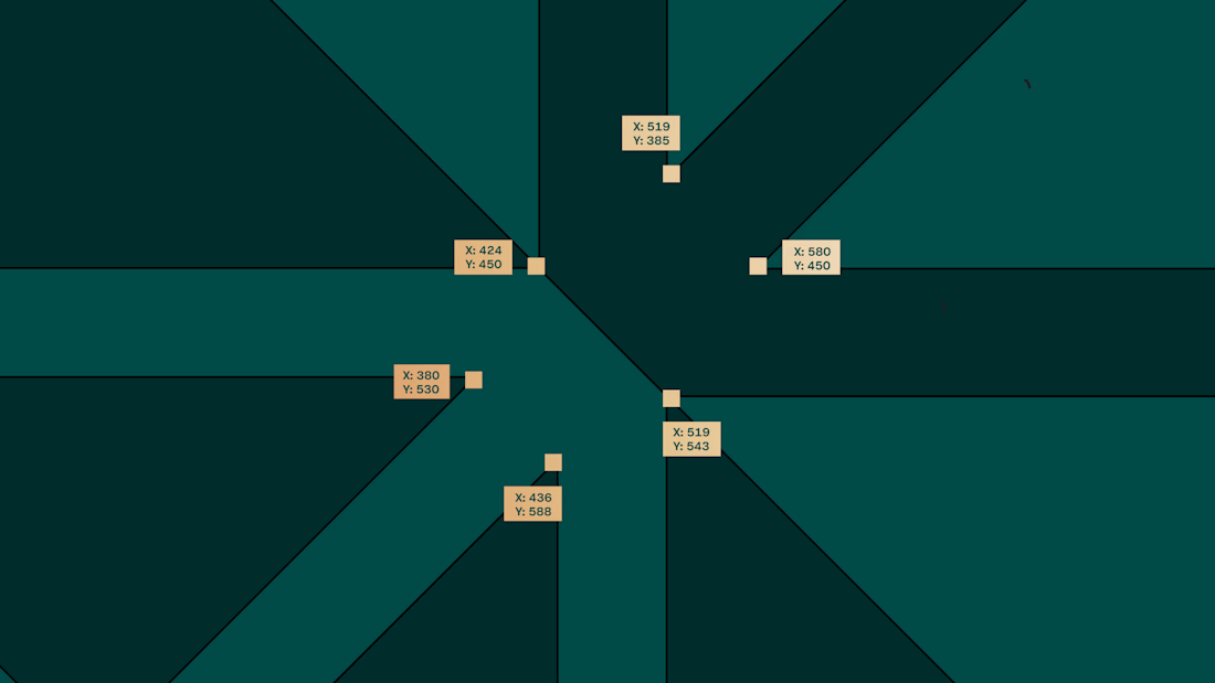
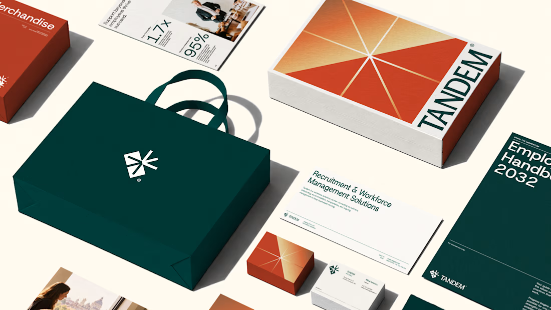
The entire brand system reflects this idea. From the name and logo to the colours and graphic language, every element reinforces the same thought: bringing businesses and workers together to create momentum.
We had a blast building this identity, and I'm genuinely happy with how it turned out!
Would love to know what you think☺
The complete project is here



Nice work!!

hey there 👋 I'm working on an AI startup that matches you with people who dress like you.
I made two intros for the site and honestly, I'm not sure which one to use. I have a slight favourite, but I want to see what everyone thinks first.
which one would you keep?
7 voted
44%
9 voted
56%
16 votes
Closed

For a 'people who dress like you' product I'd lean fast cuts, quick outfit flashes sell the matching idea before anyone reads a word. The grid could make a great second section once people want to browse. What's your slight favourite?

Tang - Café Brand Identity
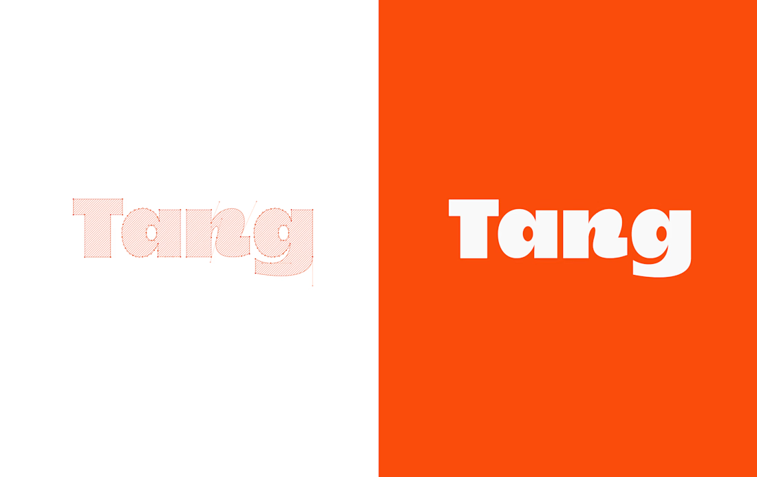
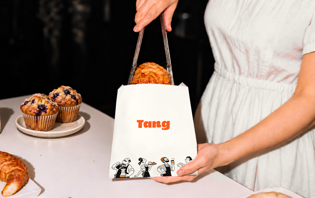
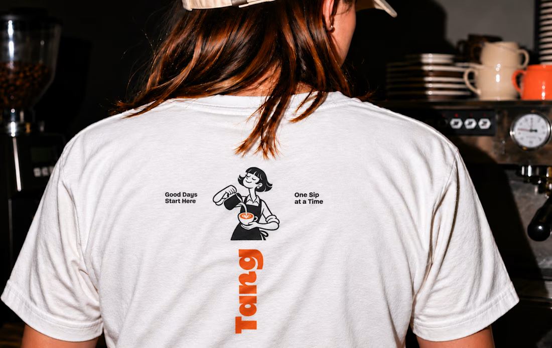
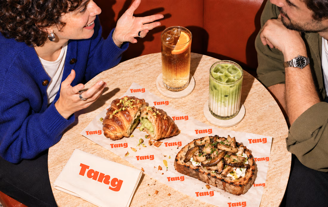
A warm, playful café identity built around the idea “Good Days Start Here.”
Bold typography, illustrated café characters, and an orange-and-cream palette connect the brand across takeaway cups, packaging, menus, and apparel. The art direction captures the atmosphere of coffee shared over conversation.
Scope includes visual identity, packaging, menu design, apparel graphics, and art direction.

T O P!!