The network for creativity
Join 1.25M professional creatives like you
Connect with clients, get discovered, and run your business 100% commission-free
Creatives on Contra have earned over $150M and we are just getting started
Back to feedPost
Taste Test

Working on art direction for my design system 'Ascendance' that will be for Webflow and Figma.
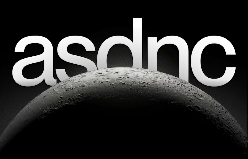
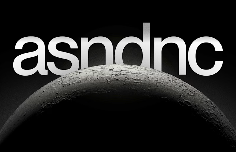
I can't decide whether to use five letters or six for the logo.
My design system's purpose is to have superior control over the look and feel when designing a website, so I want the logo to be a simple typeface that communicates dominance and sophistication.
Which one do you all think?
Tools used: Photoshop + Figma
0 voted
0%
2 voted
100%
2 votes
Closed
The network for creativity
Join 1.25M professional creatives like you
Connect with clients, get discovered, and run your business 100% commission-free
Creatives on Contra have earned over $150M and we are just getting started



Related posts

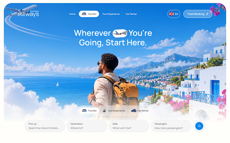
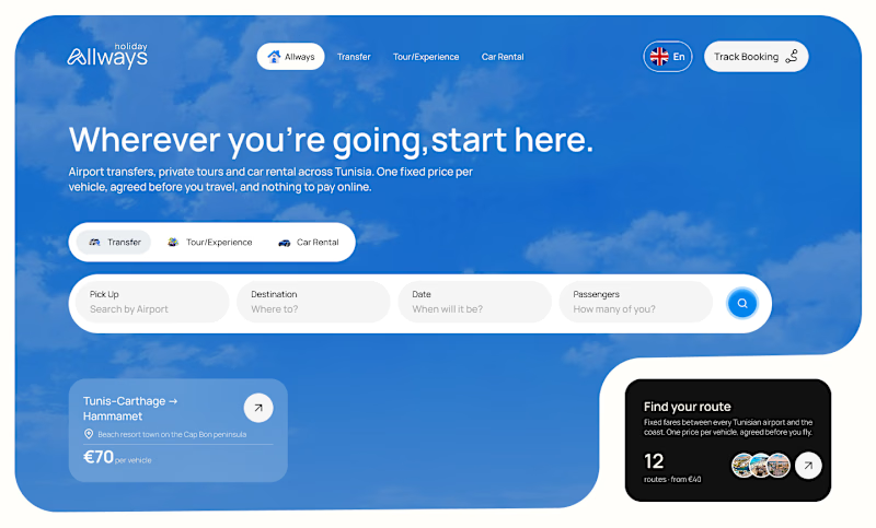
I missed an important detail in th first design direction, and the client rejected it.
After revisiting the feedback, I came up with another directiona nd it got approved
Both designs serve the same product, which one do you think got accepted for a web application?
Direction 1
Direction 2

9 voted
69%
4 voted
31%
13 votes
Closed

Dir 2 for sure!


Every letter of the wordmark was uniquely drawn in Adobe Illustrator as a guilloche pattern tile. I then built everything into custom Figma plugins that generate the result, so tash.cards can form unique words for its own communication.

This is striking Nikas! 👏 The layered guilloche lines in pink and blue against the black background look so precise. I like that you build figma plugins so the wordmark can create new words, since it makes the brand flexible and unique. Great work on tash.cards!

One pixel grid. A whole brand.
For Appy, a London product studio for impact-driven startups, the wordmark, icons, 3D smile and Appy Pixel, its custom typeface, all come from the same grid.
Appy Pixel won Typography at the Online Design Awards.
Type first or symbol first: where do you start a rebrand?

thats so nice, i loveee