The network for creativity
Join 1.25M professional creatives like you
Connect with clients, get discovered, and run your business 100% commission-free
Creatives on Contra have earned over $150M and we are just getting started
Back to feedPost

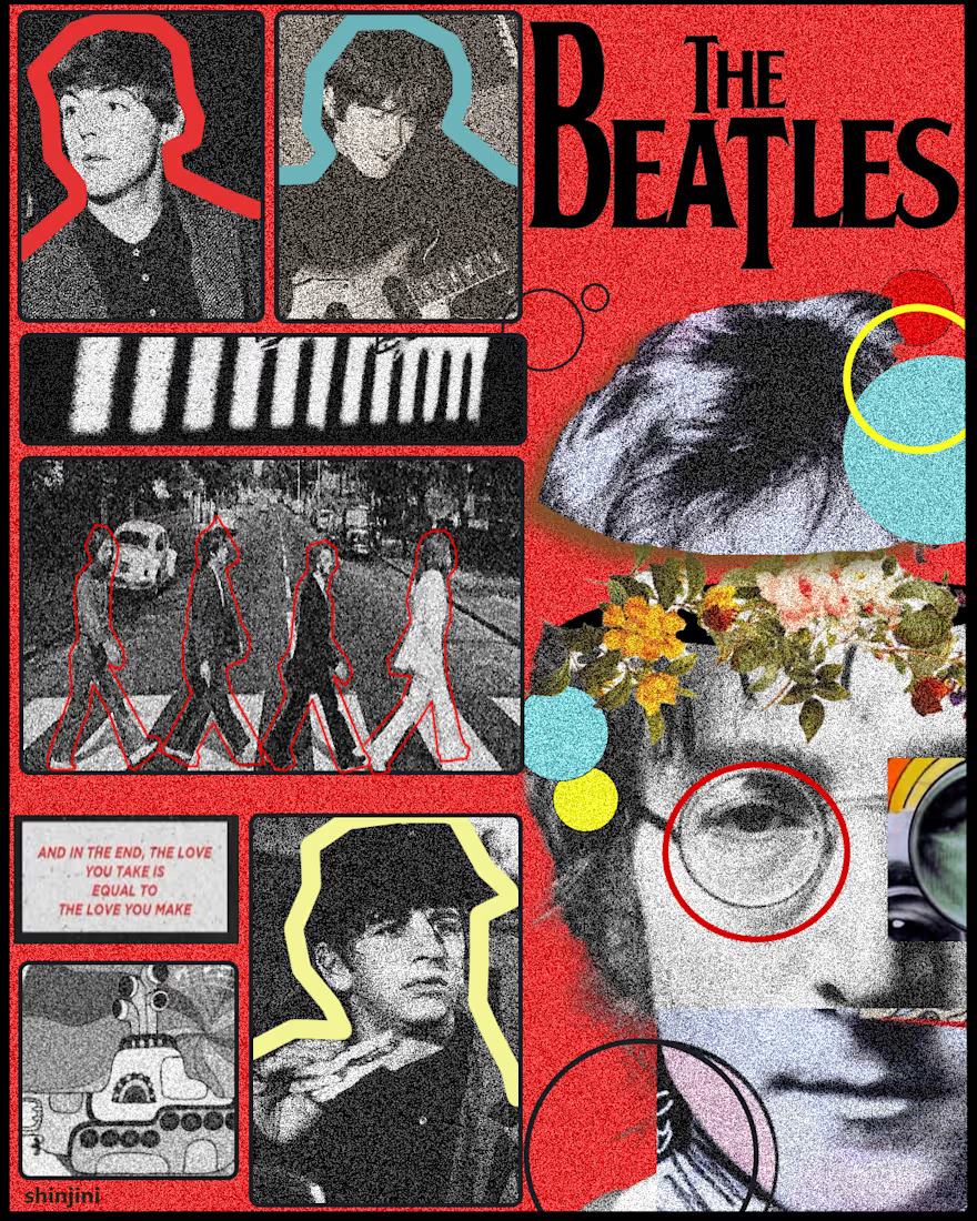
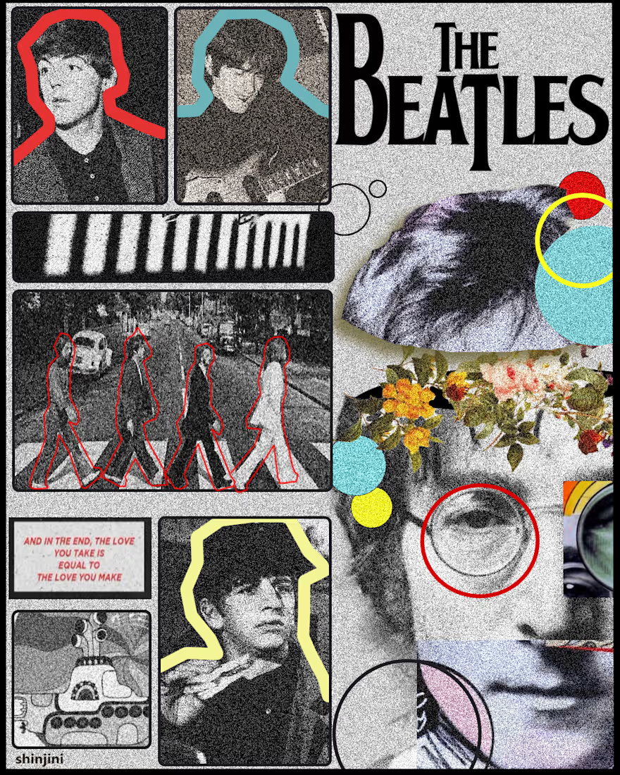
For Day 7 of Turning a band into a poster series, I hereby present The Beatles.
I created two versions and was left confused- which one looks better. Both has different emotions, the red ones pops out singing more "yellow submarine" and the grey one is leaning towards "while my guitar gently weeps".
Every poster has different stories in eyes of viewers, which one speaks to you the most? Do share your story!!!


The network for creativity
Join 1.25M professional creatives like you
Connect with clients, get discovered, and run your business 100% commission-free
Creatives on Contra have earned over $150M and we are just getting started





Related posts

Light or dark, which one wins? ☀️🌙
Same site, two moods. Warm stone and lacquer red, or the same build after dark.
Both are hand-built with a 3D paper crumple, real physics, a stick-figure film drawn in code, and a receipt that gets a bicycle kick. 🔊 Sound on.
Tell me which you'd ship: light or dark? 👇
26 voted
59%
18 voted
41%
44 votes
Closed

I really like how the light version looks, but it has some legibility issues. Since readability is more important for users than visual appeal, I think the dark version is the better option.
BTW, I initially voted for the light version, but after analyzing both options more closely, I changed my mind 😄

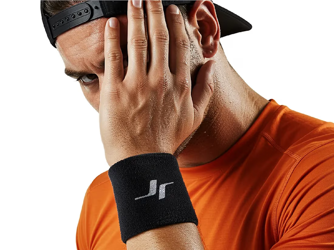
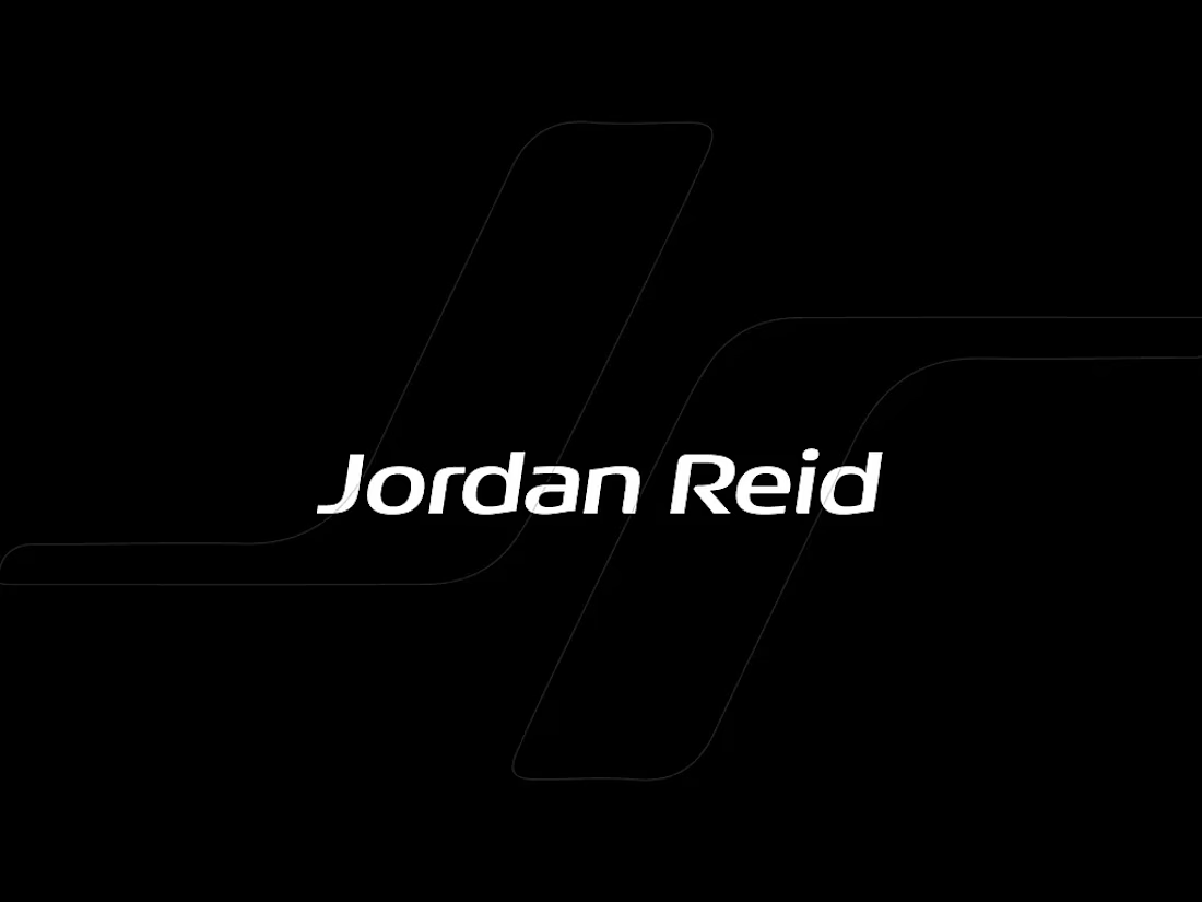
Jordan Reid - Sportswear Brand Identity





Like the logo direction

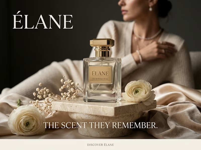
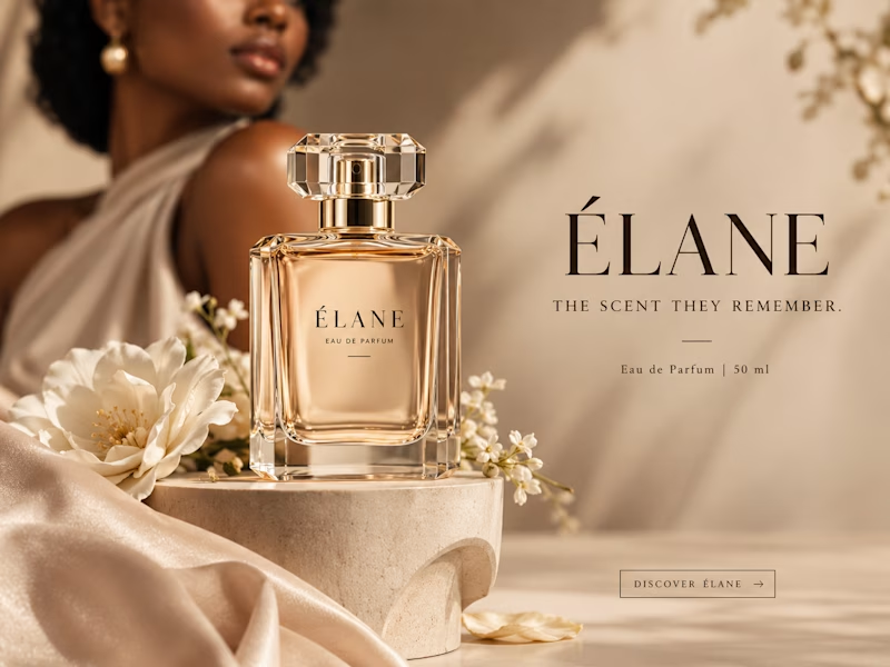
Same prompt. Same concept. Two AI tools. 👀
I gave ChatGPT and Gemini the exact same prompt to create a luxury perfume ad creative.
No changes. No extra instructions.
Now I want to know what YOU think:
Which creative did it better?
🔵 A— Gemini
🟣 B— ChatGPT
Look at the overall concept, visual quality, composition, typography, and how “ad-ready” it feels.
Who wins this round? 👀
Vote below and tell me what made you choose your answer.
#AIContent #AIAdvertising #AdCreative #CreativeStrategy #ChatGPT #Gemini #SocialMediaManager #SocialMediaStrategy #SocialMediaMarketing #MarketingStrategy #DigitalMarketing #ContentCreation

11 voted
39%
17 voted
61%
28 votes
Closed
