The network for creativity
Join 1.25M professional creatives like you
Connect with clients, get discovered, and run your business 100% commission-free
Creatives on Contra have earned over $150M and we are just getting started
Back to feedPost
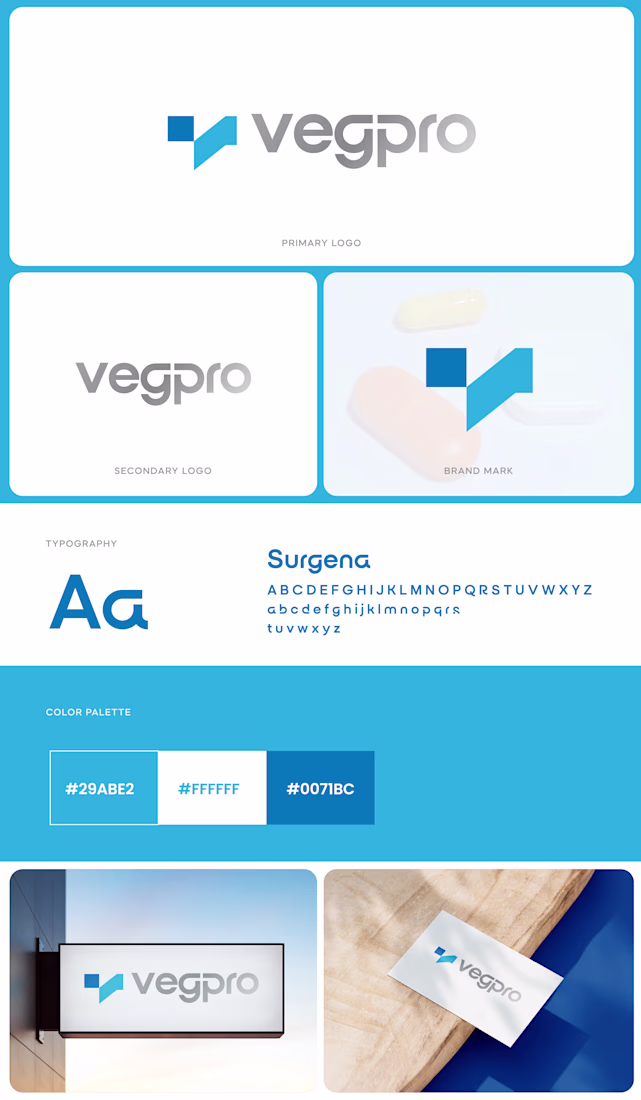
Excited to unveil the mini brand guidelines I designed for Vegpro, a standout in premium vegetable production and export. This sleek identity system captures their essence of freshness and growth through a modern blue "V" icon paired with clean "Vegpro" sans-serif typography in the primary logo, complemented by flexible secondary versions for diverse layouts.
The vibrant color palette led by #0078FF primary blue, #28A2FF secondary, and crisp neutrals evokes trust and vitality, ideal for packaging, web, and print applications tied to their fresh produce focus. Typography shines with the professional "Surgenta" font for headlines and body text, as seen in mockups on signage, business cards, and labels, ensuring consistent, elevated branding.
The network for creativity
Join 1.25M professional creatives like you
Connect with clients, get discovered, and run your business 100% commission-free
Creatives on Contra have earned over $150M and we are just getting started
Related posts
Just launched a recent brand identity project that I successfully completed for CTRL+SHIFT.
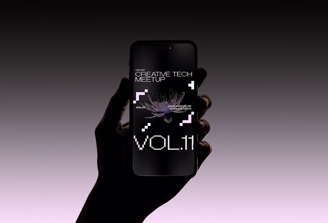
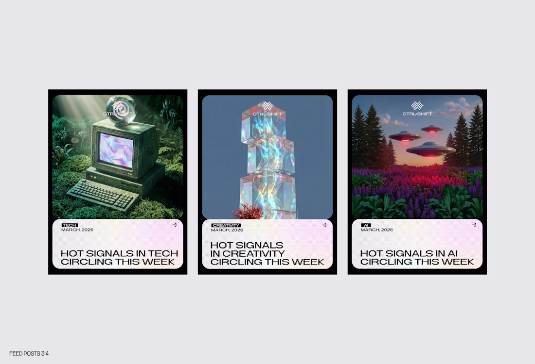
Ctrl+Shift is a brand identity project crafted for a forward-thinking platform operating at the intersection of creative technology, culture, and media. Through events, talks, content, and community, the brand brings together artists, builders, and technologists to explore creative intelligence, generative storytelling, and coding as cultural expression.
Editorial and confident, the identity is unapologetically creative-first—slightly irreverent, opinionated, and culture-forward. Designed to feel like a living platform rather than a campaign, the visual language leverages glyph dithering, color halftones, 3D ASCII graphics, and surreal soft sci-fi imagery. Anchored by a pitch-black foundation with vibrant color tints as accents, the system creates a bold yet sophisticated presence for a community built around curiosity, craft, and future-facing creativity.
You can see full project presentation here.
Feel free to like, comment and follow, kindly appreciated.
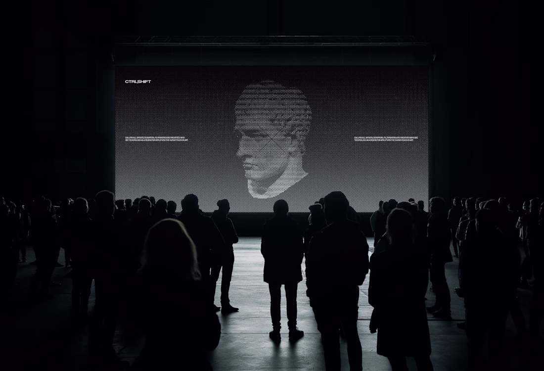
This identity for CTRL+SHIFT is a masterclass in high-end positioning. Using 3D ASCII and glyph dithering creates that "editorial and confident" feel that moves far beyond basic decoration.
It’s a perfect example of using strategic clarity to build a living platform rather than...
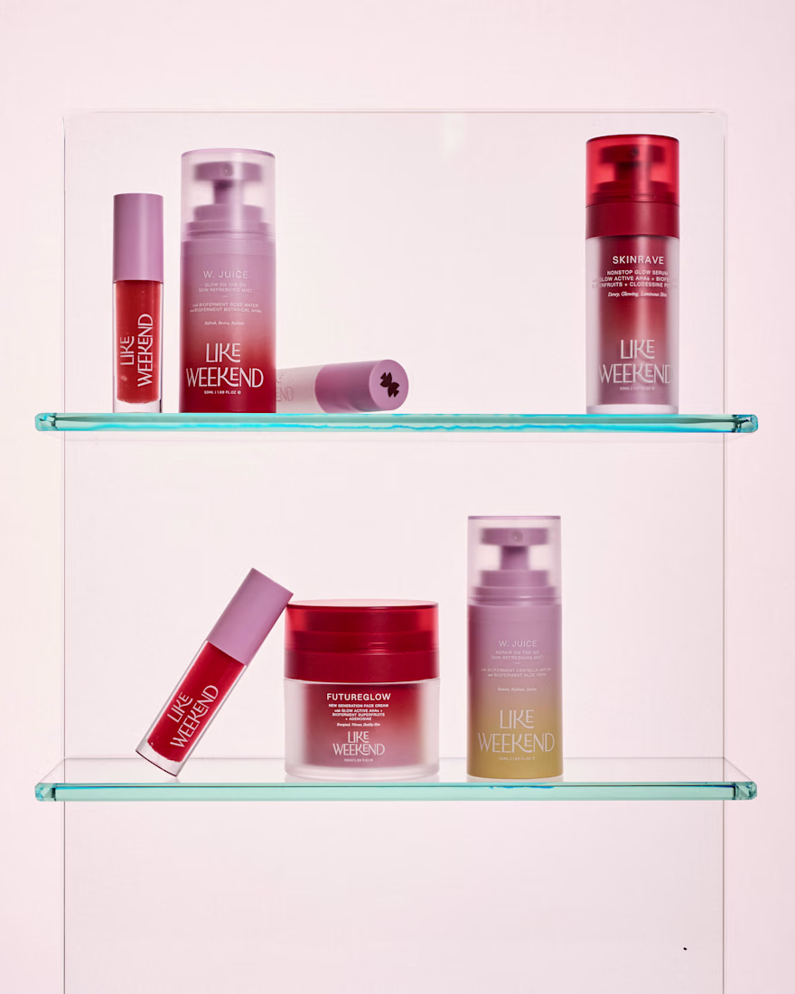
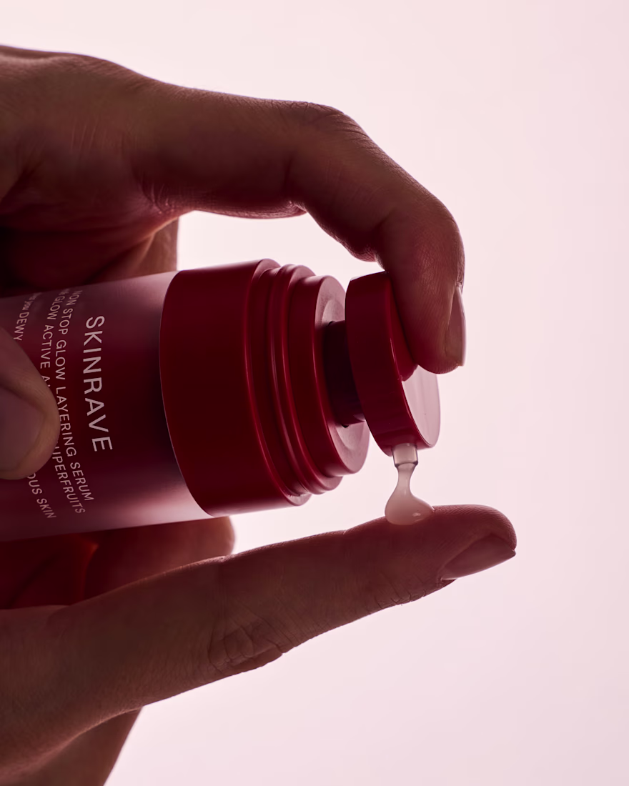
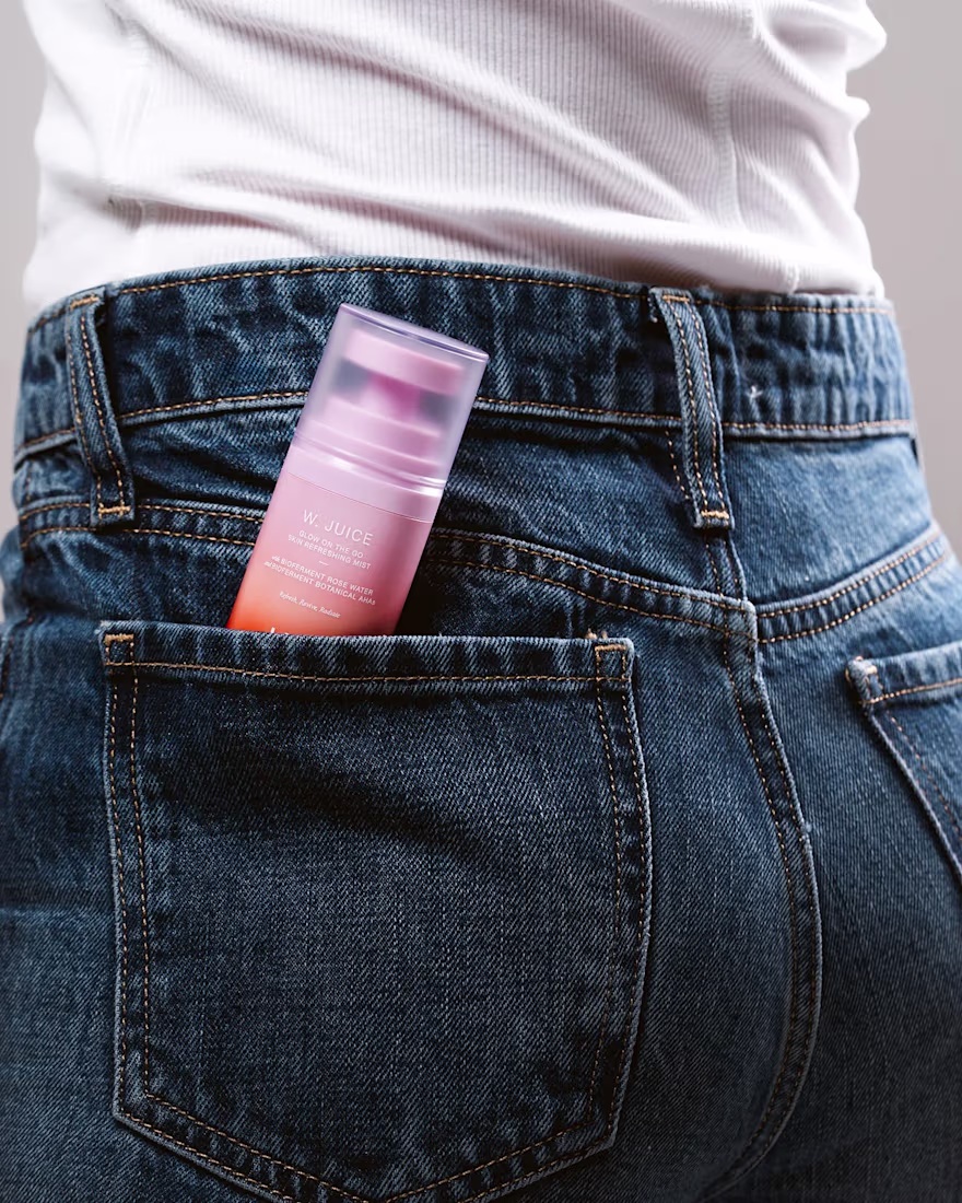
We partnered with the LIKE WEEKEND team to build a brand that captures the feeling of the Mediterranean, warm, effortless, and quietly optimistic, without relying on the usual visual clichés.
The challenge was translating an atmosphere into a system. Sunlight, salt air, ease, all expressed through a refined, contemporary lens that could sit credibly within skincare while still feeling distinctive and alive.
We developed a full brand universe rooted in skinimalism: fewer steps, smarter formulations, and a more intuitive relationship with skincare. This thinking guided everything from the visual identity to the packaging system.
Color became a key asset, not decorative, but structural. A considered palette was used to bring energy and differentiation across the range, while maintaining clarity and cohesion. The overall tone balances playfulness with restraint, creating a brand that feels fresh yet grounded.
The result is an identity that moves seamlessly between science and sensoriality, modern, lightweight, and designed to fit naturally into everyday rituals. A brand that feels as good as it performs.
Amazing work! The design is very subtle and the gradients give the product a lot of personality. I would love to buy this product!!
Brand work doesn't end when the manual gets delivered. Branding is only effective when it's smoothly applied across mediums - decks, emails, websites, social media, print assets.
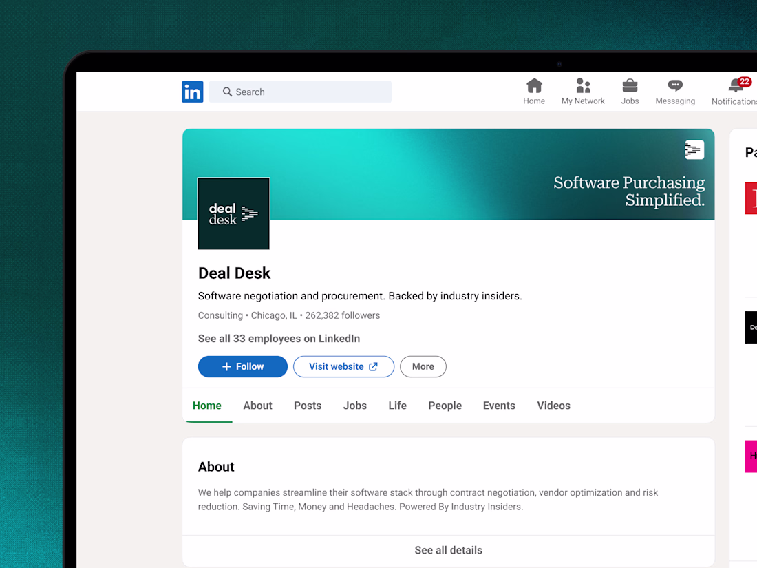
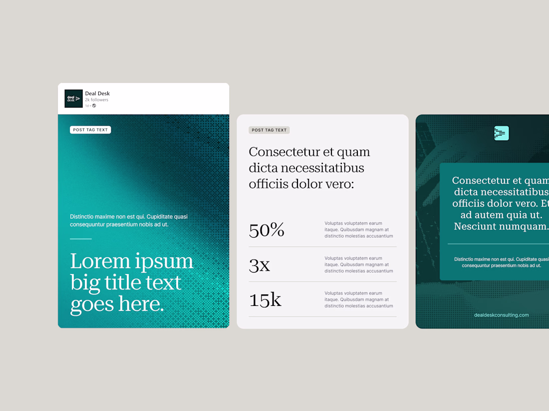
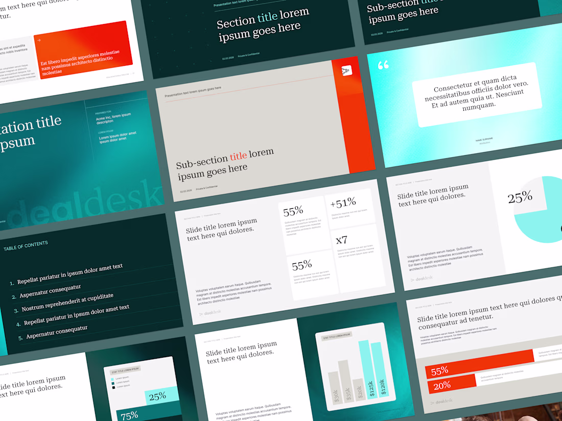
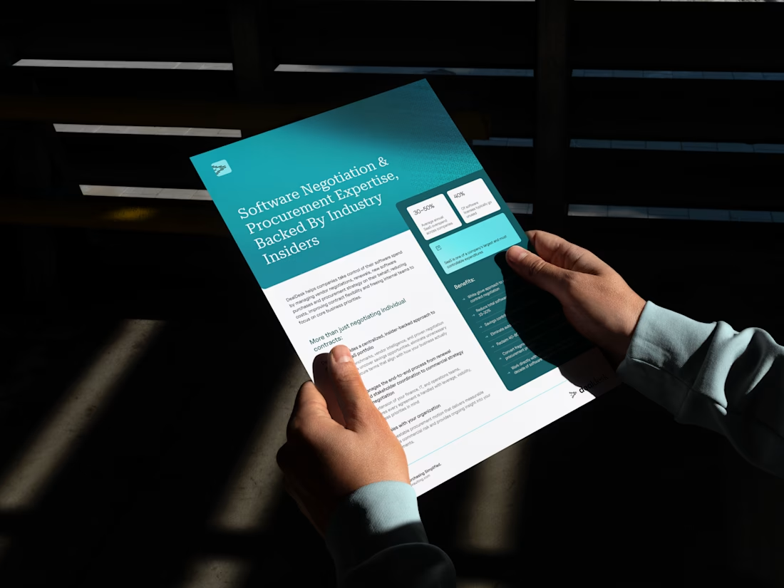
For DealDesk, we built an extensive template system: presentation decks, social media posts, one-pagers. The goal was to equip early-stage founders to keep asset production costs low while maintaining perfect brand alignment. Every template follows the same visual logic: confident typography, controlled teal palette, editorial photography standards.
The result: a self-sufficient system that scales without a full-time design team.
Intentional work. Every piece has a purpose.
Trending
Claude
Claude has entered the design space. How are you using Claude Design?
Contra University
Learn from expert creatives how to earn more using next-gen AI tools.
creativeaiflow
Creative AI workflows are evolving. What tools do you use, and what are their strengths and weaknesses?
portfolioreview
The best portfolios tell a story, not just show a grid. Share yours for feedback.
freelancerlife
Freelancer life is wins, pivots, and everything in between. What’s yours right now?