The network for creativity
Join 1.25M professional creatives like you
Connect with clients, get discovered, and run your business 100% commission-free
Creatives on Contra have earned over $150M and we are just getting started
Back to feedPost

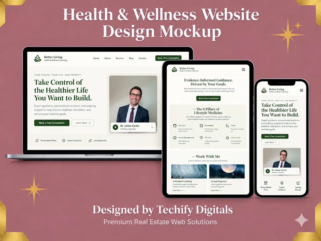
Health & Wellness Website Design
A modern, conversion-focused website designed for a health and wellness professional looking to build trust, communicate expertise, and turn visitors into consultation bookings.
The website features a clean, calming visual system with clear messaging, strategic calls-to-action, service sections, lifestyle-focused content, an expert profile, and a responsive experience across desktop, tablet, and mobile.

The network for creativity
Join 1.25M professional creatives like you
Connect with clients, get discovered, and run your business 100% commission-free
Creatives on Contra have earned over $150M and we are just getting started








Related posts

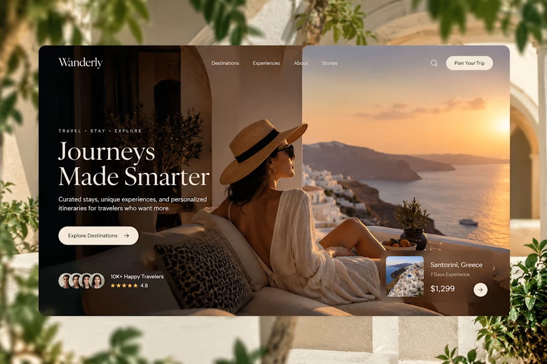
Designed for people who want the journey to feel as good as the destination.
Created a premium travel website concept for Wanderly, combining cinematic imagery with an editorial-style digital experience.
The goal was to make the website feel less like a typical travel booking platform and more like a luxury travel magazine you can interact with.
What I focused on:
• Premium travel brand direction
• Cinematic hero experience
• Editorial typography
• Destination and experience cards
• Strong visual storytelling
• Clear booking-focused CTA
• Social proof and traveler ratings
• Responsive web layout
• Luxury hospitality-inspired UI
The design uses warm neutrals, deep shadows, soft typography, and immersive imagery to create a sense of escape before the user even starts planning the trip.
Designed with a strong Figma + Framer-style approach, focusing on visual hierarchy, interaction, and conversion.
#WebDesign #TravelDesign #Figma #Framer #UIUX #LandingPage #LuxuryTravel #BrandDesign #WebDesignInspiration #Contra



Elegance hero

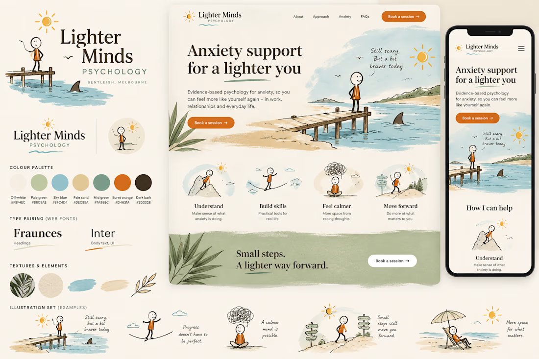
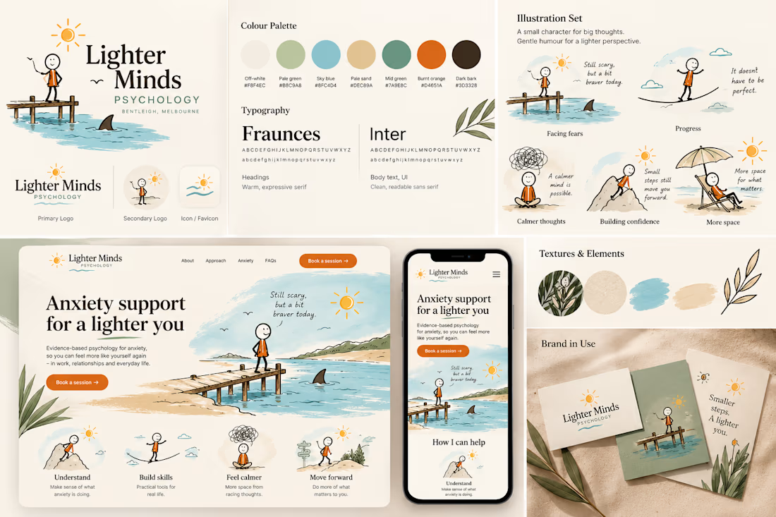
Coastal Calm — Anxiety & Wellness Brand Concept
A self-initiated visual identity and landing-page concept exploring how an anxiety-treatment brand could feel calm, distinctly Australian and gently humorous without relying on clinical wellness clichés.
The Concept: This speculative brand study explores a warmer visual language for anxiety and mental-health services, balancing clinical trust with personality and gentle humour.
Creative Direction: The identity draws from Australian coastal environments through sun-bleached neutrals, paperbark greens, water blues, sand tones and tactile illustrated textures.
A recurring hand-drawn character navigates small moments of uncertainty, from standing near a suspicious shark fin to balancing across a tightrope. The intention is not to make anxiety itself humorous, but to bring lightness to the sometimes disproportionate situations our minds create around it.
Visual System: The concept combines editorial typography, loose line illustration, natural textures and generous whitespace. Burnt orange provides moments of energy against the otherwise quiet coastal palette.
The landing-page exploration demonstrates how the system could extend from brand identity into a responsive digital experience.
Scope explored: Brand direction · Logo system · Colour palette · Typography · Character illustration · Landing-page UI · Mobile responsive direction
Self-initiated speculative concept created for portfolio demonstration. Not commissioned by or affiliated with the businesses depicted.

This is nice 👌

Designed a modern Healthcare Landing Page.
A calm teal and soft blue interface with elegant serif typography for a warm and trusted first impression.
A quick doctor search, friendly doctor profiles, hand-drawn medical illustrations, and patient reviews make finding care feel simple and human. Clean cards, generous spacing, and a smooth mobile booking section keep the whole page clear and easy to explore.
healthcarewebsitedesignmedicallandingpageProduct DesignUI DesignWeb DesignAdobe After EffectsFigmaJitter


I love this very much