The network for creativity
Join 1.25M professional creatives like you
Connect with clients, get discovered, and run your business 100% commission-free
Creatives on Contra have earned over $150M and we are just getting started
Back to feedPost

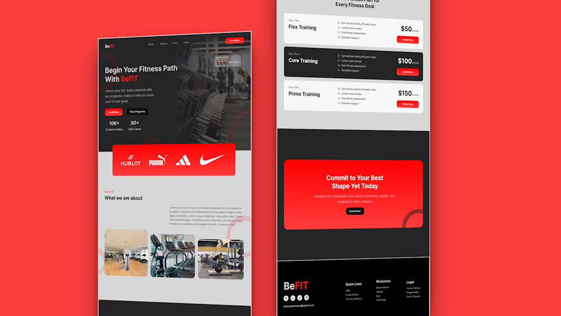
Just designed a gym landing page concept focused on one goal:
getting users motivated to take action from the first scroll. The idea was to keep things bold, clean, and conversion focused, no clutter, no confusion.
The network for creativity
Join 1.25M professional creatives like you
Connect with clients, get discovered, and run your business 100% commission-free
Creatives on Contra have earned over $150M and we are just getting started











Related posts

A landing page should continue the conversation started by the ad.
For Corpus, a Pilates and physiotherapy studio, I designed campaign-specific entry points. Pilates, physiotherapy and RPG each needed a relevant starting point, while sharing one visual system.
The page keeps the brand’s warm, editorial character through typography, photography and movement. Clear service information and WhatsApp calls to action give that visual experience a practical next step.
My role covered art direction, responsive web design, interaction and AI-assisted front-end development.
This clip shows the general version. The responsive layouts follow the same visual language across desktop and mobile.
When designing campaign landing pages, do you start with one master page or with the individual ad journeys?

Separate entry points per campaign under one visual system is exactly the right instinct. The warm editorial character comes through even in the clip. I tend to start with the individual ad journeys, then build the system around what they have in common. Did the WhatsApp CTA drive noticeably more bookings than a standard form?

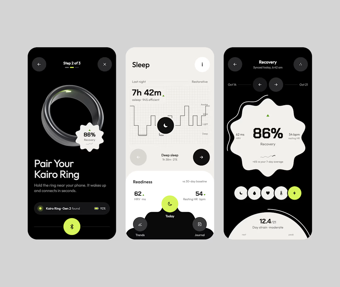
A fresh take on fitness tracking, where performance meets simplicity.
The idea was to create a premium, minimal dashboard that transforms everyday workout data into a visually engaging and effortless experience.
Built around a bold editorial layout, immersive workout imagery, dark metric cards, expressive typography, and subtle lime accents.
Design highlights:
· Immersive workout experience
· Clean, modular performance cards
· Intuitive progress tracking
· High-contrast typography and refined spacing
· Minimal visual language with purposeful color
The challenge was finding the right balance between aesthetic appeal and functional clarity, ensuring every component has a purpose.
Less noise. Better focus. Smarter fitness tracking.
Would love your feedback!


Impressive mobile UI

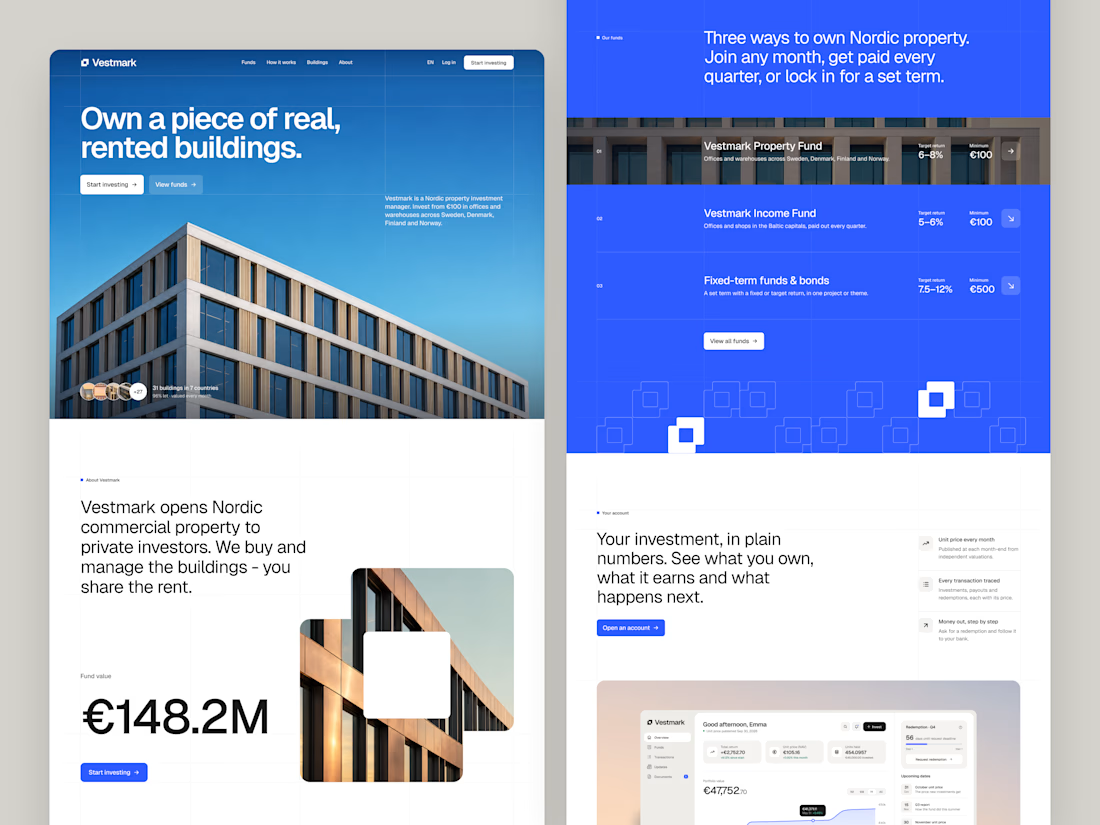
Website UI/UX for Vestmark, introducing the property funds and investor product.