The network for creativity
Join 1.25M professional creatives like you
Connect with clients, get discovered, and run your business 100% commission-free
Creatives on Contra have earned over $150M and we are just getting started
Back to feedPost
A banner should do more than fill a space, it should make people stop, look, and remember your brand.
Designed this English & IELTS Training Center Roll-Up Banner with a clean layout, strong hierarchy, premium colors, and a clear CTA, so students can understand the message in just a few seconds.
Because when your brand looks professional, people notice the difference.
Would your institute stand out with a banner like this? 👀
Best Design: www.fiverr.com/sellers/rifatislam149/edit
Portfolio: https://dribbble.com/artoryxrifat
#RollUpBanner #EducationDesign #IELTSBanner #GraphicDesign #Branding #PrintDesign #BannerDesign #CreativeDesign
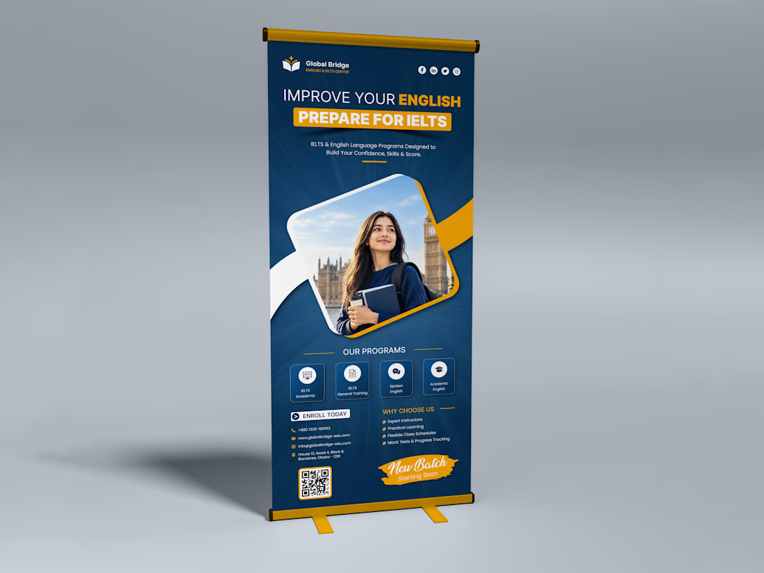

The hierarchy reads really well at a glance—the headline and CTA feel especially effective for a roll-up format. Nice restraint in the color palette too.

Thank you so much! I really appreciate your feedback. 😊 I’m glad the hierarchy, CTA, and overall color balance work well for the roll-up format.
contra.com
Rohan Ahmed - UI Designer | Contra
Framer Developer | Webflow & Figma to Web. View Rohan Ahmed’s Profile on Contra. The Independent-first, commission-free freelance marketplace shaping the future of work.

nice work
Thanks!
The network for creativity
Join 1.25M professional creatives like you
Connect with clients, get discovered, and run your business 100% commission-free
Creatives on Contra have earned over $150M and we are just getting started
Trending
retrofuturism
Share your favorite designs from the past exploring the distant future. Or your own take on the aesthetic 🚀
halftone
Dots. Texture. Grain. Let's see your designs using the halftone technique.

Midjourney
Creatives are showing off what they're making with Midjourney.
colorgrade
Video editors sound off: How do you enhance the mood of your video in color grading?
Challenges
View all


Related posts

One of my clients told me to create a banner for hime that should be clean yet impactful
So i created a clear and business oriented banner (below) for him and he liked it so much.
The first one i created just for practice....


A branding I've been working on for the last month.


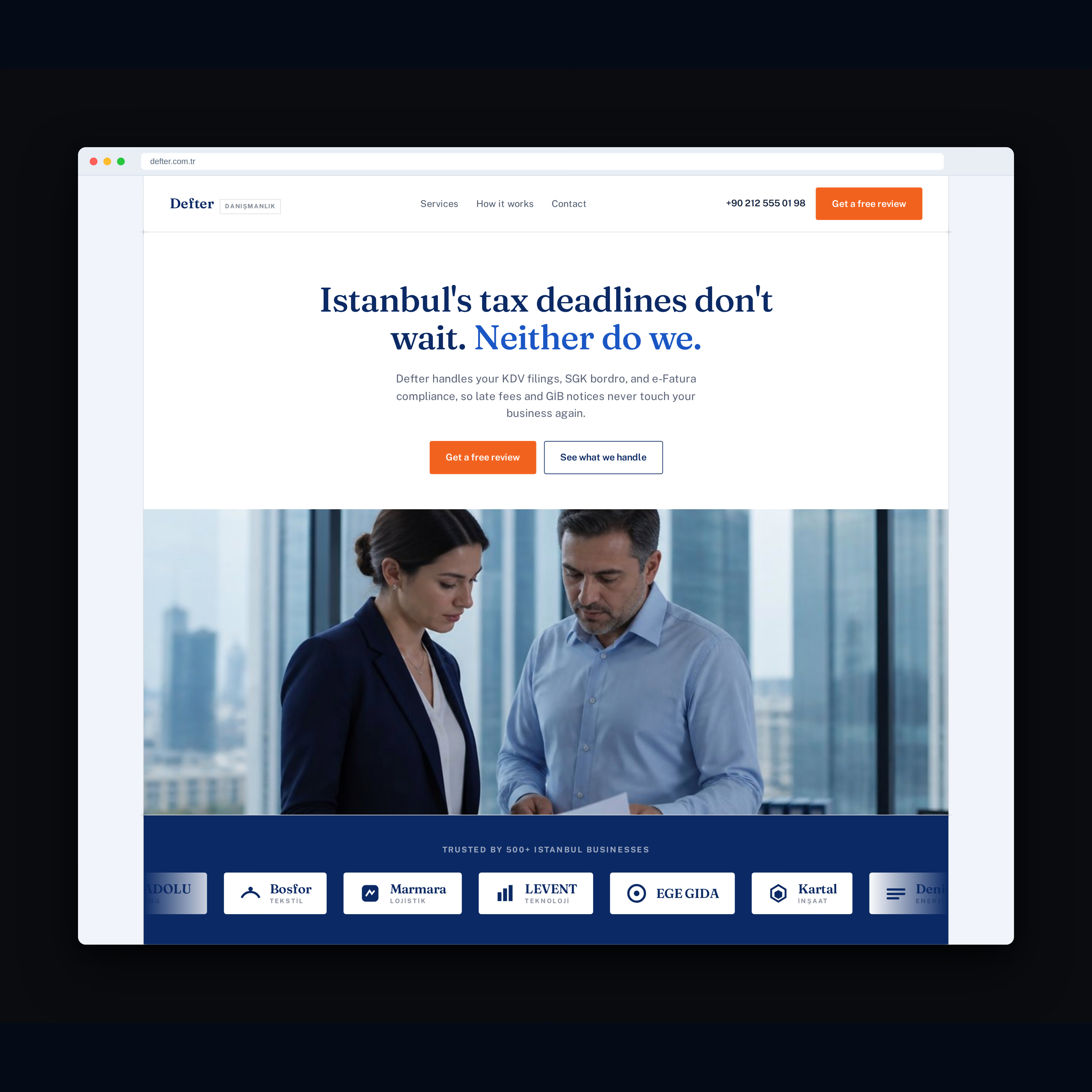
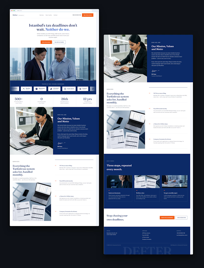
Recent work for Defter, an accounting firm in Istanbul.
The goal was simple: take a traditionally serious industry and create a website that feels modern, trustworthy, and premium.
Clean typography, strong visual hierarchy, and a bold navy + orange identity.
What do you think of the final design?

Looks good!