The network for creativity
Join 1.25M professional creatives like you
Connect with clients, get discovered, and run your business 100% commission-free
Creatives on Contra have earned over $150M and we are just getting started
Back to feedPost
The design is just the beginning. The source code is ready to build on.
MoneyCheck is a modern personal finance web experience designed and developed as a ready-to-customize digital product.
Buy the source code and get:
• Complete project files
• Responsive web interface
• Finance dashboard UI
• Reusable components
• Setup documentation
Use it as a starting point for your own fintech, personal finance, SaaS, or portfolio project.


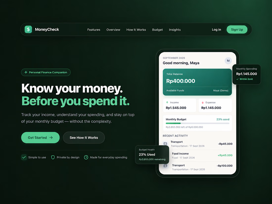

It is useful to see a finance interface offered as a working product rather than only a visual concept. Which parts of MoneyCheck did you make easiest for another team to customize?

Thank you! I intentionally designed MoneyCheck to be modular, so the easiest parts to customize are the dashboard widgets, transaction categories, budgeting components, and navigation structure.
I also kept the visual styles and components consistent, making it easier for another...
Modular widgets make the handoff much easier.

The reusable-component angle is especially strong here—MoneyCheck feels like a practical foundation, not just a polished screen. Nice balance of product clarity and visual restraint.
Thank you, Rohan! That was exactly the intention behind MoneyCheck — building a clear and reusable foundation rather than designing isolated screens. Really appreciate you noticing the balance between flexibility and visual restraint.
The network for creativity
Join 1.25M professional creatives like you
Connect with clients, get discovered, and run your business 100% commission-free
Creatives on Contra have earned over $150M and we are just getting started

Challenges
View all


Related posts

Designed a dashboard concept for tracking net worth across every asset type — stocks, crypto, property, pensions, funds, cash, and liabilities — all in one place.
Instead of the usual pie chart or bar graph, the centerpiece is a dial: a single, glanceable gauge showing where your wealth actually sits. Behind it, a quiet grid of every asset category fades in and out of visibility, reinforcing that everything's accounted for even when it's not the focus.
Dark UI, a single confident green accent, and a lot of negative space — built to make a genuinely overwhelming task (seeing your entire financial picture at once) feel calm instead of cluttered.


wow the animation feels super smooth, what is this animation for?

Working on the homepage for Still Blooming, a wedding and floral studio, I explored two different layout directions for the hero section. Same brand, same copy, just a different structure and visual rhythm.
Option 1 : Left Aligned. Text sits on the left with supporting content beside it, giving an editorial, asymmetrical feel.
Option 2 : Centered. Everything is stacked and centered, giving a clean, balanced, more classic hero layout.
Would love your honest UX/UI take which direction feels more elegant, functional, and true to a wedding/floral brand, and why?
22 voted
41%
32 voted
59%
54 votes
Closed

Great Design :)


Some designers are obsessed with removing friction. Usually, they’re wrong.
When it comes to high stakes fintech "invisible" is a bug, not a feature.
We designed the Tithe onboarding with a mandatory slide to confirm. One second of friction to ensure a lifetime of trust.
Don't just make it fast but rather feel right.
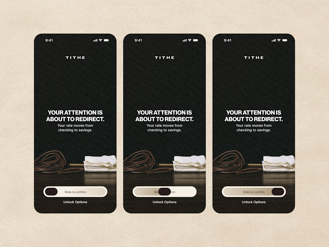

The slide-to-confirm is a nice touch. For financial decisions, that extra moment of intention makes sense.