The network for creativity
Join 1.25M professional creatives like you
Connect with clients, get discovered, and run your business 100% commission-free
Creatives on Contra have earned over $150M and we are just getting started
Back to feedPost

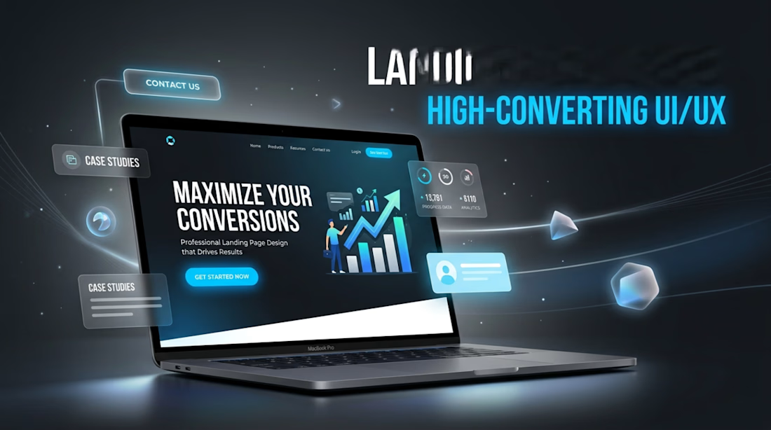
A great landing page doesn’t just look good it converts.
I design modern, high converting landing pages focused on clear structure, strong visual hierarchy, and strategic call to actions. Every section is built to guide users smoothly and turn visitors into customers.
From bold hero sections to clean content flow, my goal is to create landing pages that are not only visually appealing but also performance driven.
If you’re looking to upgrade your online presence or launch a product with impact, a well-designed landing page can make all the difference.
Let’s build something that actually drives results.
The network for creativity
Join 1.25M professional creatives like you
Connect with clients, get discovered, and run your business 100% commission-free
Creatives on Contra have earned over $150M and we are just getting started





Related posts

AI Sales Agent SaaS Landing Page
A modern AI Sales Agent & Sales Intelligence SaaS website designed for startups and growing businesses looking to automate sales workflows, streamline lead management, and boost revenue through intelligent automation and real-time insights. The design combines a premium SaaS aesthetic with a conversion-focused user experience, featuring clear product messaging, interactive sections, and a scalable interface built to support modern sales teams.


Amazing design

Same prompt. Two builders.
One site made with Lovable, one with Google AI Studio. A Flemish still-life snack brand, gilt frames, GSAP scroll, the works.
Which one is better?
33 voted
67%

16 voted
33%

49 votes
Closed


Professional work