The network for creativity
Join 1.25M professional creatives like you
Connect with clients, get discovered, and run your business 100% commission-free
Creatives on Contra have earned over $150M and we are just getting started
Back to feedPost
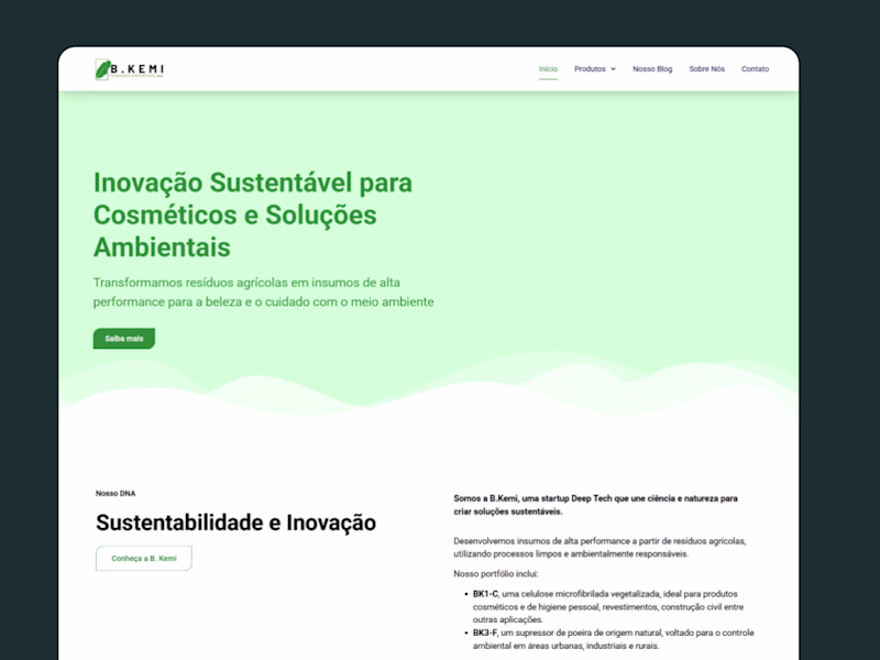
Taste Test
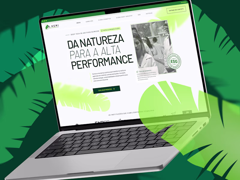
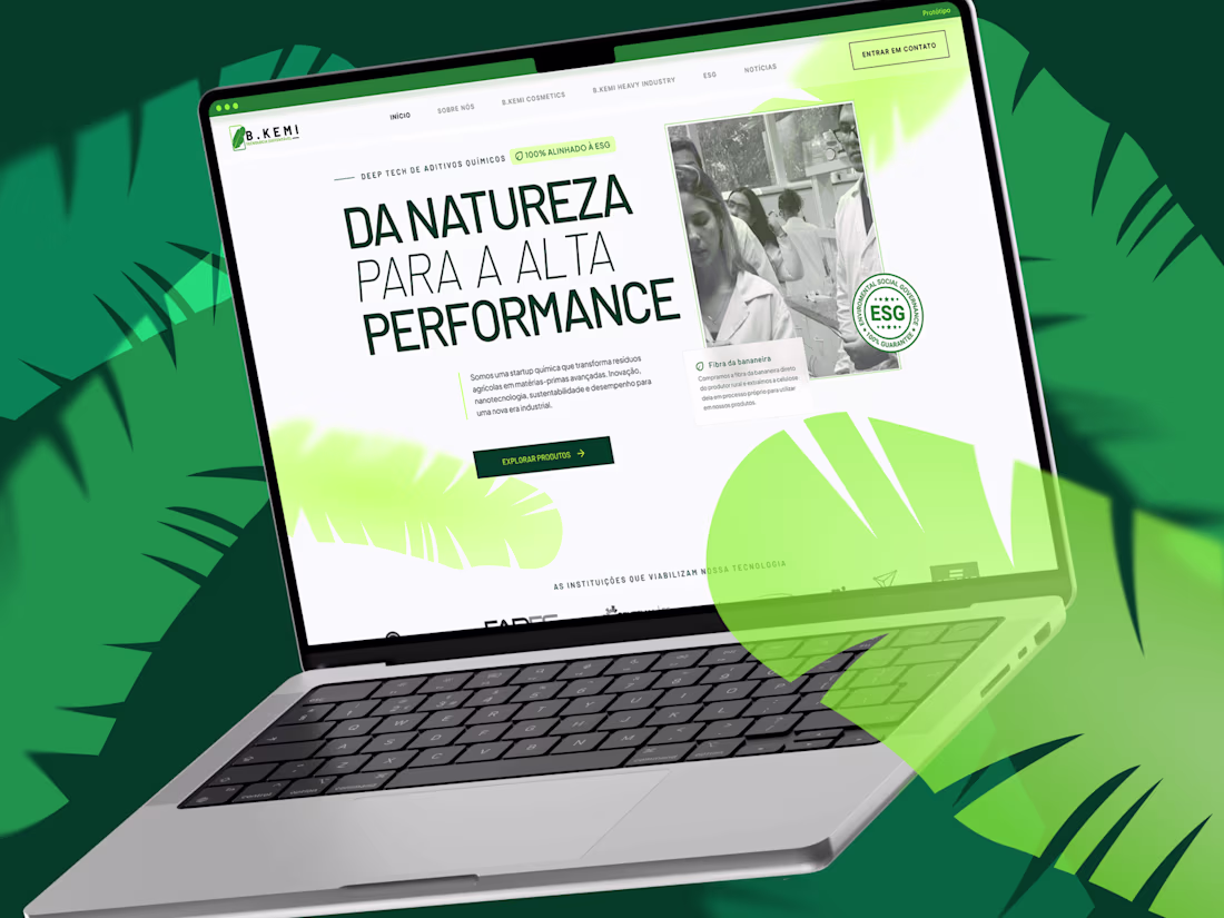
Honest check: when a potential client opens your website today, which side of the spectrum does it feel closer to? Ps: This redesign case is on my profile!
12 votes
Ends in 1d
safely on the right
The only right place to be haha. Appreciate the vote, Esther!
Voted safely on the right. The bold typographic direction reads immediately as a brand with a point of view, which is what clients are actually paying for. The before looks like a template, the after looks like a decision was made.
Spot on, @MD Rafee Alam! "The after looks like a decision was made" specifically made me emotional, thank you!! 🥹 That was the exact goal, moving them from just existing on the internet to actually taking a stand.
And, yes, from what I analyzed, the one on the left (the client's previous...
The one on the the desktop mockup is so nice
Appreciate it, @Girum Tamiru! It had a glow up comparing to the left one right? haha. There’s just something about thoughtful designs on a MacBook screen that hits different ⚡
And by the way, you can see the full redesign of this project right here ;) https://contra.com/p/c6eOWAFr-bkemi-or-website-uiux-redesign?r=michelle_pani
Closer to the right for me.
What stands out isn't just the visual upgrade, it's the shift in perception. The redesign communicates innovation, credibility, and brand confidence much faster. In many UX projects, those first few seconds often determine whether visitors continue exploring or leave.
Exactly this! And it's funny you used the word "shift", I actually designed this at the software house Shift, so that was quite literally our mandate! ;)
But jokes aside, you nailed it: the visual upgrade was just the vehicle to engineer trust in those critical first 3 seconds.
I love your use of color and composition here.
The network for creativity
Join 1.25M professional creatives like you
Connect with clients, get discovered, and run your business 100% commission-free
Creatives on Contra have earned over $150M and we are just getting started
Related posts
Which tool do you use to animate your designs ?
I made a litle change, which one better?
16 voted
47%
18 voted
53%
34 votes
Closed
3d Sounds cool, but this normal scroll looks premium and decent to me. good work on both 🙌
For the #ConfigMakeathon, I created Book Trace. It is a reading journal app that helps you capture thoughts while you read, and leave a personal trace when you finish.
[Concept]
Book Trace turns the experience of reading into something you can hold onto. Instead of forgetting what a book meant to you, you leave a Trace — one sentence, one emotion, one word. The app also reads what you wrote and tells you what kind of reader you are, with book recommendations matched to your type and genre.
[Project Overview]
For this submission, I designed:
- Onboarding flow;
- Still Reading experience with in-the-moment note capture;
- Finished flow with the full Trace journey;
- Reader Identity system with personalized recommendations;
- Library with saved traces;
- UI Kit and design system.
[Workflow]
I built the full product from concept to prototype in Figma. UI Kit, component library, and interactive flows all in one file.
[My Experience]
What I loved most about this challenge was how it pushed me to think about the full user journey, not just screens, but emotions. Book Trace started as a simple idea and grew into something that feels genuinely personal.
Figma made it possible to move from rough concept to polished prototype without ever leaving the workspace.
Thank you to the Figma team for a challenge that made me build something I actually want to use!
Live project
LinkedIn post
Community link
If this resonates with you, a like, comment goes a long way. Thank you 🙌
Amazing!
Trending
Claude
Claude has entered the design space. How are you using Claude Design?
Contra University
Learn from expert creatives how to earn more using next-gen AI tools.
MagicPath
The canvas is infinite, and exploration is becoming the workflow. How are you using MagicPath?
creativeaiflow
Creative AI workflows are evolving. What tools do you use, and what are their strengths and weaknesses?
freelancerlife
Freelancer life is wins, pivots, and everything in between. What’s yours right now?