The network for creativity
Join 1.25M professional creatives like you
Connect with clients, get discovered, and run your business 100% commission-free
Creatives on Contra have earned over $150M and we are just getting started
Back to feedPost
A helmet hanger shaped like a flaming skull needed a brand that's just as loud. 💀🔥
Skelmet makes a 3D-printed wall mount for motorcycle helmets. The helmet sits on the skull, the gloves and keys hang below, and your riding gear finally gets a proper spot on the wall instead of a chair.
This is what I designed for them:
• The mark. Skeleton plus helmet. I explored four routes, and the one that made it puts the skull right inside the wordmark, where one word turns into the other.
• The colour palette. High-vis orange on near-black, basically the colours of riding kit and warning signs, matched to the orange mount so the logo, the box and the product read as one thing.
• The packaging. Every panel does a job, and there's a wall-mounting template inside, so nobody needs a tape measure.
• The product imagery, art-directed with AI from photos of the real mount.
"Built to hold. Made to stand out." That's the line on the front of the box, and honestly, it was the brief too.
If you've got a product that deserves a brand people actually want on display, I'd love to hear about it!


Indeed! That was the overall thought behind designing it the way it is. Thanks a lot!
The network for creativity
Join 1.25M professional creatives like you
Connect with clients, get discovered, and run your business 100% commission-free
Creatives on Contra have earned over $150M and we are just getting started



Related posts

What if one of the most meaningful messages you ever receive… is written by a version of you that no longer exists?
That question became Dear Future my submission for the #Base44Challenge.
We save photos.
We save messages.
We save memories.
But we rarely preserve who we were in that exact moment what we were thinking, hoping for, afraid of, or becoming.
So I designed a digital time capsule where your words don’t just get stored.
They wait for you.
With Dear Future, you can:
✦ Write a letter to your future self or someone else
✦ Add memories and images
✦ Choose the exact future date it should return
✦ Personalize your capsule with colours and seals
✦ Seal it so it can’t be read or edited before its opening date
✦ Watch the countdown inside your personal archive
✦ Return later and experience the letter as something preserved not just another notification
But the biggest design challenge wasn’t creating a way to send a letter later.
It was designing the wait.
As a Senior Product & UI/UX Designer, I wanted every interaction to support that idea.
The archive.
The physical capsule metaphor.
The vintage television.
The sealing ritual.
The countdown.
The responsive mobile experience.
None of them are there just for decoration. Together, they turn anticipation into part of the product.
I designed the UX, visual system, interaction language, responsive experience, storytelling, and complete product flow then built and shipped the working experience with @Base44.
This project reminded me why I love product design:
A good interface helps someone complete a task.
A meaningful experience makes them feel something while doing it.
Dear Future Words outlive the moment.
Experience the project ↓
Dear future capsule
Would you write something for yourself five years from now?


Upgoating this.....This is such impressive work!

Sketch, refinement and the final mark for an athletic jewellery brand.
Complete Case Study : https://www.behance.net/gallery/247008505/Logo-and-Brand-Identity-design-for-ERND
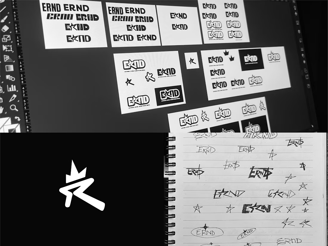


ERND sketched in marker next to the cleaned up mark is my favourite part. you can see the star idea survive the whole process