The network for creativity
Join 1.25M professional creatives like you
Connect with clients, get discovered, and run your business 100% commission-free
Creatives on Contra have earned over $150M and we are just getting started
Back to feedPost
Taste Test

Guess the client's choice! 🎯
A recent case study for a branding and printing company that offers full-cycle branding services (they print merchandise, packaging, and promotional items on just about anything).
Both had strong arguments, but only one won the final vote.
Which one do you think the client chose?

2 voted
40%
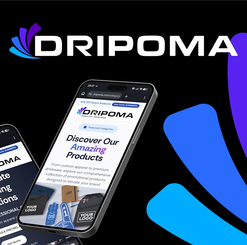
3 voted
60%
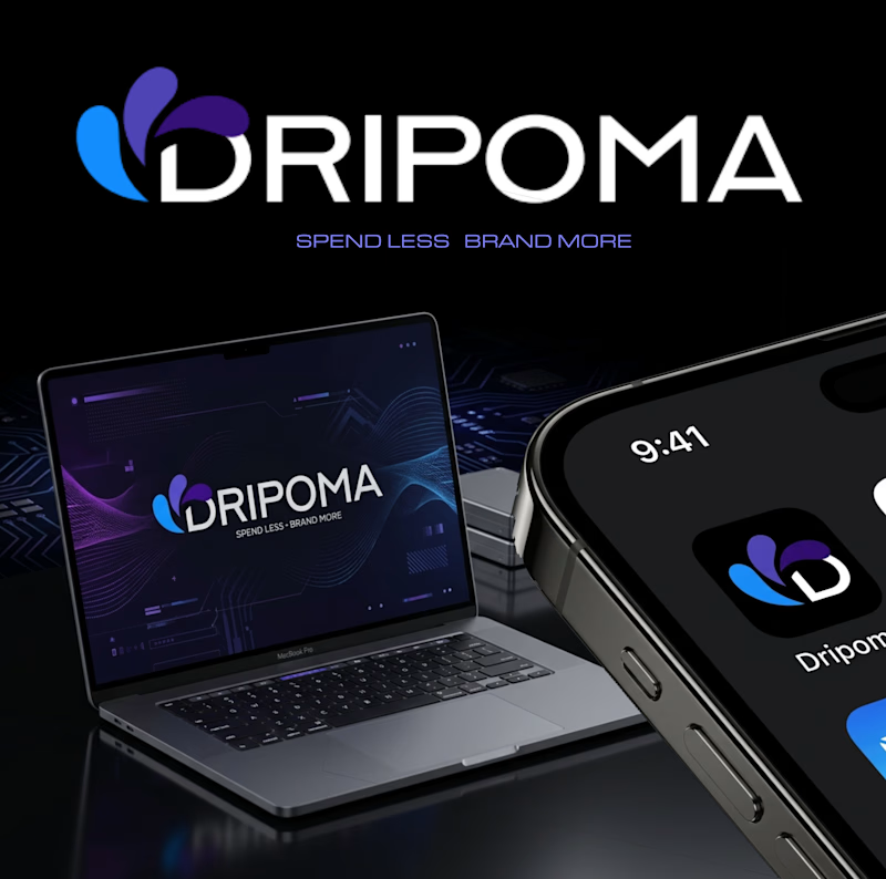
5 votes
Closed


For a company printing merch, packaging, and promo across that many surfaces, I'd guess the client leaned toward whichever version holds contrast best from foil stamping down to a phone screen. Which concept actually won, and was durability across print methods part of the pitch?

Great Work!
The network for creativity
Join 1.25M professional creatives like you
Connect with clients, get discovered, and run your business 100% commission-free
Creatives on Contra have earned over $150M and we are just getting started





Related posts

Two logo concepts for Formosa1 Exotic Car Rentals. Which one wins?
A: bold geometric F1 monogram, car tucked inside the mark. Strong and iconic.
B: car silhouette leads, red wordmark with a speed streak. Fast and clean.
Drop your vote 👇
17 voted
53%
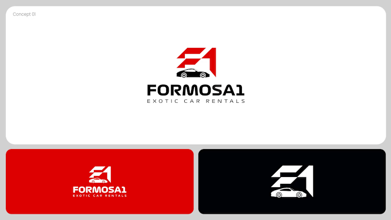
15 voted
47%
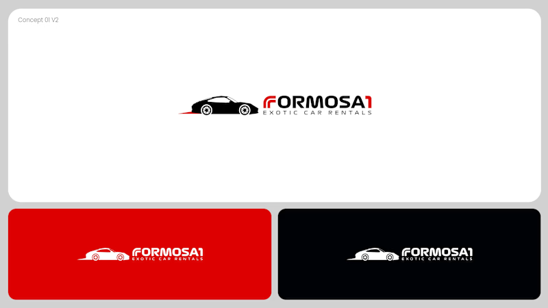
32 votes
Closed

Both are great but I feel that was something special in the bottom one that's why I choose it❤️❤️

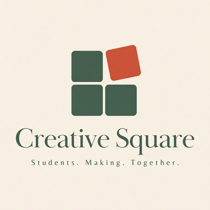
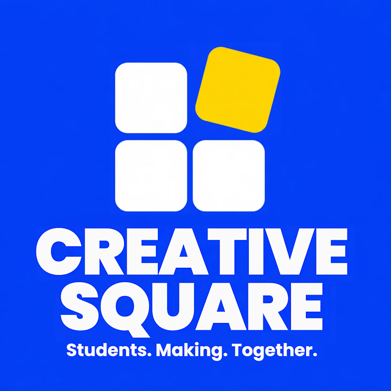
Meet Creative Square, a logo for university students. Same mark, two personalities: loud and energetic, or calm and editorial. Which one would you pick?
13 voted
48%
14 voted
52%
27 votes
Closed
The bold are so attractive that's incredible I choose it ❤️❤️

NICE HUMANS
Making automation feel human.
Context
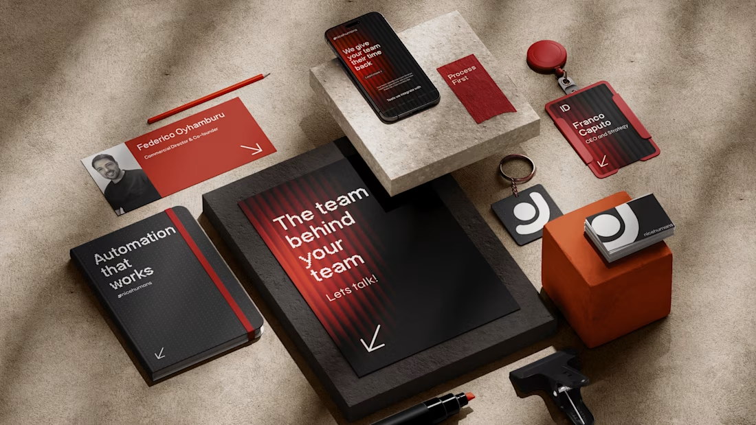
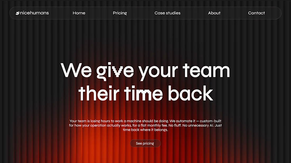
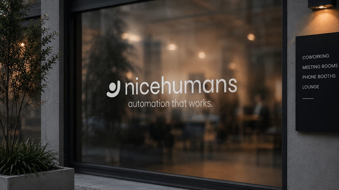
Nice Humans is a growing automation studio that helps teams streamline how they work. As they scaled, their brand no longer reflected the expertise or the people behind it.
The challenge
The automation market speaks in efficiency, systems and scale, and it often sounds interchangeable. Nice Humans needed to claim leadership in that space while standing for something competitors overlook: automation is ultimately about people.
The approach
Rather than starting with a logo, we started with a positioning: a team that builds for other teams. From there we developed a complete brand strategy, including archetype, tone of voice, verbal identity and a visual language. Each one was designed to balance technical authority with human warmth.
The outcome
A cohesive brand system that sets Nice Humans apart in a crowded category and gives them a clear, consistent voice to grow with.

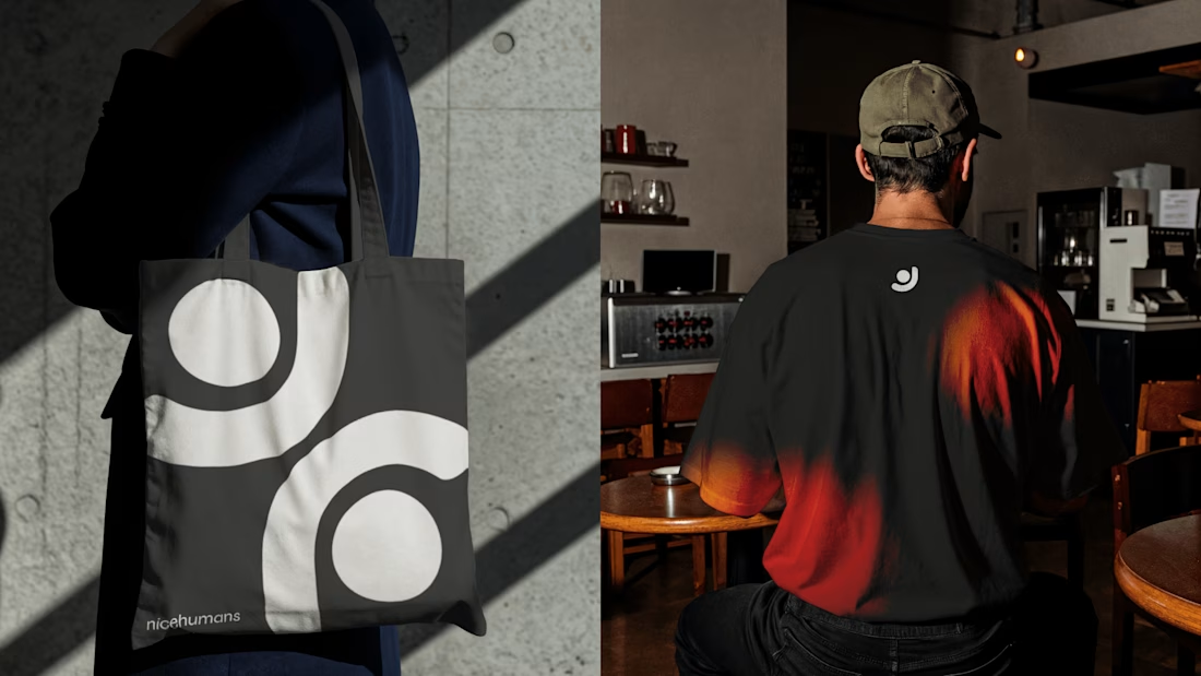

Great strategy and sleek execution! The visual hierarchy across web and print is spot on. 👏