The network for creativity
Join 1.25M professional creatives like you
Connect with clients, get discovered, and run your business 100% commission-free
Creatives on Contra have earned over $150M and we are just getting started
Back to feedPost

Web design and Webflow development for ProVita, a fertility hospital and building a connected digital experience for patients.


"Built around you" in big navy type feels calm and personal for a fertility hospital, and the single blue Book Appointment button stands out without shouting. The top banner for international patients is a smart touch. Does the case study show how patients get from there to booking?
Thanks, glad the banner landed. Booking is covered further down the case study, in the “Booking an appointment” section. It’s a two step form with its own calendar on Ghana time, past slots switch off, and missing fields get a plain message right where the problem is.
The...

provita-hospital.webflow.io
Fertility Clinic in Tema, Ghana | ProVita
ProVita offers specialist fertility care, IVF, IUI, ICSI, gynaecology and reproductive surgery in Tema, Ghana. Meet our team and book a consultation.
The network for creativity
Join 1.25M professional creatives like you
Connect with clients, get discovered, and run your business 100% commission-free
Creatives on Contra have earned over $150M and we are just getting started
Related posts

Serious numbers, calm design.
512Financial is an Austin-based firm that steps in as the finance, HR and hiring team growth-stage companies don’t have yet. Their world is board meetings, due diligence and funding rounds, which can feel heavy and intimidating for founders.
My goal with the website was to make it feel the opposite: clear, steady and human. Deep green tones, lots of breathing room, and a “Readiness by Stage” section that lets every founder find their next step in seconds, from Seed to Series B and beyond.
Live now: 512financial.com


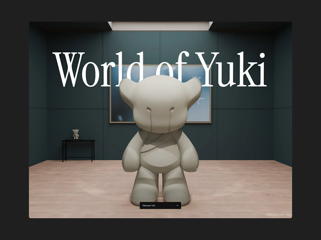
Our latest project for Nági by Isaac is live now! 🚀
A full 3D blender built website together with Higgsfield Scroll Environments is live now on Framer! We've put a crazy amount of work into this project, feel free to check it out here <3


Nice model


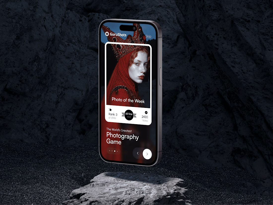
A new day, a new design to share! 📸
This time it is a photography challenge app that brings creativity and competition together through contests, voting, and gamification. What do you think of this one? ✨