The network for creativity
Join 1.25M professional creatives like you
Connect with clients, get discovered, and run your business 100% commission-free
Creatives on Contra have earned over $150M and we are just getting started
Back to feedPost
Taste Test

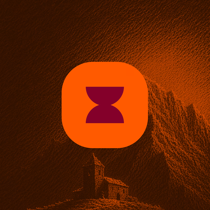
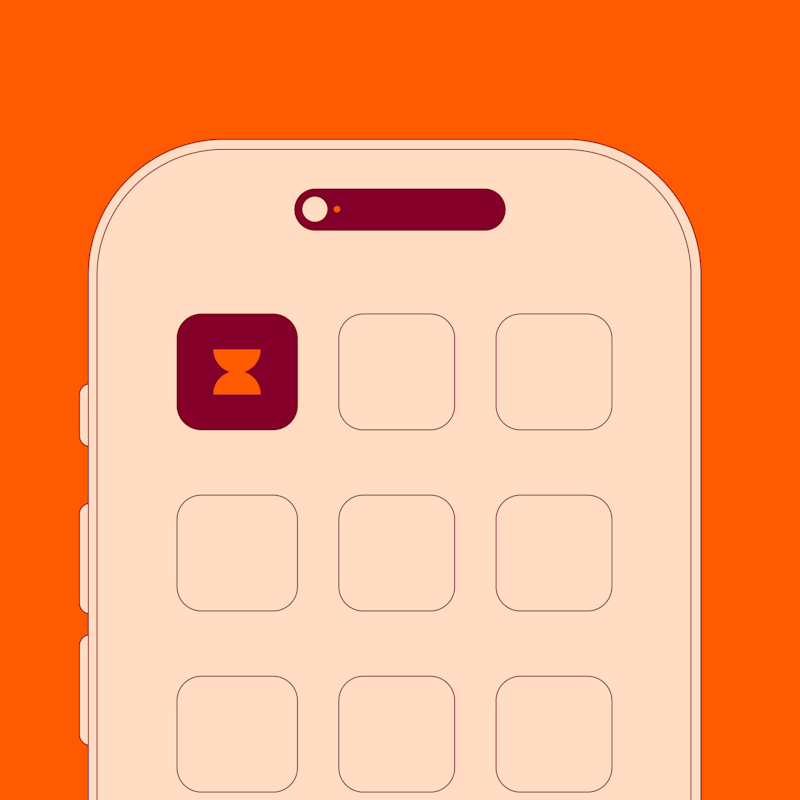
Same app icon, two ways to show it.
The landscape one looks better. The phone one is more honest about how it'll actually look.
Which would you go with?

3 voted
100%
0 voted
0%
3 votes
Closed

nice work
The network for creativity
Join 1.25M professional creatives like you
Connect with clients, get discovered, and run your business 100% commission-free
Creatives on Contra have earned over $150M and we are just getting started




Related posts


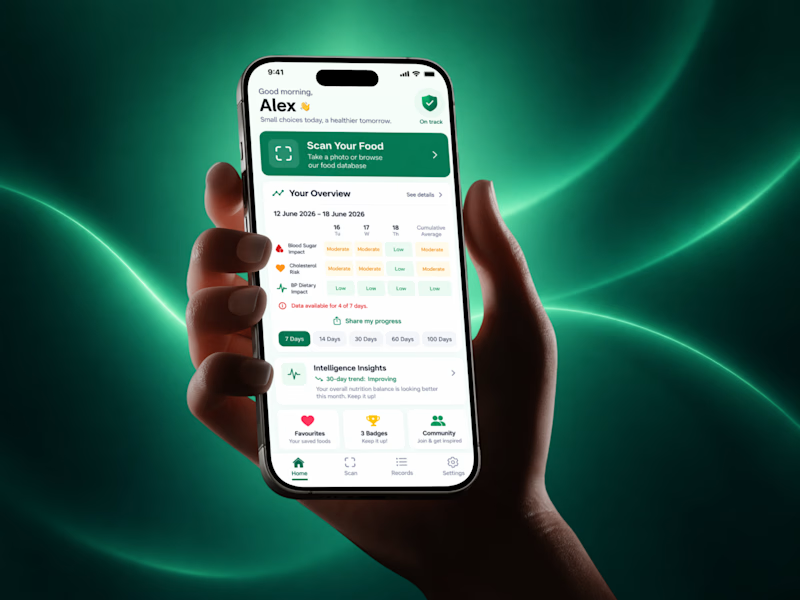
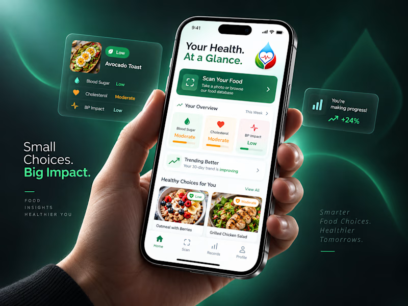
Trying out two cover designs for a project.
Which one looks better to you? Would love to hear your thoughts! 👀
5 voted
20%
20 voted
80%
25 votes
Closed

New Direction, no question. Your Health At a Glance plus those cleaner cards actually invite you in, the original feels more like a dashboard you have to decode. Small choices, big impact, very fitting given the copy.

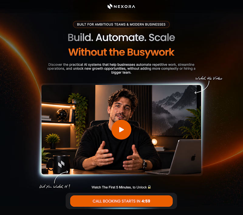
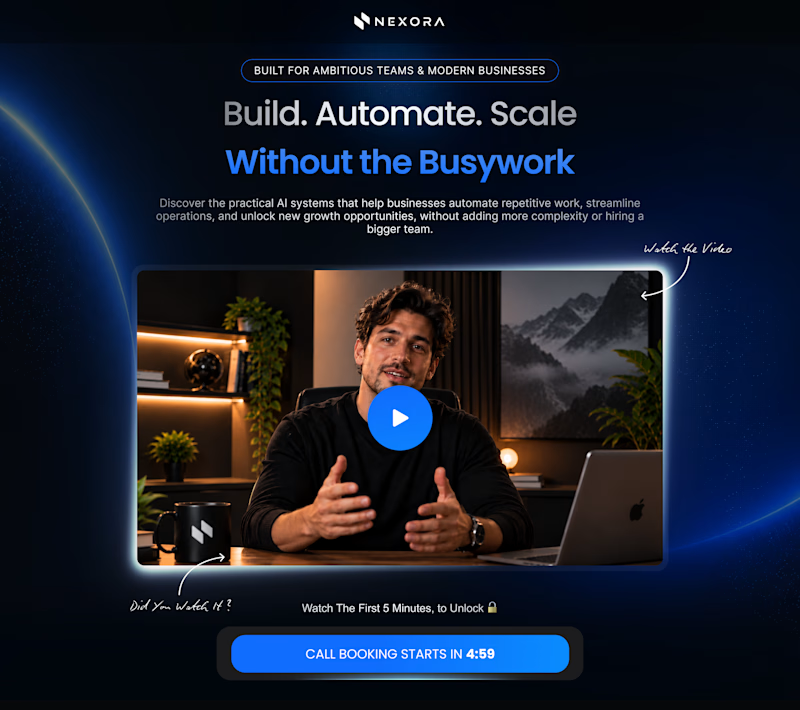
Orange vs. Blue
Two color directions. One hero section. Which one would you pick?
6 voted
32%
13 voted
68%
19 votes
Closed

I dont think every SaaS should have a blue tone, orange looks very more attractive while the message also stays clear. 🙌

Two amazing components result for you :)
A -- Testimonials section by using Vision Engine
B -- Team section bye using Pixel Decode
Which component effect do you like ?
👇🏻 A or B ?
6 voted
40%
9 voted
60%
15 votes
Closed