The network for creativity
Join 1.25M professional creatives like you
Connect with clients, get discovered, and run your business 100% commission-free
Creatives on Contra have earned over $150M and we are just getting started
Back to feedPost
Taste Test


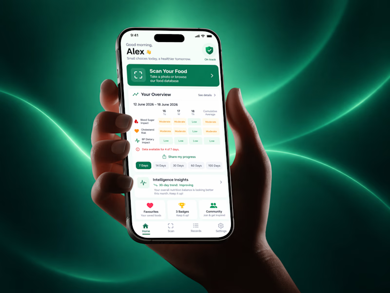
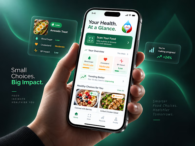
Trying out two cover designs for a project.
Which one looks better to you? Would love to hear your thoughts! 👀
5 votes
Ends in 1d


New Direction reads cleaner to me. The lock-screen cards make the health story obvious before the app even opens, and the green still feels calm.

original

Going with New Direction, the dark background makes the phone mockup pop way more than the flat green does. Is this going out for client approval or are you testing it with real users too?
This was just for the cover photo I'm going to put on my profile. I just couldn't decide which one looks better in the project shot.

New Direction, no question. Your Health At a Glance plus those cleaner cards actually invite you in, the original feels more like a dashboard you have to decode. Small choices, big impact, very fitting given the copy.

New Direction for me. The data-forward layout feels more purposeful for a health app and the tagline placement works well. The Original has clean energy too but the New Direction gives you more to engage with at first glance.
The network for creativity
Join 1.25M professional creatives like you
Connect with clients, get discovered, and run your business 100% commission-free
Creatives on Contra have earned over $150M and we are just getting started

Challenges
View all


Related posts

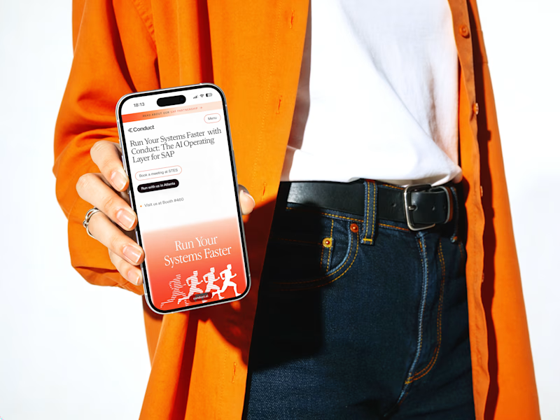
Which cover gets your vote? 👀
I’m finally sharing this case study and I’m stuck between these two.
1 or 2? Which one would you click first? 👇

14 voted
34%
27 voted
66%
41 votes
Closed


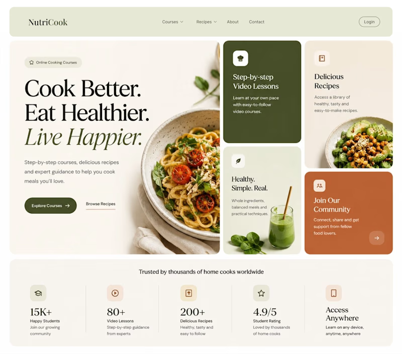
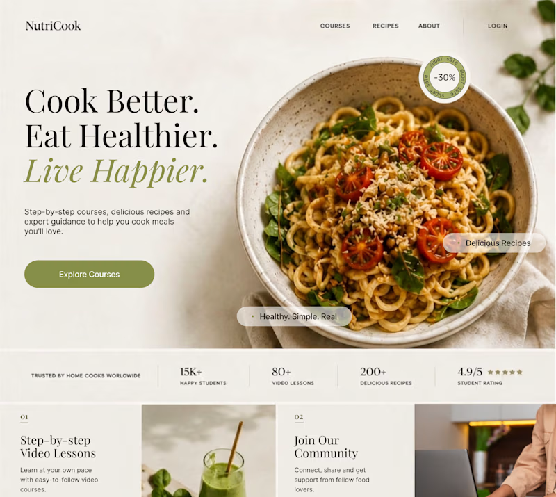
Same content. Two completely different vibes.
What happens when you keep the course content the same, but change the structure, typography, and color palette?
Two hero sections. One course. Two different visual experiences.
Which one would you choose? 1 or 2?
29 voted
41%
42 voted
59%
71 votes
Closed

Option 1 works well , the heirarchy and card layout on the hero is very smart
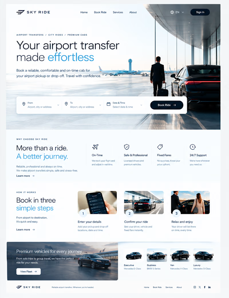
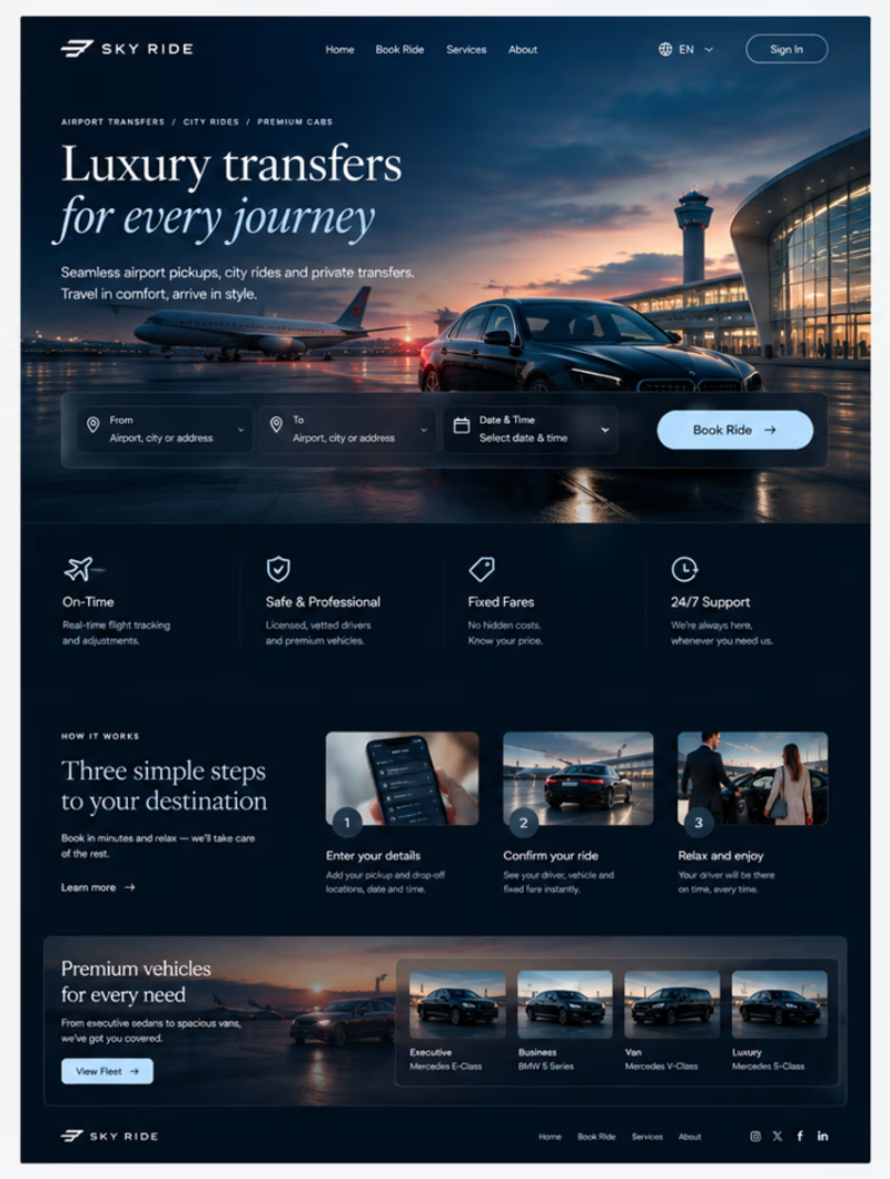
Which design theme would you prefer to select?

4 voted
50%
4 voted
50%
8 votes
Closed


Awesome design !