The network for creativity
Join 1.25M professional creatives like you
Connect with clients, get discovered, and run your business 100% commission-free
Creatives on Contra have earned over $150M and we are just getting started
Back to feedPost

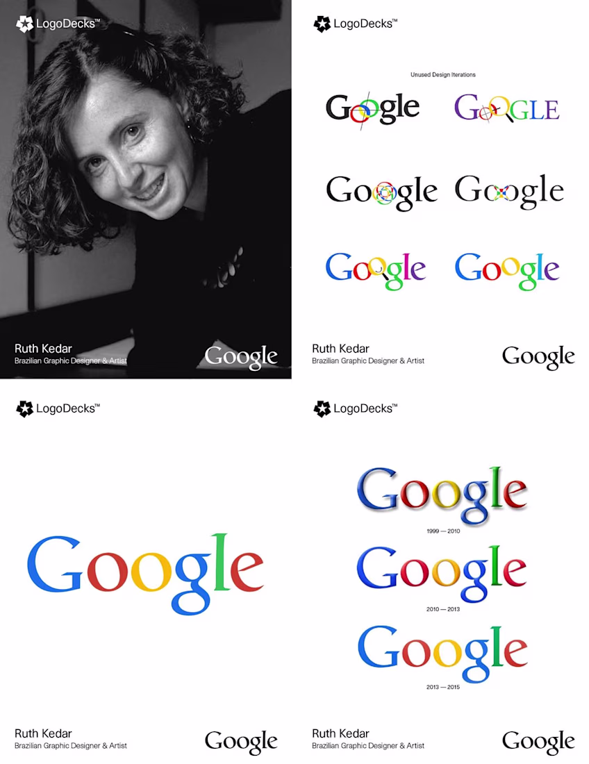
🚀 DAY 15 - POSTING LEGENDARY DESIGNS HISTORY - FOLLOW FOR MORE 🚀
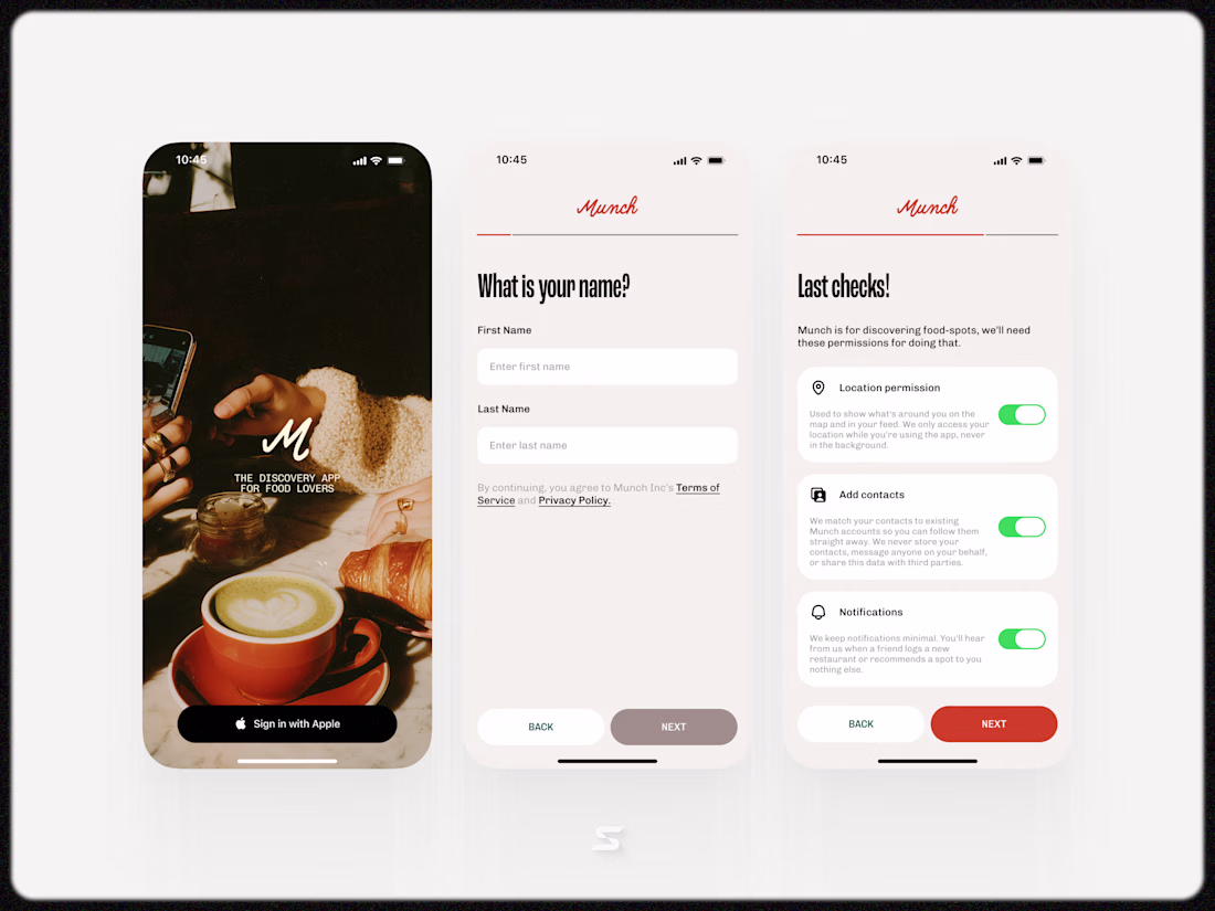
Ruth Kedar, a Brazilian-born designer and Stanford professor, was commissioned in 1999 to create a more professional visual identity for the fledgling search engine, Google. Moving away from the hobbyist look of previous versions, Kedar developed several iterations that explored concepts of connectivity and search precision, often incorporating magnifying glasses or interlocking "o"s. The final design she settled on used the elegant Catull typeface, featuring a distinct, tilted "e." Her choice of primary colors, interrupted by a secondary green on the letter "l" was intended to signify that Google followed its own rules and wasn't afraid to be playful. This iconic logo defined the company’s global brand for sixteen years, remaining largely unchanged until its major redesign in 2015.
The network for creativity
Join 1.25M professional creatives like you
Connect with clients, get discovered, and run your business 100% commission-free
Creatives on Contra have earned over $150M and we are just getting started
Related posts

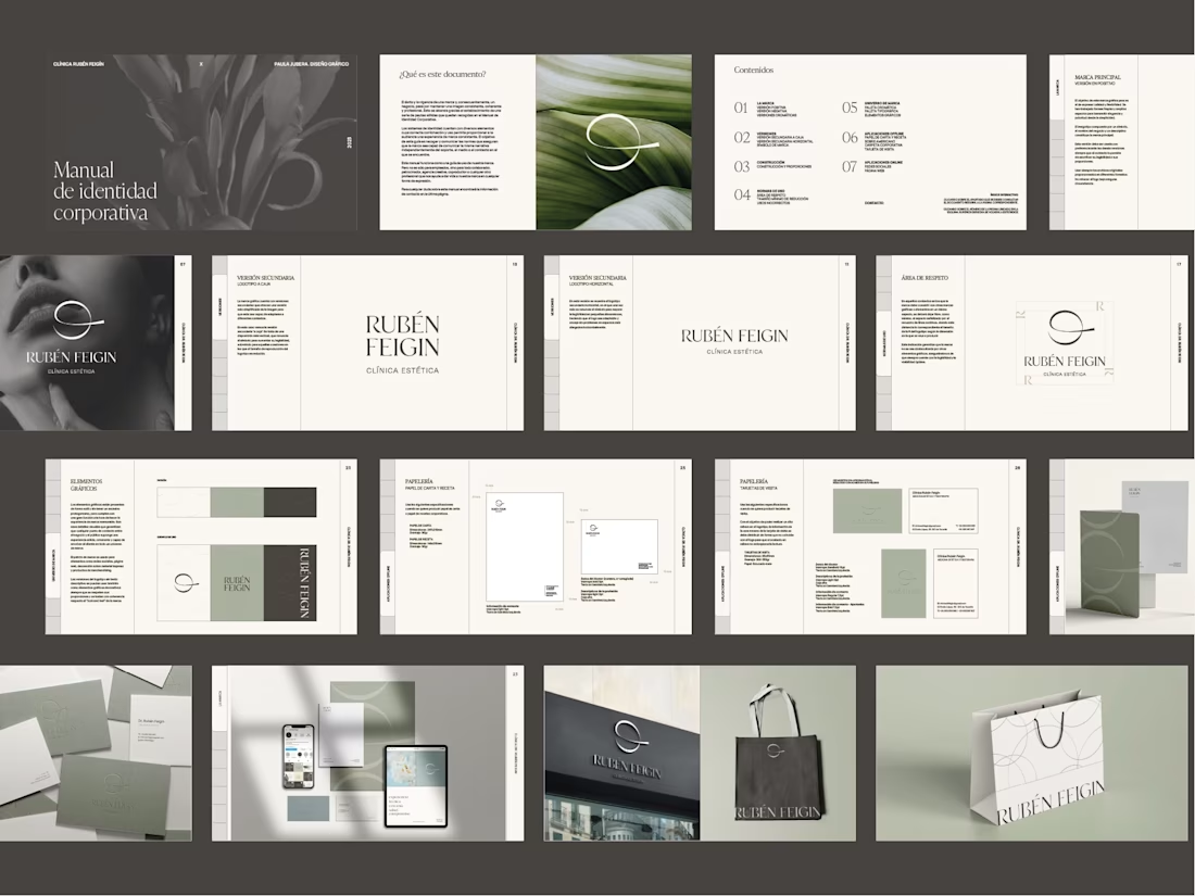
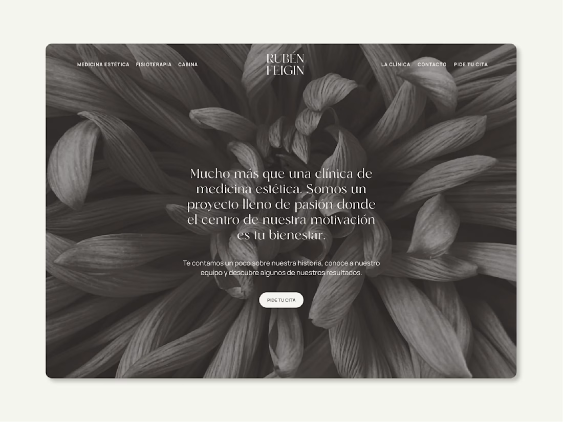
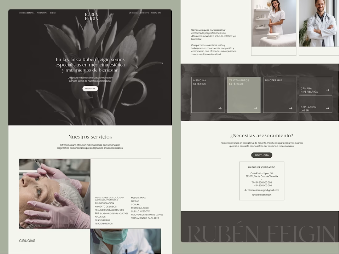
A web and brand identity project for an aesthetic clinic I worked on a while ago — still one of the projects I enjoyed the most.
Built around a bloom-inspired concept.


Awesome!


Thats Really Nice

Peep, logo design — designed by Chick Studio
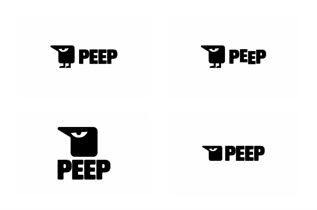


The chunky bird mascot with the bold wordmark is so memorable — Peep has a real personality


Trending


Notion
Notion isn’t just where you work, it’s starting to work for you. What agents are you building?
portfolioreview
The best portfolios tell a story, not just show a grid. Share yours for feedback.
brandguidelines
Brand guidelines are becoming living systems, not static documents. What are you building for your clients?
aivideo
AI video tools are moving at warp speed. Which ones are you experimenting with?
freelancerlife
Freelancer life is wins, pivots, and everything in between. What’s yours right now?