The network for creativity
Join 1.25M professional creatives like you
Connect with clients, get discovered, and run your business 100% commission-free
Creatives on Contra have earned over $150M and we are just getting started
Back to feedPost
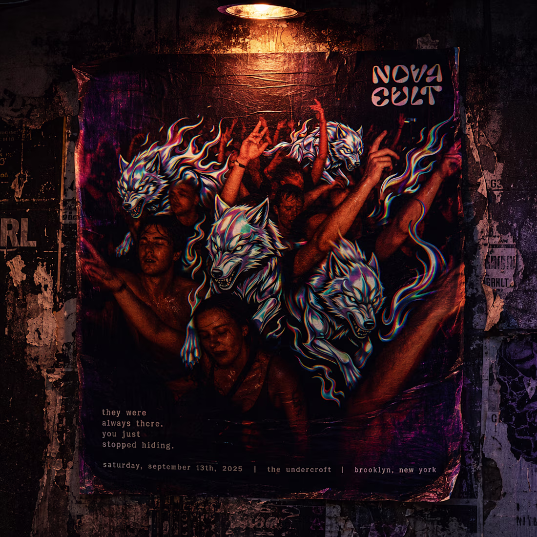
I built a rave brand where the typeface is softer than the imagery.
That contrast is the whole system.
Pilowlava — rounded, almost gentle — set in chrome-white uppercase against documented bodies mid-dissolution and illustrated creatures emerging from real skin.
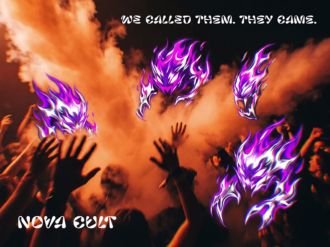
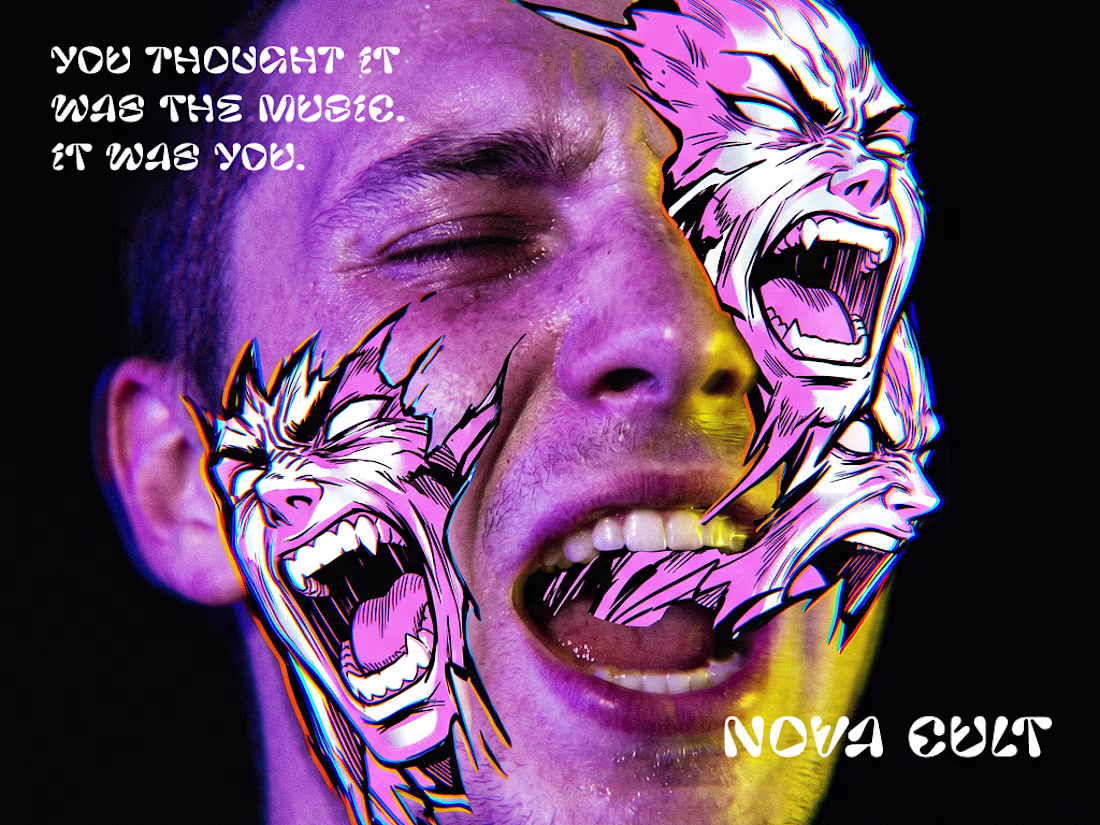
The rule: nothing is fully one thing.
Photography already halfway to illustration.
Illustration already claiming physical space.
Where they meet — chromatic aberration.
Electric blue and plasma pink bleeding at every edge.
The copy follows the same logic.
It doesn't describe the night.
It speaks from inside it.
"you thought it was the music. it was you."
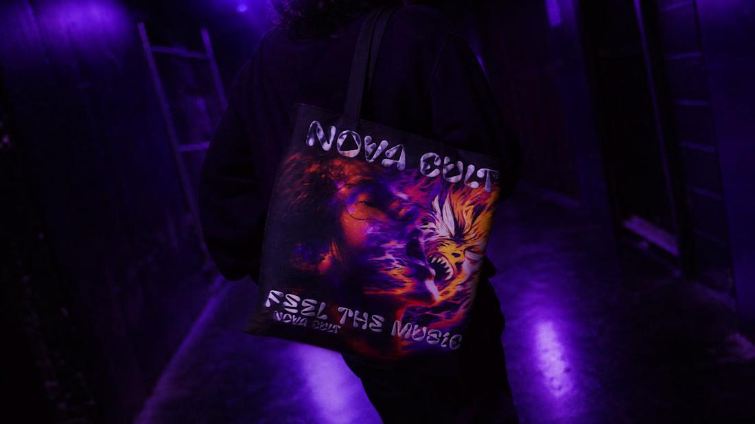
NOVA CULT — since the first night.
—
TYPEFACE: PILOWLAVA | COLLISION: PHOTO × ILLUSTRATION | CHROMATIC ABERRATION: #7B00FF × #FF2D78 | GROUND: #080808
The network for creativity
Join 1.25M professional creatives like you
Connect with clients, get discovered, and run your business 100% commission-free
Creatives on Contra have earned over $150M and we are just getting started
Related posts
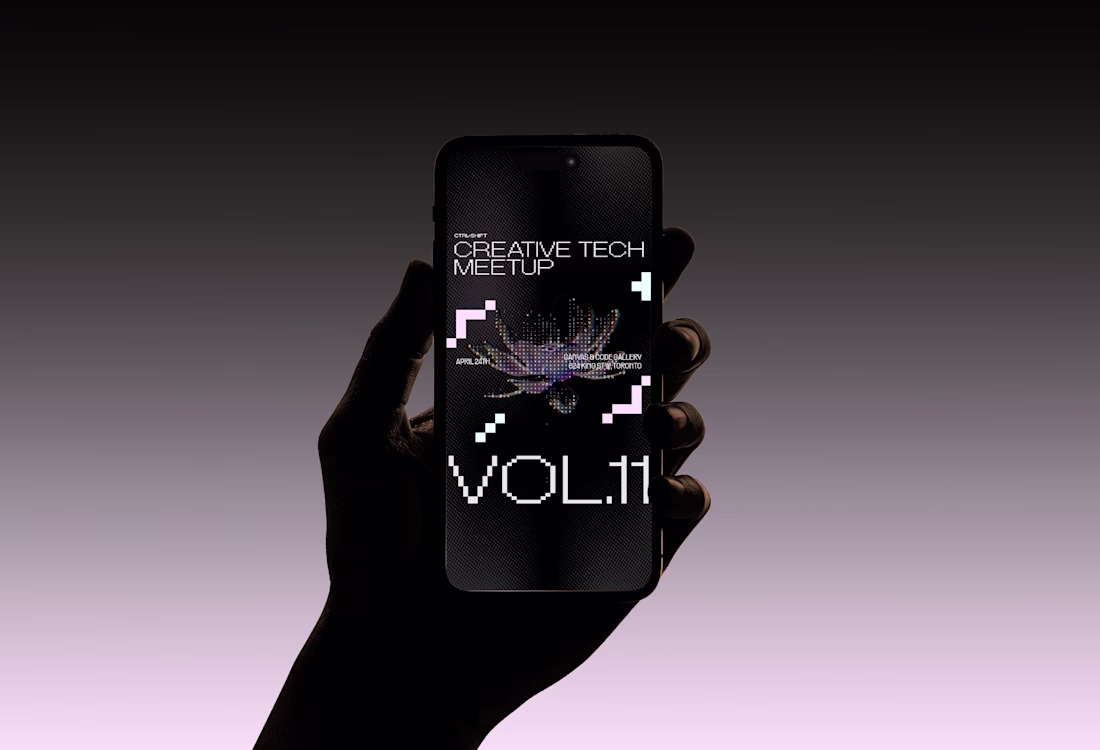
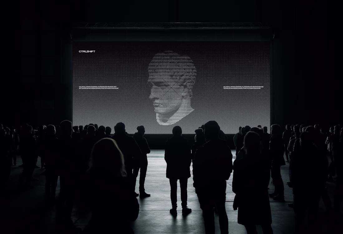
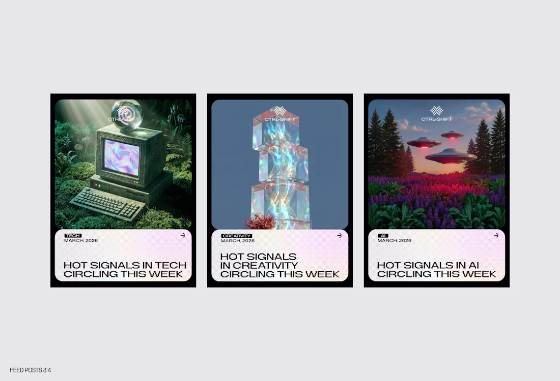
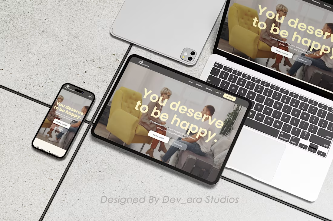
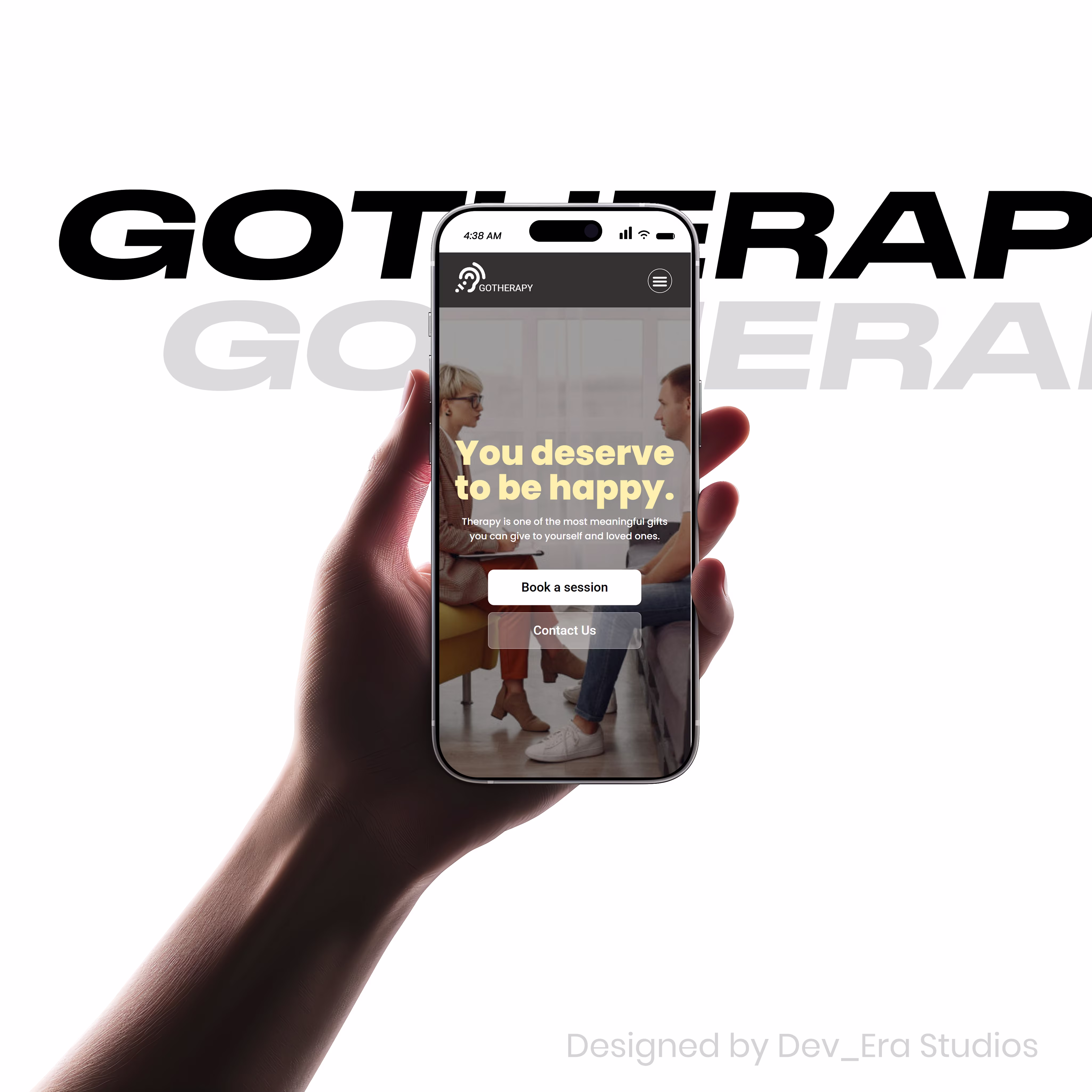
Just launched a recent brand identity project that I successfully completed for CTRL+SHIFT.
Ctrl+Shift is a brand identity project crafted for a forward-thinking platform operating at the intersection of creative technology, culture, and media. Through events, talks, content, and community, the brand brings together artists, builders, and technologists to explore creative intelligence, generative storytelling, and coding as cultural expression.
Editorial and confident, the identity is unapologetically creative-first—slightly irreverent, opinionated, and culture-forward. Designed to feel like a living platform rather than a campaign, the visual language leverages glyph dithering, color halftones, 3D ASCII graphics, and surreal soft sci-fi imagery. Anchored by a pitch-black foundation with vibrant color tints as accents, the system creates a bold yet sophisticated presence for a community built around curiosity, craft, and future-facing creativity.
You can see full project presentation here.
Feel free to like, comment and follow, kindly appreciated.
This identity for CTRL+SHIFT is a masterclass in high-end positioning. Using 3D ASCII and glyph dithering creates that "editorial and confident" feel that moves far beyond basic decoration.
It’s a perfect example of using strategic clarity to build a living platform rather than...
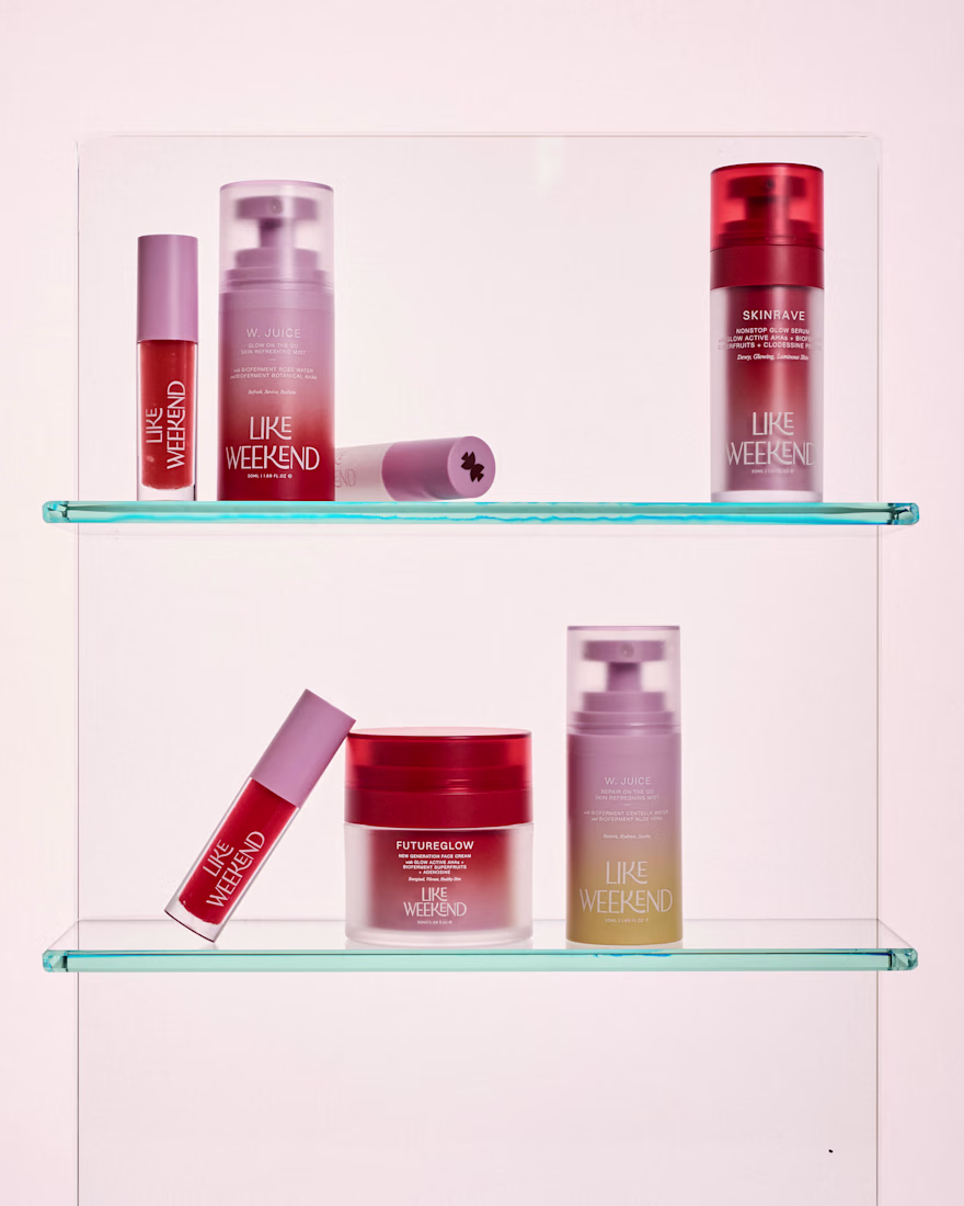
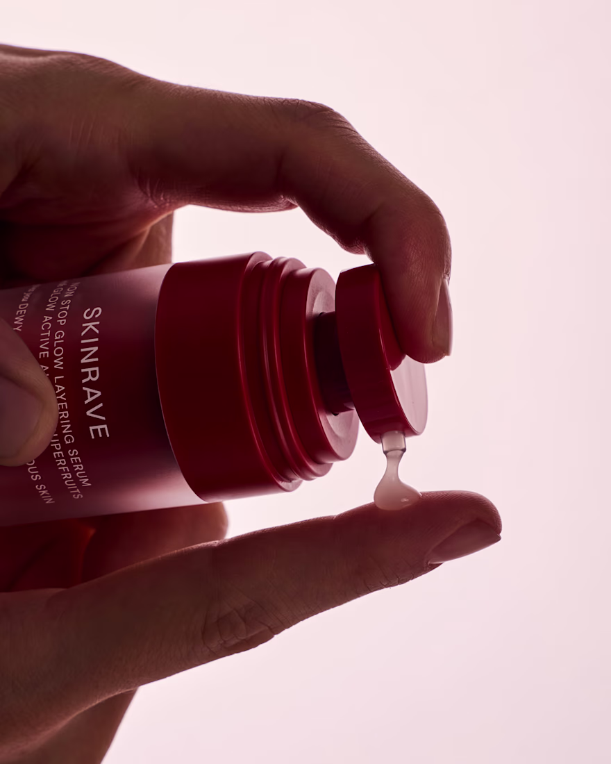
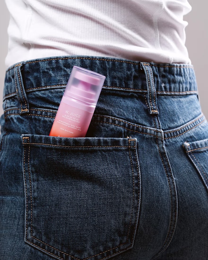
We partnered with the LIKE WEEKEND team to build a brand that captures the feeling of the Mediterranean, warm, effortless, and quietly optimistic, without relying on the usual visual clichés.
The challenge was translating an atmosphere into a system. Sunlight, salt air, ease, all expressed through a refined, contemporary lens that could sit credibly within skincare while still feeling distinctive and alive.
We developed a full brand universe rooted in skinimalism: fewer steps, smarter formulations, and a more intuitive relationship with skincare. This thinking guided everything from the visual identity to the packaging system.
Color became a key asset, not decorative, but structural. A considered palette was used to bring energy and differentiation across the range, while maintaining clarity and cohesion. The overall tone balances playfulness with restraint, creating a brand that feels fresh yet grounded.
The result is an identity that moves seamlessly between science and sensoriality, modern, lightweight, and designed to fit naturally into everyday rituals. A brand that feels as good as it performs.
Amazing work! The design is very subtle and the gradients give the product a lot of personality. I would love to buy this product!!
Creating these professional visual assets is part of the comprehensive package we provide to ensure our clients brands always look their best. Ready to elevate your online presence?
Let’s connect

Trending
Claude
Claude has entered the design space. How are you using Claude Design?
Contra University
Learn from expert creatives how to earn more using next-gen AI tools.
creativeaiflow
Creative AI workflows are evolving. What tools do you use, and what are their strengths and weaknesses?
portfolioreview
The best portfolios tell a story, not just show a grid. Share yours for feedback.
freelancerlife
Freelancer life is wins, pivots, and everything in between. What’s yours right now?