The network for creativity
Join 1.25M professional creatives like you
Connect with clients, get discovered, and run your business 100% commission-free
Creatives on Contra have earned over $150M and we are just getting started
Back to feedPost

A marketplace homepage has two jobs at once: sell to buyers and recruit sellers. Most only do one well.
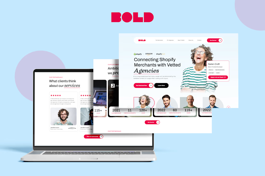
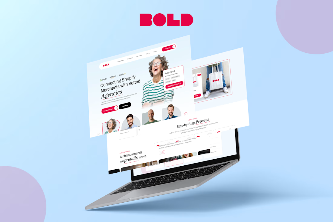
That was the challenge in my BOLD concept, a platform that connects Shopify merchants with vetted agencies and developers.
Merchants arrive wanting someone they can trust with their store. Experts arrive wanting good clients. If the page talks to only one of them, the marketplace never fills up.
So the hero speaks to both, without splitting into two websites:
1) For merchants: a clear "Get Matched Now" action, with Shopify, Shopify Plus and Amazon logos up top so they know this is built for their world.
2) For experts: a real profile card with skills like React.js, Hydrogen and Liquid, plus "Apply to be an Expert" right beside it
3) Real faces instead of abstract icons, because hiring is about people
4) Stats on every agency card (projects completed, hours worked, customer since) so trust is built through numbers, not promises
Bold red for action, soft blue for calm, and an italic serif accent so it feels human, not corporate.
Designers, honest question:
On a two-sided marketplace, should the homepage serve both audiences, or pick one and send the other to a separate page?


The network for creativity
Join 1.25M professional creatives like you
Connect with clients, get discovered, and run your business 100% commission-free
Creatives on Contra have earned over $150M and we are just getting started



Related posts

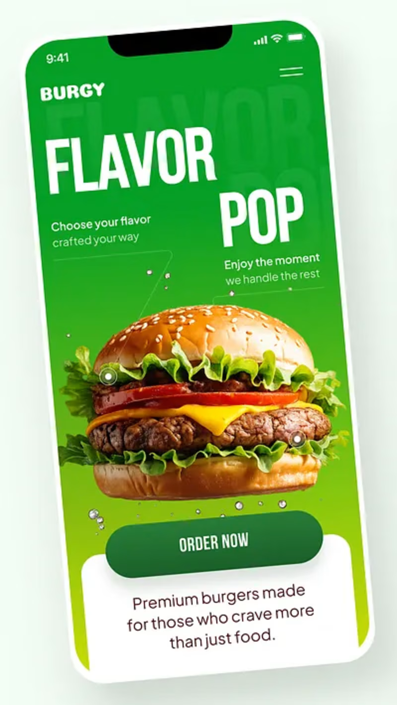
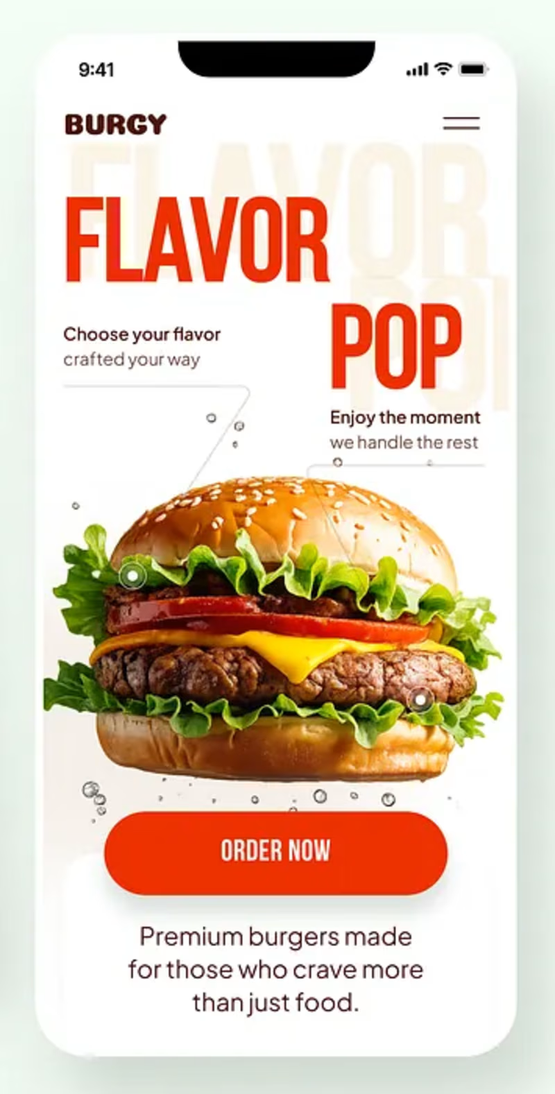
Burgy, a mobile concept for burger ordering. 🍔
Bold type, premium food visuals, and a fast path from craving to checkout.
Two color directions for the hero screen. Which one converts better?
Vote and tell me why 👇
Poll options: 🟢 Green | 🔴 Red
#UIDesign #MobileApp #FoodApp #AppDesign #UX #RestaurantApp
13 voted
43%
17 voted
57%
30 votes
Closed

Green for me, and I'd bet on it converting better too. The red version is loud in the way every food app is loud, while the green makes the burger the hero and the screen instantly recognizable in a feed. The green background also gives the white FLAVOR POP type far more contrast, so the message lands a beat faster.


Niceee

Luxury Travel Agency Landing Page Design
A modern luxury travel agency website concept designed to inspire premium travel experiences through elegant visuals, immersive storytelling, and a seamless user experience. The design combines cinematic destination imagery, refined typography, intuitive navigation, and sophisticated layouts to create a high-end digital presence for luxury travel brands.
The website focuses on increasing engagement and booking inquiries with a clean user journey, responsive design, premium destination showcases, curated travel packages, testimonials, and compelling call-to-action sections. Crafted in Figma with a strong emphasis on usability, aesthetics, and conversion-focused design.


