The network for creativity
Join 1.25M professional creatives like you
Connect with clients, get discovered, and run your business 100% commission-free
Creatives on Contra have earned over $150M and we are just getting started
Back to feedPost

Your website isn't just a portfolio - it's your first impression! 🚀
People often spend weeks perfecting their product but only a few hours thinking about how it's presented.
The reality?
Research has consistently shown that design heavily influences how users perceive credibility and trust. One well-known body of research from Stanford found that visual design plays a major role in whether people perceive a website as credible. Another line of research has shown that people form a first impression of a website in as little as 50 milliseconds before they've even started reading your content.
A great website isn't just about aesthetics.
It's about communicating:
✓ Professionalism
✓ Trust
✓ Clarity
✓ Consistency
The same applies to social media.
Your Instagram, LinkedIn, or Facebook feed is often the second place potential clients visit. An inconsistent visual identity or outdated graphics can unintentionally create friction—even if your product or service is excellent.
As a Graphic & Game Design student and working student in B2B design, I've seen how thoughtful branding and consistent visual communication can strengthen a company's online presence.
Whether it's:
Brand Identity, Logo Design, Social Media Content, Marketing Assets, UI/UX Concepts
my goal is always the same: creating designs that don't just look good—but build trust.
I'd love to hear your thoughts:
How important do you think first impressions are in today's digital world? 👇
The network for creativity
Join 1.25M professional creatives like you
Connect with clients, get discovered, and run your business 100% commission-free
Creatives on Contra have earned over $150M and we are just getting started







Related posts

Still looking for someone to give your brand’s online presence a little more life?
I’m one.
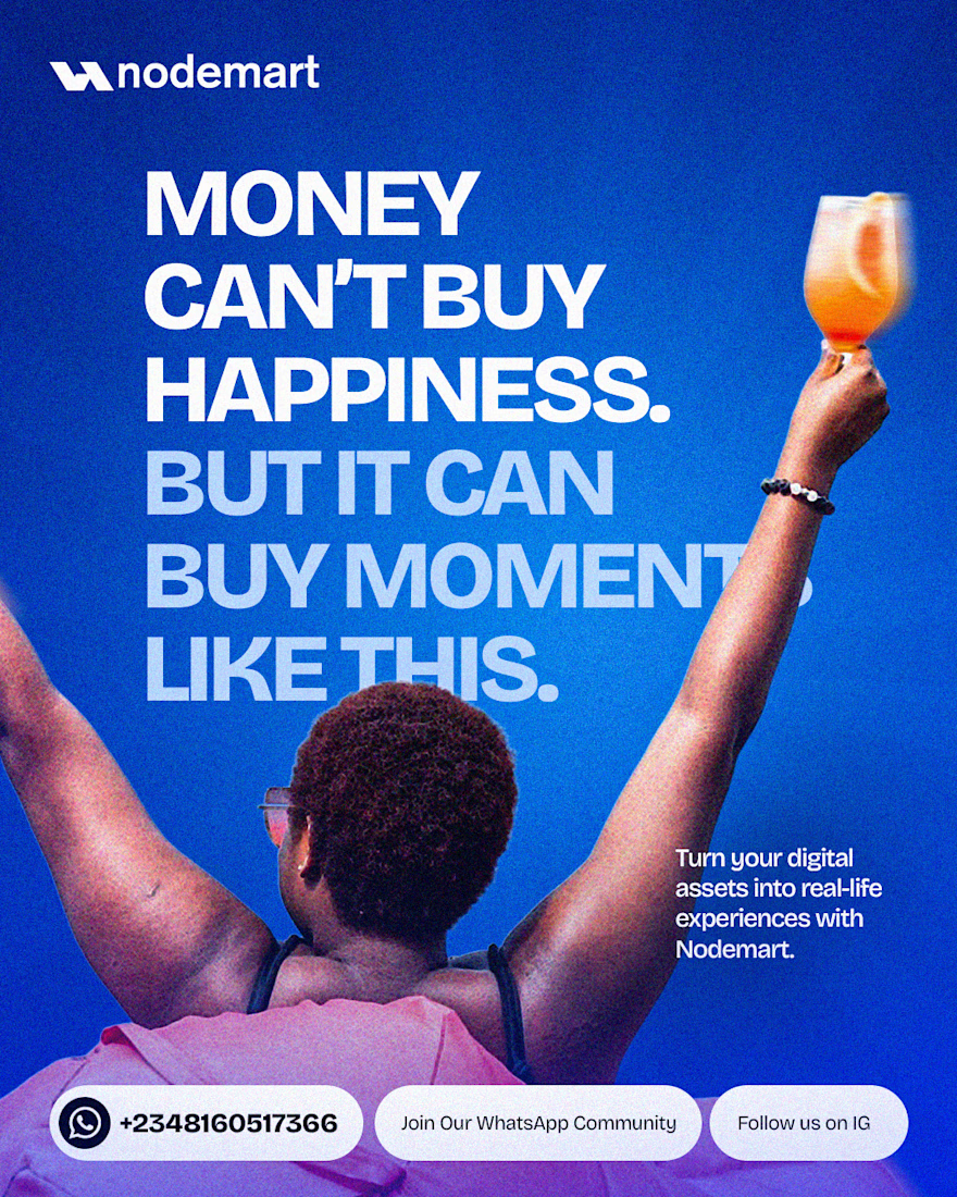
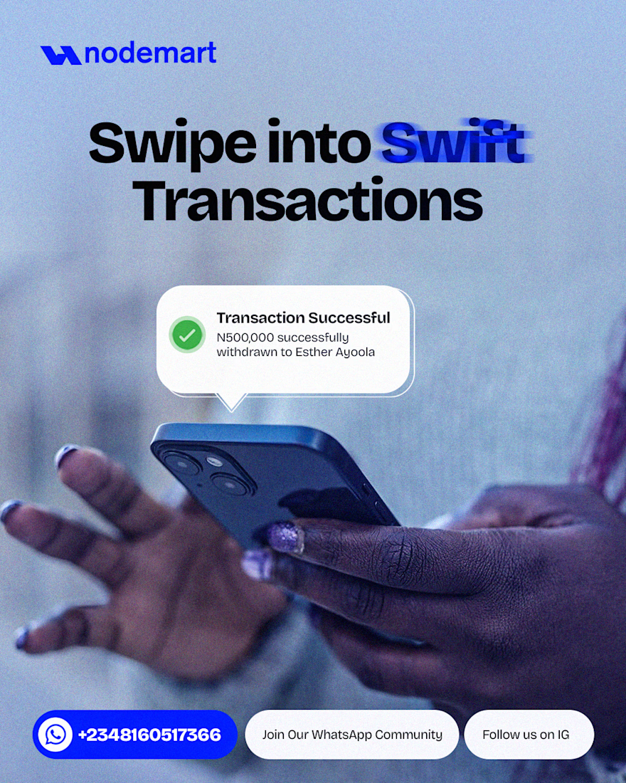
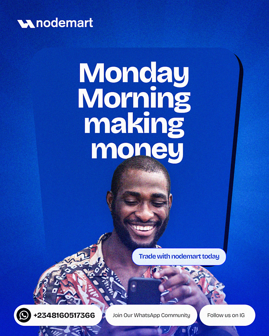
A few pieces from my work for Nodemart — different messages, different moments, but one visual language throughout.
I’m Damilola, a Product Designer who also designs the visual presence around the product.



Great work

Took a WebGL fabric physics simulation and pushed it to the absolute limit.
Built a complete visual concept for a Peptides brand around it. Pure interaction, zero boring static layouts. Let's go!


Pushing fabric physics that far for a peptides concept is a strong choice. The quiet editorial layout lets the motion carry the brand instead of competing with it.

Which color direction feels right for this digital payment app?
While designing a full digital payment app experience, from bills overview to payment confirmation, I explored two different color systems for the entire flow. Same screens, same functionality, just a different accent palette and personality.
Option 1 - Neon Green. Bold, high-energy, and gives a sharp, fintech-forward feel throughout the journey.
Option 2 - Cyan/Blue. Cool, modern, and leans more premium and trustworthy across the whole app.
Would love your honest UX/UI take, which direction feels more trustworthy, engaging, and appropriate for a digital payment app, and why? 👇
3 voted
38%
5 voted
62%
8 votes
Closed

Cyan/Blue