The network for creativity
Join 1.25M professional creatives like you
Connect with clients, get discovered, and run your business 100% commission-free
Creatives on Contra have earned over $150M and we are just getting started
Back to feedPost

Here is a tailored LinkedIn post designed to showcase your brand system guidelines and demonstrate your expertise in typography and design systems.
Headline Options
Defining the details: Why negative examples belong in every brand identity system.
Typography is 10% font selection and 90% spatial control.
Post Body
Creating a strong visual identity isn’t just about defining the rules—it’s about defining the boundaries.
When building brand guidelines, explicitly documenting what to avoid is often what saves a system from being diluted in real-world application. Spacing, hierarchy, and weight distribution can completely alter how a brand is perceived.
Here are four common typography pitfalls I always document in brand systems to keep visual communication sharp and legible:
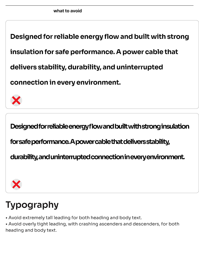
Leading Extremes: Overly loose leading disconnects lines of text, while overly tight leading causes ascenders and descenders to collide. Both ruin readability.
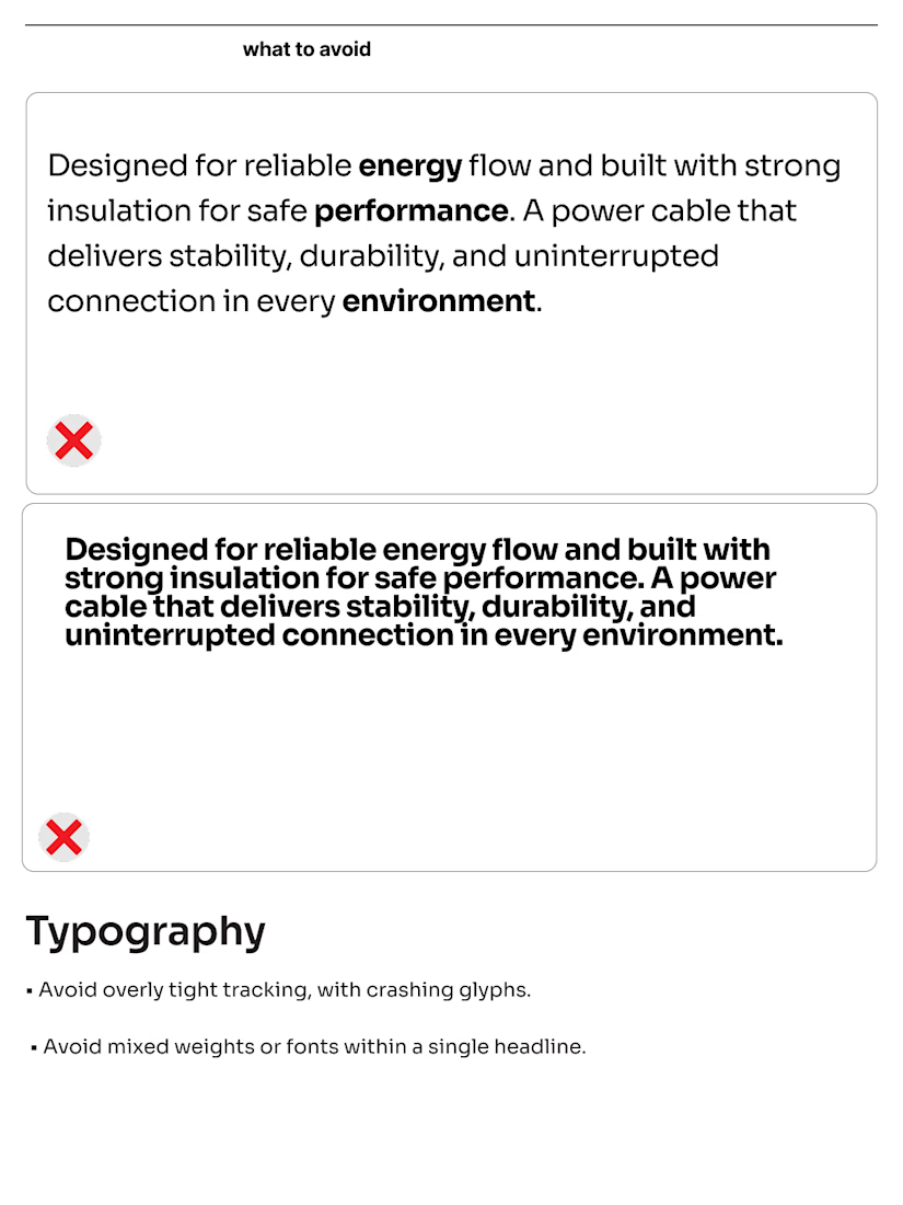
Mixed Weights in Headlines: Injecting random bold or medium weights within a single line creates unnecessary visual noise and weakens message hierarchy.
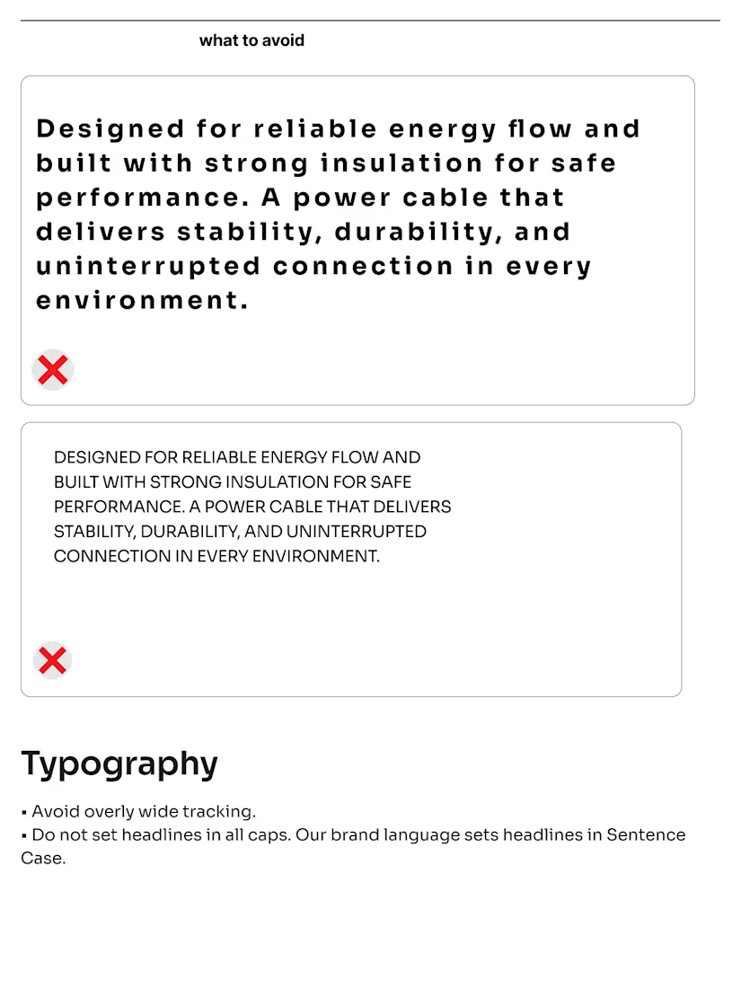
Tracking & Letter-Spacing: Forcing characters together causes glyphs to crash while stretching tracking too wide breaks paragraph cohesion.
Case Misuse: Setting entire paragraphs or headlines in ALL CAPS creates unnecessary visual friction—sticking to standard Sentence Case maintains clean, accessible reading flow.
A visual system should empower teams to execute consistently without guesswork. Clear guardrails guarantee the brand looks as intended across every touchpoint.
Would you like me to adapt this with a specific call-to-action or tailor it to highlight a specific project case study?

The network for creativity
Join 1.25M professional creatives like you
Connect with clients, get discovered, and run your business 100% commission-free
Creatives on Contra have earned over $150M and we are just getting started





Related posts


How far can you take a logo beyond the first draft?
I started with Recraft's Logo Maker and a fictional idea: Bibu's Paws, a cosy little dog rescue and adoption shelter.
I wanted the identity to feel warm, homely and full of character, so I explored a few logo directions before settling on the little dog tucked inside a house.
From there, I took the idea further, building out the visual identity with an earthy colour palette, typography, illustrations and a few real-world applications: the shelter space, dog merchandise and an adoption welcome kit.
I enjoyed seeing how a small starting point could grow into a brand with its own personality and world.
Now I'm curious: if you were building a brand around this logo, what would you create next?






It turned out so cozy, you did great


My latest branding project for the Atlanta Museum of Paleontology.
Check out the full project at maximjungle.com


A T-rex drawn in one thin outline is such a good mark 🦖 I'd happily visit that museum.