The network for creativity
Join 1.25M professional creatives like you
Connect with clients, get discovered, and run your business 100% commission-free
Creatives on Contra have earned over $150M and we are just getting started
Back to feedPost


The network for creativity
Join 1.25M professional creatives like you
Connect with clients, get discovered, and run your business 100% commission-free
Creatives on Contra have earned over $150M and we are just getting started
Challenges
View all


Related posts

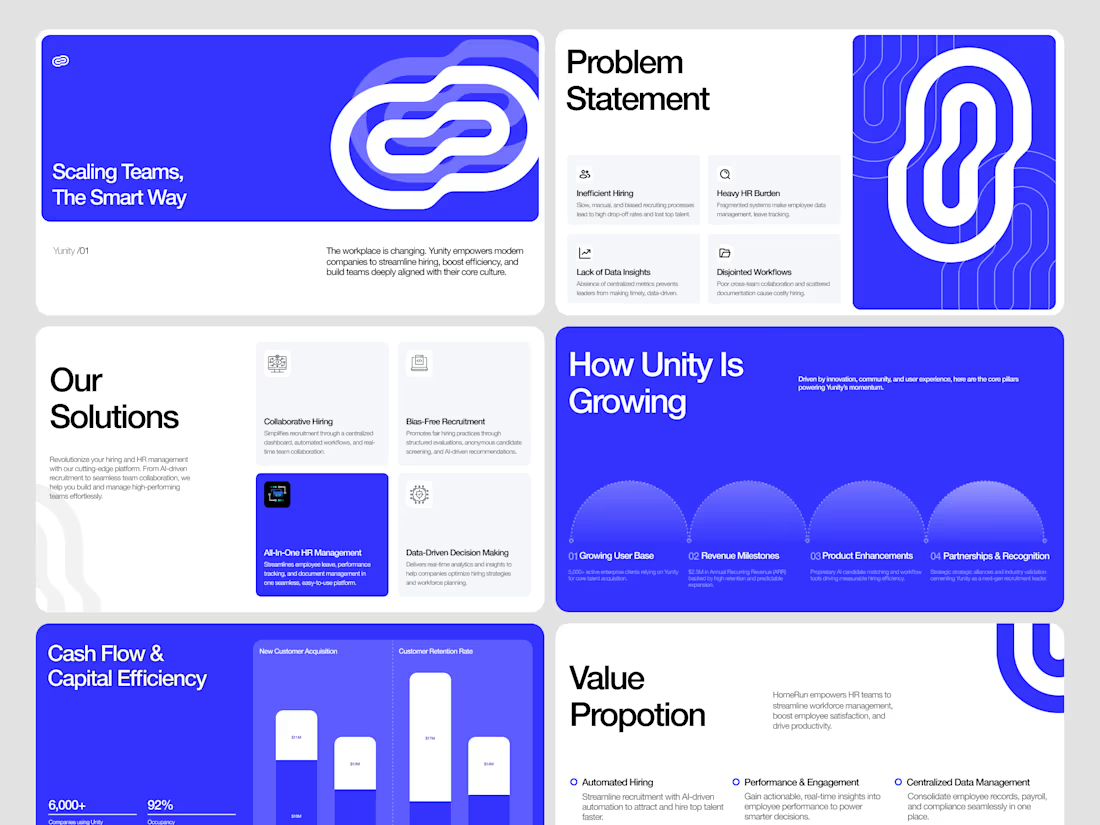
We designed an investor-ready Figma pitch deck for Yunity, turning complex HR analytics, collaborative workflows, and growth metrics into a compelling visual narrative.
Explore the full case study on Contra and let's bring your next pitch deck to life: https://contra.com/p/QPgY3BQg-yunity-hr-tech-pitch-deck-design?r=airzon_agency 🚀


Super clean work!

Not just another deck. A visual story built to make complex ideas impossible to ignore. From bold layouts to striking visuals, every detail works together to keep the audience hooked.


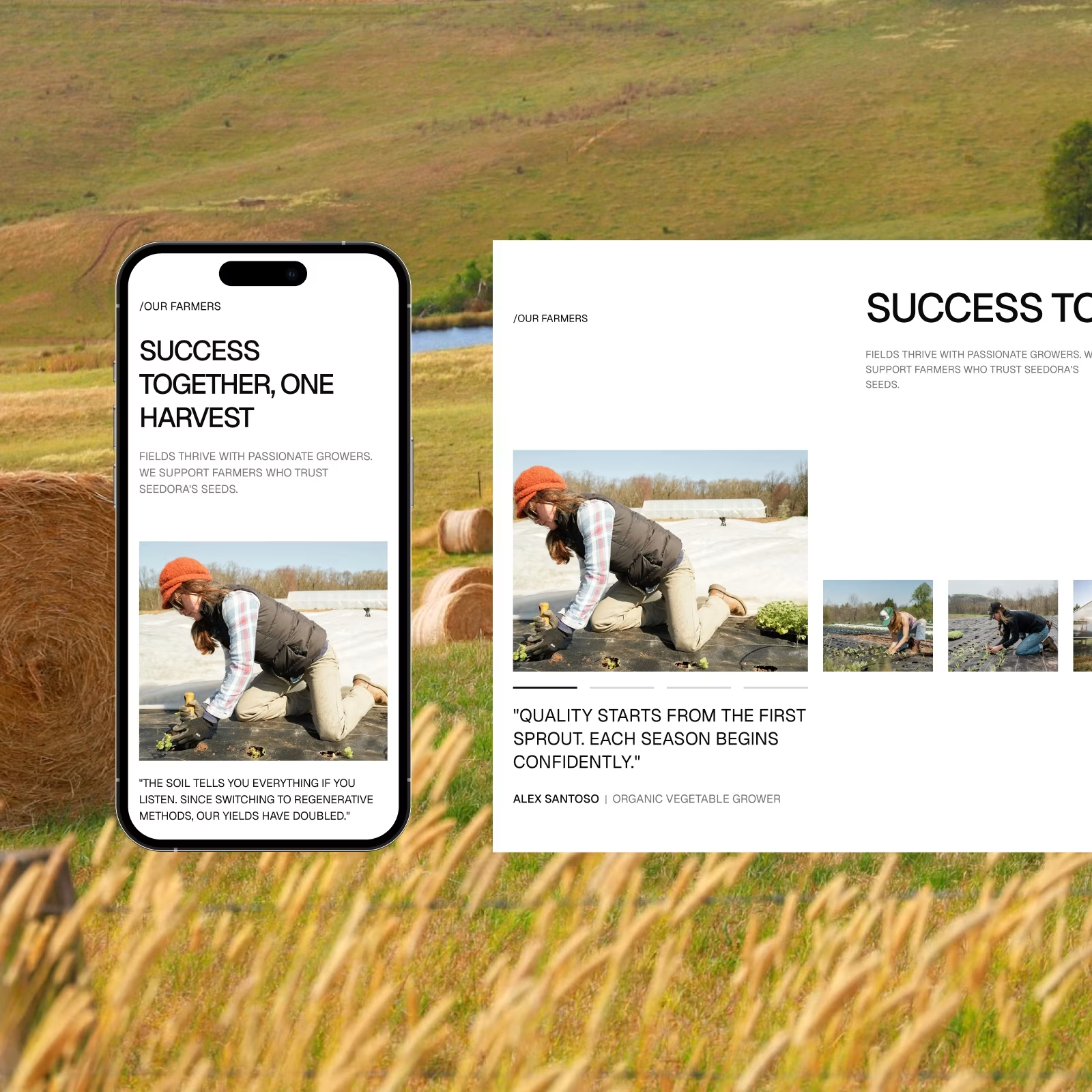
Seedora — Premium Seed Brand. A closer look at the people behind the harvest.
Photography, storytelling, and responsive layouts bring a more human side to the brand. One more post coming with the full website.