The network for creativity
Join 1.25M professional creatives like you
Connect with clients, get discovered, and run your business 100% commission-free
Creatives on Contra have earned over $150M and we are just getting started
Back to feedPost

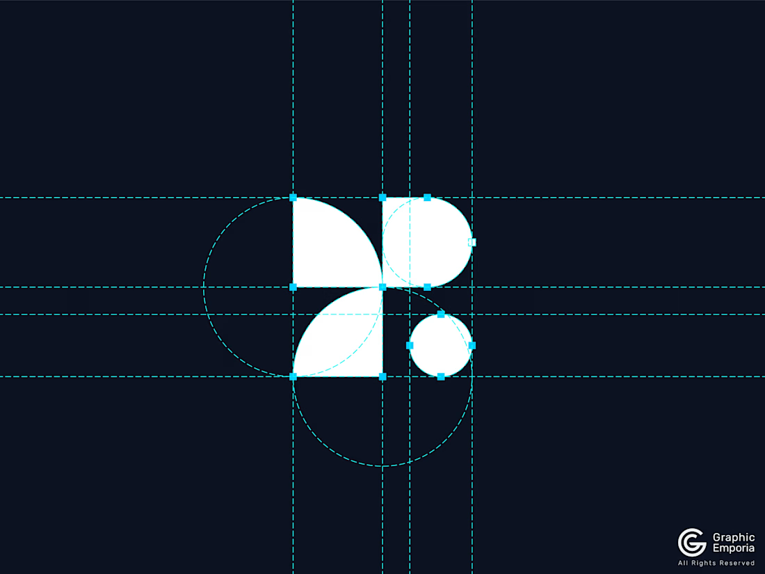
Geometric R Letter Mark - A SaaS Logo Foundation
A Loop That Closes: A SaaS Logo Foundation Reveal
Two petal shapes, reaching toward each other from opposite corners. A circle where one of them meets its partner. One small dot, marking the exact point where everything closes.
Nothing here points in just one direction. It goes out, and it comes back, which is the whole idea behind the brand I'm building it for.
This is the start of a new mark for my SaaS and tech startup, logofolio. It is an "R," built on the idea that feedback only counts when someone actually closes the loop.
More coming soon.
Building a SaaS or technology startup?
Helping SaaS startups build memorable, scalable, and investor-ready brands.
Available for SaaS & Tech Startup Projects.

The network for creativity
Join 1.25M professional creatives like you
Connect with clients, get discovered, and run your business 100% commission-free
Creatives on Contra have earned over $150M and we are just getting started





Related posts

Brand identity work for WesoftAI



Still waiting to hear back from @Contra HQ
So I did what any designer would do: I made the card myself 😂
Brushed metal. Laser-engraved logo. Holographic Mastercard rings. Full 360° spin. I'm going to keep polishing this until the real one shows up in my mailbox. Your move, Contra 👀
(Concept / fan design, not an official Contra product..Yet 🙌 )


“Okay, this looks WAY too good 🔥 Contra needs to make this real 👀”

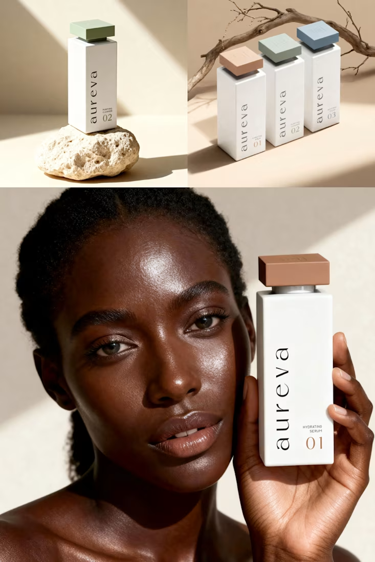
A closer look at Aureva, a Paris-based skincare brand I worked on.
The brief was to create a brand identity and packaging that felt premium yet approachable. I paired distinctive typography with soft earth tones, using color to give each product its own place within the range.
The full case study is now on my profile.

Premium branding