The network for creativity
Join 1.25M professional creatives like you
Connect with clients, get discovered, and run your business 100% commission-free
Creatives on Contra have earned over $150M and we are just getting started
Back to feedPost

Never settle for just one mode.
Same interface, charts, and interactions. Both Light and Dark feel equally polished.
Which one is your pick?


The network for creativity
Join 1.25M professional creatives like you
Connect with clients, get discovered, and run your business 100% commission-free
Creatives on Contra have earned over $150M and we are just getting started



Related posts

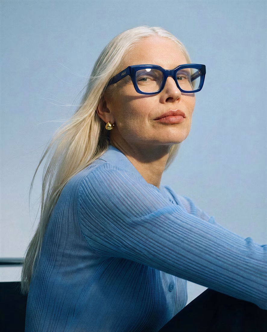
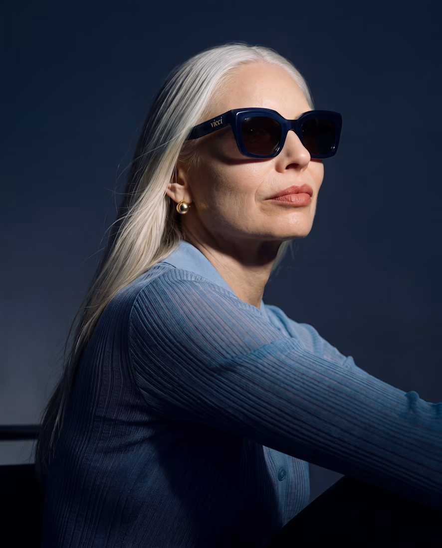
What happens when you give an old piece a dark mode and a pair of sunglasses? 🕶️
I took a piece from my portfolio and ran it through Krea 3 to see how far I could push it while keeping the original composition.
Before → light and daytime.
After → dark mode, with sunglasses.
Where it helped: quick edits that kept the composition intact, making it easy to explore a different mood.
Where I’d still go by hand: final color balance, lens reflections, and those tiny details that make everything feel intentional.
Before or after? Tell me which one you’d keep and what you’d edit next 👇



Beautiful

Quick poll for builders & designers here: When you're designing a data-heavy dashboard that people keep open for 6+ hours a day, do you default to Warm Light Mode or Low-Glare Dark Mode first?
4 voted
67%
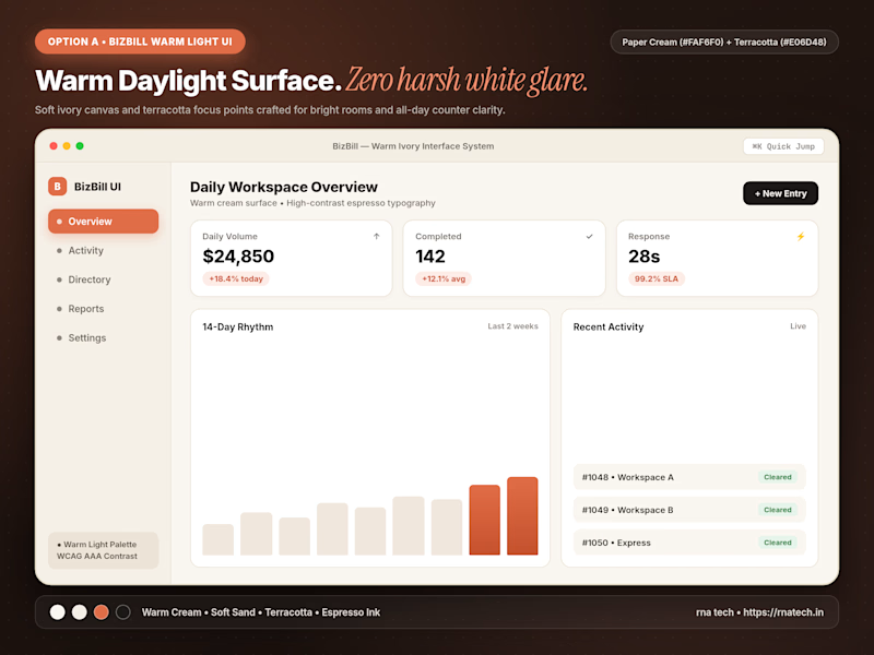
2 voted
33%
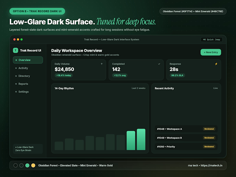
6 votes
Closed

I’d start with warm light mode for a clean, comfortable look, but low-glare dark mode is a great option for long working hours too!

We're currently working on this animation for a mobile app. We're debating whether to use fall colors, like seasonal ones or stick with the app's current color scheme.
Community, which color scheme would you vote for?

8 voted
38%
13 voted
62%
21 votes
Closed

Option 2 was stunning🔥🔥🔥🔥