The network for creativity
Join 1.25M professional creatives like you
Connect with clients, get discovered, and run your business 100% commission-free
Creatives on Contra have earned over $150M and we are just getting started
Back to feedPost

Meet Koda 🐻
Not just a mascot, a companion built into the product.
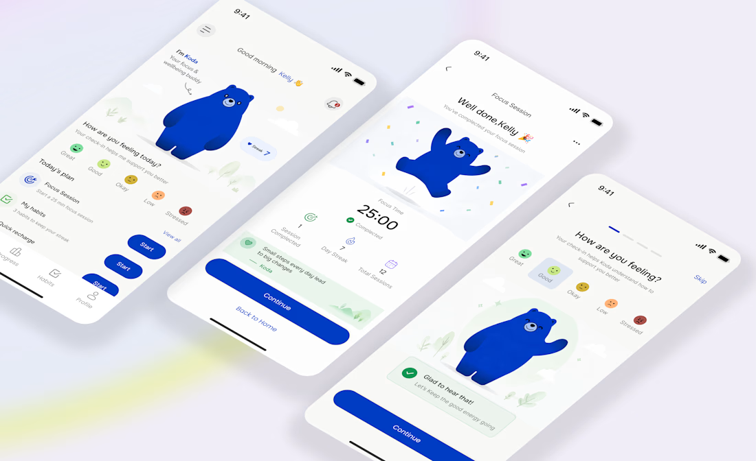
Koda powers a new kind of wellbeing + focus app where the interface doesn’t just respond to taps, it responds to you. Your mood, your habits, your consistency.
Instead of dashboards full of noise, the experience is simple:
- You check in
- You focus
- You build small wins
- Koda reacts in real time
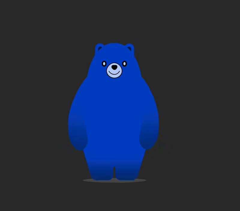
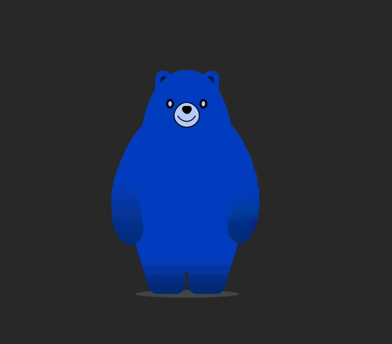
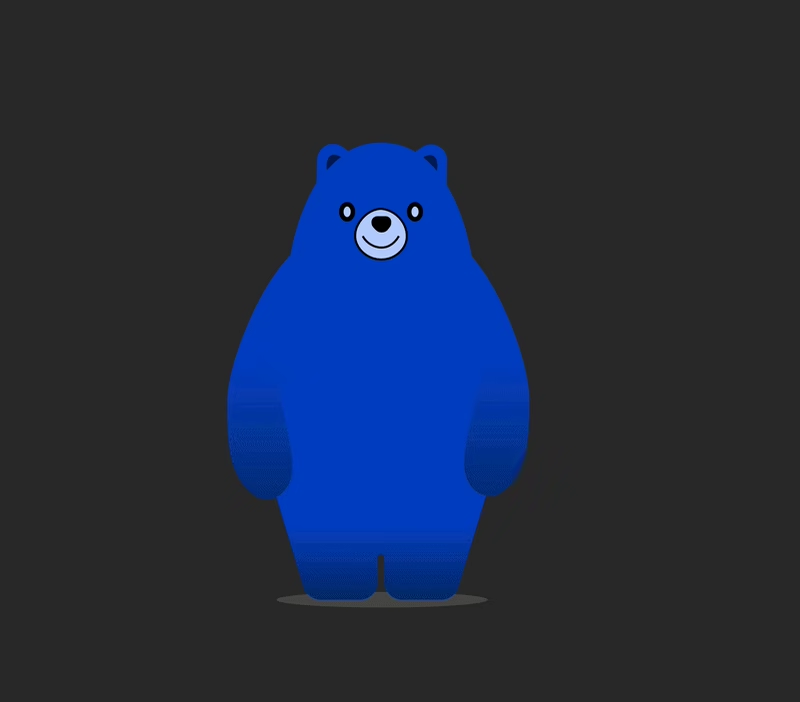
From a calm idle state, to a gentle wave during onboarding, to a full jump when you complete a session, every motion is intentional. The bear isn’t decoration, it’s feedback.
This project explores how character-driven design can:
- Reduce friction
- Improve emotional engagement
- Make consistency feel rewarding, not forced
- Built as a product concept and interaction system, not just visuals.
Curious to hear how you’d use a companion like this in your daily flow.



looks great
The network for creativity
Join 1.25M professional creatives like you
Connect with clients, get discovered, and run your business 100% commission-free
Creatives on Contra have earned over $150M and we are just getting started

Challenges
View all


Related posts

NEXOR — Creative Digital Agency Website 🔥
NEXOR is a futuristic website concept for a creative digital studio focused on digital products, brand systems, and bold digital experiences.
The goal was to create a memorable first impression while keeping the agency’s services and next steps clear.
Special attention was given to:
• a bold hero composition with oversized typography and futuristic imagery;
• a vibrant orange and black palette that creates a distinctive visual identity 🟠;
• a strong visual hierarchy that balances creative expression with usability;
• clear CTAs for starting a project or booking a call;
• a contact form integrated directly into the hero section;
• responsive mobile layouts that preserve the visual impact 📱;
• a full-screen mobile menu with intuitive navigation and prominent contact options.
The result is an expressive digital experience that combines bold visual storytelling with a clear path to conversion.
Looking to create a distinctive website for your creative agency, digital studio, or technology brand? Let’s build something extraordinary together ⚡


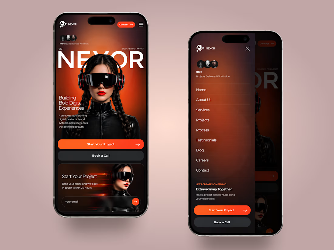
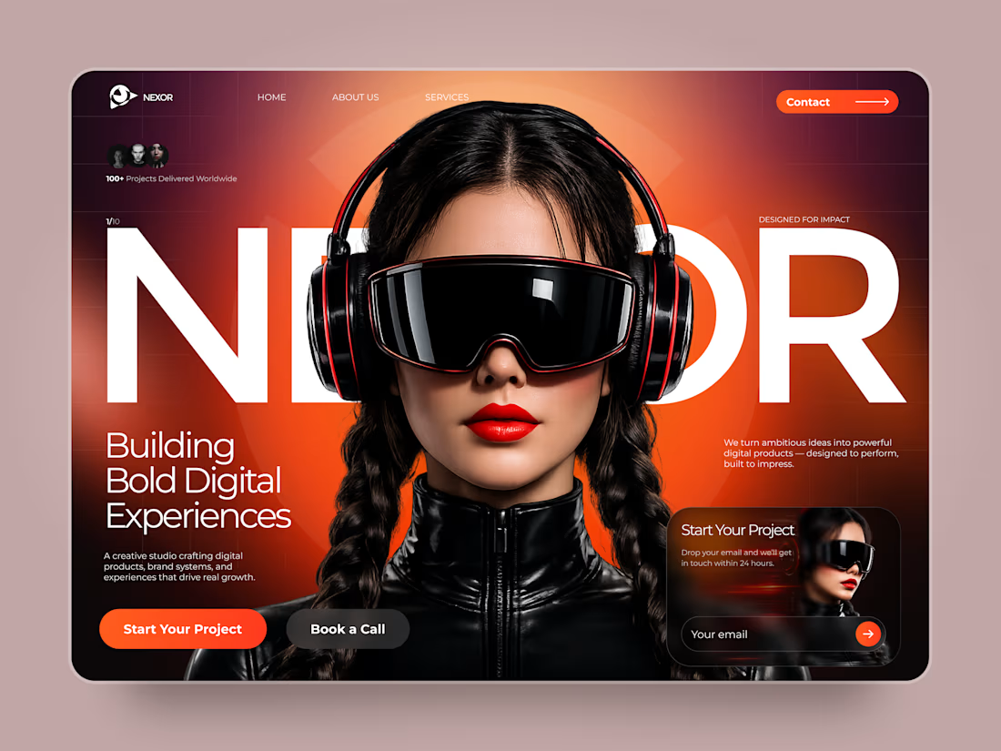
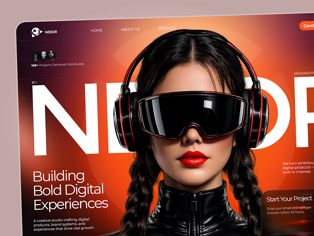

The orange-and-black system has real presence, and the mobile frames show the hierarchy holding together rather than just shrinking. The clear CTA placement is a smart counterweight to the oversized hero type.

Sometimes it’s hard to visualise data clearly without overwhelming users, but that’s what we aim for.
A snippet from daily design explorations using Magicpath and Figma.

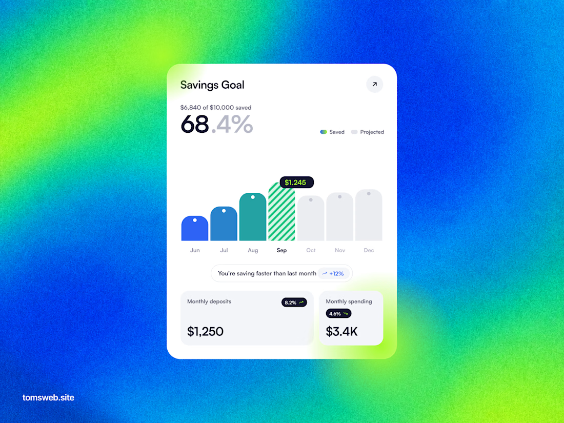
The chart keeps the progress story legible without turning the dashboard into a wall of metrics. The bright gradient is a bold backdrop, while the centered white card gives the key numbers a clear focal point.

I just like making things like this.
I made this one as an experiment without opening a single design app. Basically, I just kept telling Codex what I wanted it to do.
It’s not a magic button. It took around 100 prompts and quite a few hours. But the fact that you can make something like this just by talking, without touching a keyboard or mouse, is still pretty wild.
And the whole thing runs and renders right in the browser.