The network for creativity
Join 1.25M professional creatives like you
Connect with clients, get discovered, and run your business 100% commission-free
Creatives on Contra have earned over $150M and we are just getting started
Back to feedPost

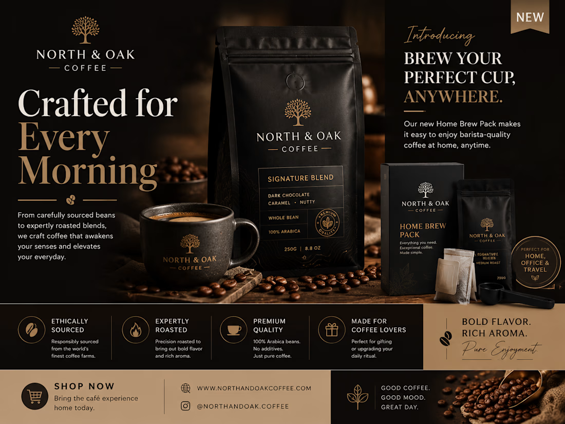
Designed a luxury promotional flyer for “North & Oak Coffee” to showcase the brand’s premium coffee products and newly launched packaged coffee for home brewing. The design emphasizes elegant branding, premium packaging, and a sophisticated visual identity to attract modern coffee lovers.


The network for creativity
Join 1.25M professional creatives like you
Connect with clients, get discovered, and run your business 100% commission-free
Creatives on Contra have earned over $150M and we are just getting started






Related posts

How do you brand a business that doesn’t fit into one box?
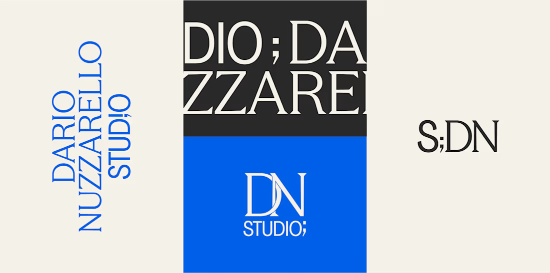
Dario Nuzzarello built a Studio that works across engineering, IT, strategy, and software. The challenge was creating a typographic identity that could bring all those disciplines together without limiting the brand to just one.
I wanted to avoid making it feel overly technical or cold. Since Dario’s work is highly custom and interdisciplinary, the identity needed to feel precise and structured while still being human and approachable.
Sometimes, the best solution is finding the right type, proportions, and details to make a name stand on its own.
What do you think about the final result?


A studio that spans engineering, IT, strategy and software is a naming and typography problem more than a logo problem, so leading with type was the right call. Precise but human is a hard line to walk. Did Dario push for a symbol at any point?

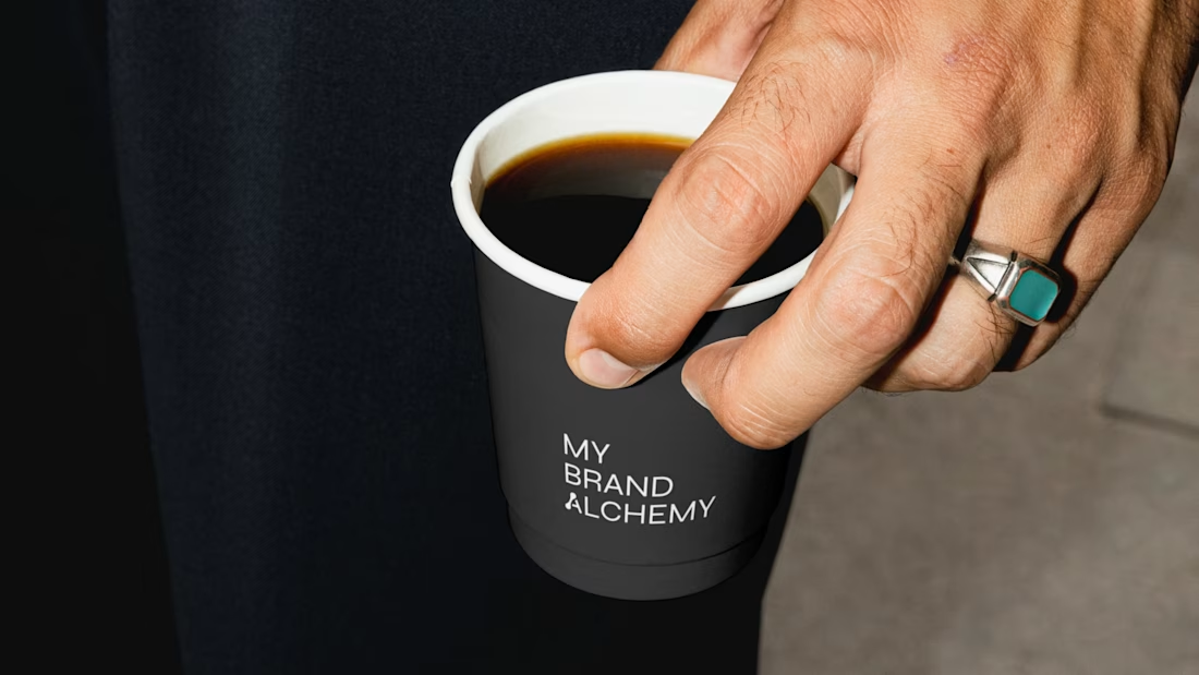
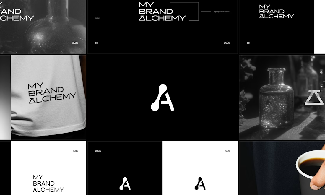
My Brand Alchemy – Visual Identity
How do you brand a branding agency without hiding behind someone else’s product?
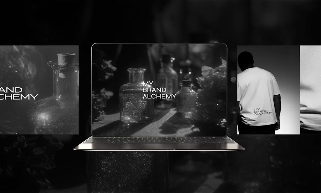
The real question with My Brand Alchemy, a studio that helps entrepreneurs reimagine and transform their businesses, was this: Its identity had to stand on its own, not borrow from anyone else's.
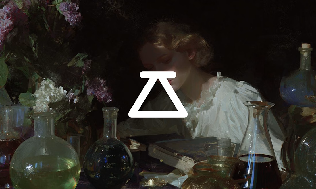
We built the system around one metaphor: the laboratory. Strategy as an experiment and clarity as the result of patient work.
→ A monochrome palette, stripped of anything decorative
→ Precise, concept-driven typography with a custom symbol woven into the wordmark
→ Atmospheric glass photography against clean geometric forms
The whole system is meant to feel like a workshop, not a showroom. Transformation as something slow and carefully made, not performed.
Would you trust a branding studio more if its own brand looked like a lab, or like a gallery? 👇



The laboratory framing works because you're treating the studio's own identity as the experiment — the system has to earn its credibility by doing the reimagining it sells. The naming and taxonomy feel honest; if the system stretches into motion and sound, the same...

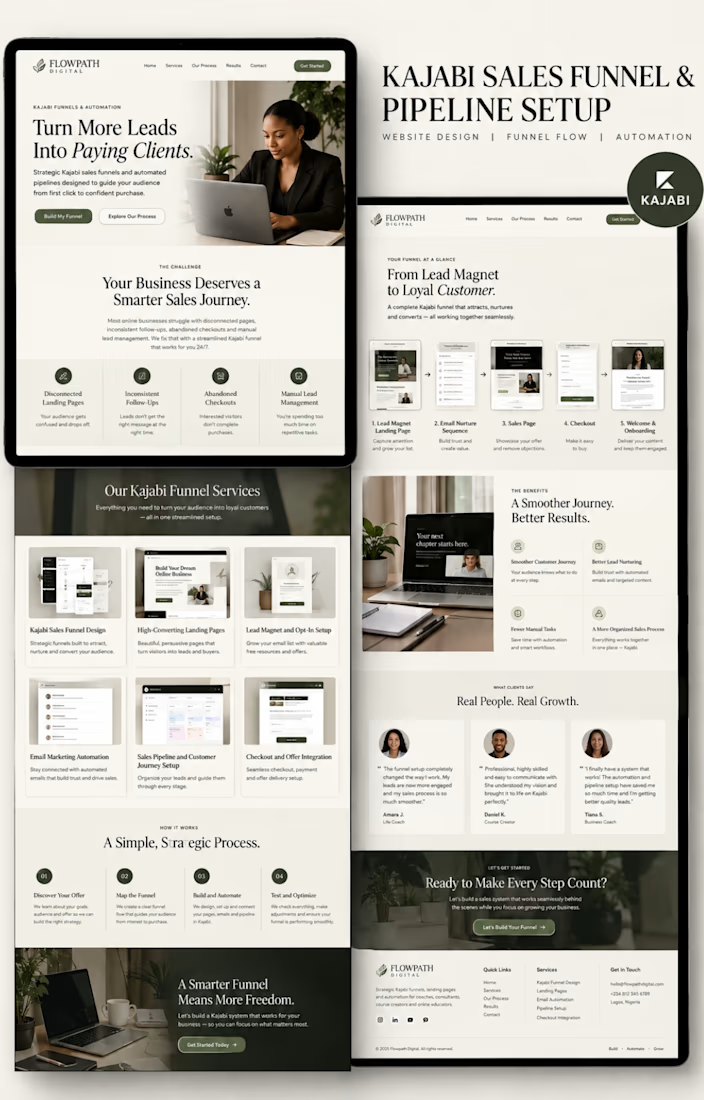
Kajabi Sales Funnel & Pipeline Setup | FLOWPATH DIGITAL