The network for creativity
Join 1.25M professional creatives like you
Connect with clients, get discovered, and run your business 100% commission-free
Creatives on Contra have earned over $150M and we are just getting started
Back to feedPost
PARALLAX — from sketch to final identity 🌀
Swipe through the design process behind this exhibition branding project — from raw, hand-drawn wave paths in Illustrator to the final kinetic typography system.
This is a brand identity for a contemporary art exhibition. Every letter in the logo design for "PARALLAX" was warped and adjusted by hand, line by line — no plugins, no shortcuts. This typography design technique reflects the whole concept: perception shifting depending on where you stand.


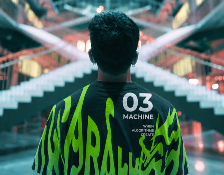
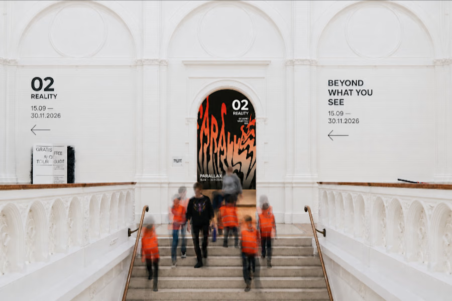
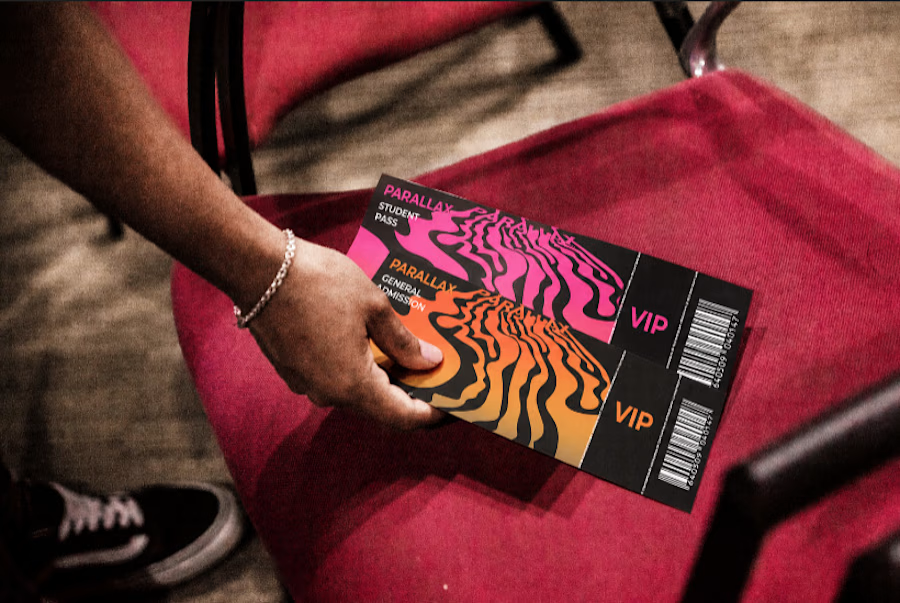

Going from hand-drawn wave paths to a full kinetic typography system is such a satisfying arc to see documented. How long did the whole process end up taking from that first sketch to final delivery?

Honestly, the most fun was putting all of this into a presentation and stuff. The drawing went the fastest (the biggest challenge was perspective, but I got it quickly), so if I count it all up, I managed to get everything done in about a week.
The network for creativity
Join 1.25M professional creatives like you
Connect with clients, get discovered, and run your business 100% commission-free
Creatives on Contra have earned over $150M and we are just getting started
Related posts

Project Update: Behind the Scenes Go behind the scenes and see how I created a logo, complete brand identity, and promotional video using only Envato assets.


A behind-the-scenes breakdown is such a good move for this challenge, it shows the process instead of just the polished output. Building a full brand identity plus a promo video from only Envato assets is no small feat, what took the most iteration, the logo or the video edit?

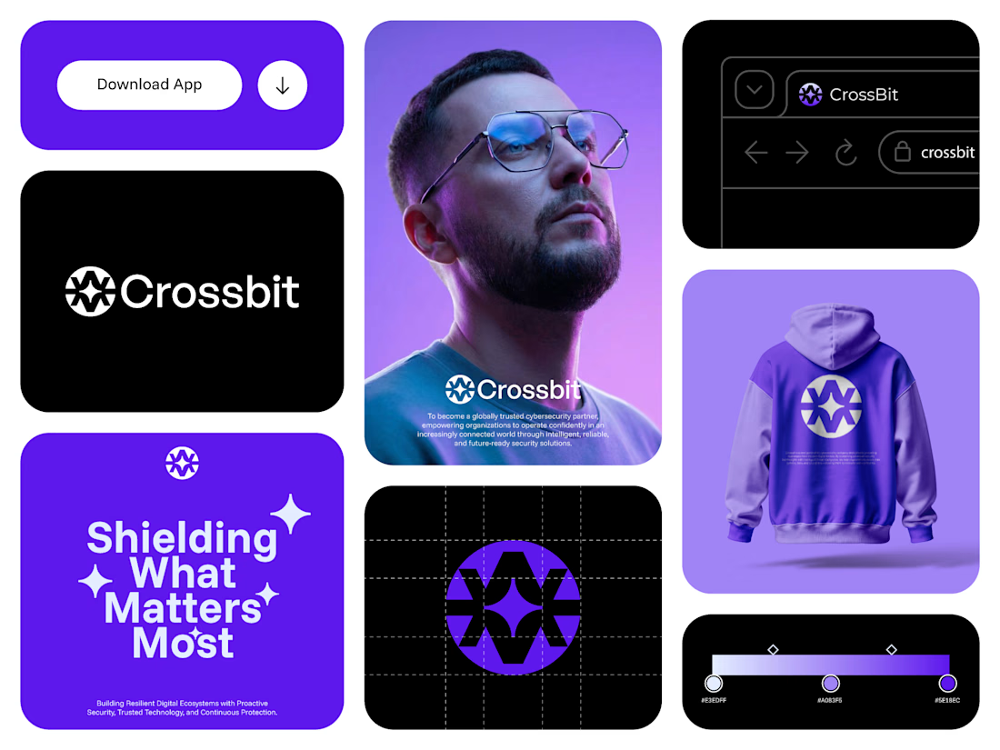
Crossbit — Cybersecurity Brand Identity & Logo Design
Crossbit needed an identity that felt secure without relying on tired lock-and-shield visuals. I designed a geometric shield-star mark — clean, modern, and built to hold trust at a glance.
The system carries across app UI, packaging, and merch, giving the brand a consistent, premium feel wherever it shows up.
What I delivered:
Logo design, brand mark, visual identity system, app UI direction, merch mockup
Specializing in logo and brand identity for tech, SaaS, fintech, and cybersecurity startups. Open to new projects — let's build something sharp together.


My birthday.
An idea.
And... a streetwear brand?
This year, I turn 24.
For a while, I kept thinking about everything I hadn't done yet. Not because I couldn't, but because I had convinced myself I couldn't.
That thought became the starting point for this project.
I started imagining 24 not as an age, but as a streetwear brand. A brand built around a mindset rather than a number. One that represents the moment you stop waiting for permission and start moving.
My first idea was to create a full commercial using Envato's AI tools. The AI generated exactly what I asked for, but the more I explored, the more I realized the real project wasn't the commercial—it was the identity behind it.
So I made a different creative decision. Instead of forcing the original concept, I stripped it back to a single campaign poster. That shift became my Human by Design moment.
AI helped me generate possibilities. But deciding what to keep, what to reject, what to simplify, and how to communicate the emotion behind the idea—that was the part only I could do.
24.
It's not about the number.
It's about the attitude.

Thanks for sharing your change in direction!







Trending

Claude
Claude has entered the design space. How are you using Claude Design?

Contra University
Learn from expert creatives how to earn more using next-gen AI tools.
creativeaiflow
Creative AI workflows are evolving. What tools do you use, and what are their strengths and weaknesses?
freelancerlife
Freelancer life is wins, pivots, and everything in between. What’s yours right now?