The network for creativity
Join 1.25M professional creatives like you
Connect with clients, get discovered, and run your business 100% commission-free
Creatives on Contra have earned over $150M and we are just getting started
Back to feedPost

New project uploaded. One of the best brand identity I've designed.
What do you think?


Love how the letterforms get cropped into these big geometric blocks with that circle floating over them, it almost reads like a pictogram before it reads like a name. Who's the client behind it? Curious if they pushed back on showing so little of the wordmark.
The network for creativity
Join 1.25M professional creatives like you
Connect with clients, get discovered, and run your business 100% commission-free
Creatives on Contra have earned over $150M and we are just getting started





Related posts

When we work with founders, companies who sell to bigger companies, the same thing comes up.
The product or service is good. But the deck looks like one company, the site looks like another, and the copy says the same sentence every AI company says.
With a startup client that doesn't cost you much. One founder tries it and decides.
Inside a bigger company it's five people, and most of them never speak to you. Someone in procurement, someone in security, a VP who hasn't heard your name. They pass your deck and your site around and decide without you in the room.
So we start with the brand and build the site on top of it, so both say the same thing.


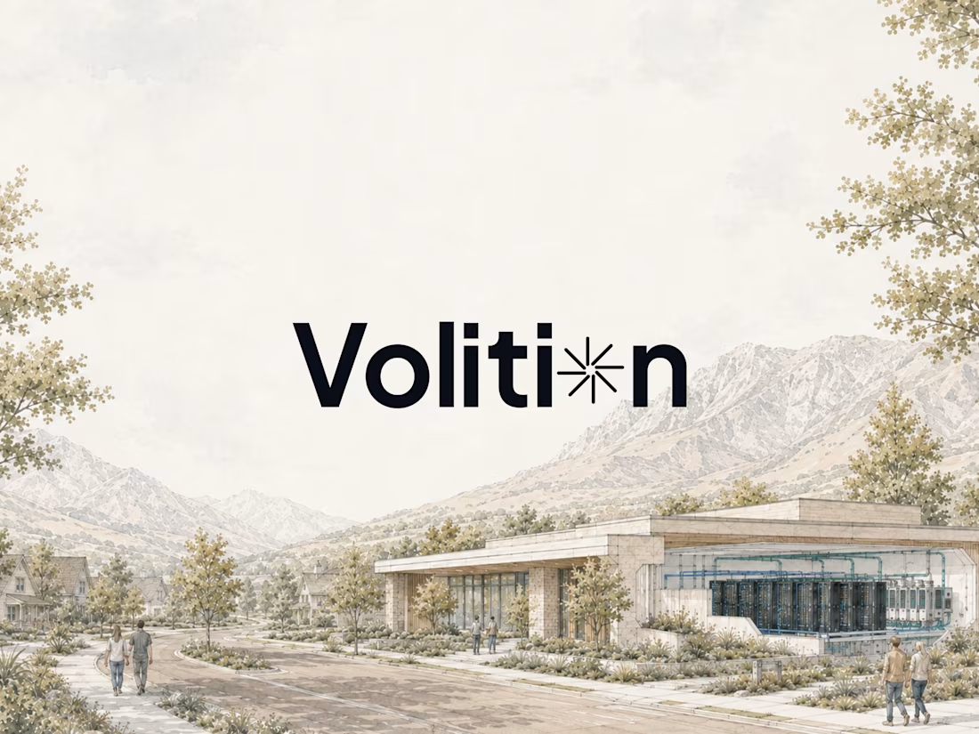
The Volition wordmark on that painted landscape makes the infrastructure feel grounded instead of abstract. The custom mark in the i stays quiet enough that the building still leads.

A few things I’ve been working on lately.
Motion graphics, animation, design, illustration and a bit of everything in between.
This reel brings together selected work from different projects and clients, showing some of the styles, formats and challenges I’ve worked on recently.
Hope you enjoy it.

A versatile and polished reel.

Luxora Skincare Serum Packaging
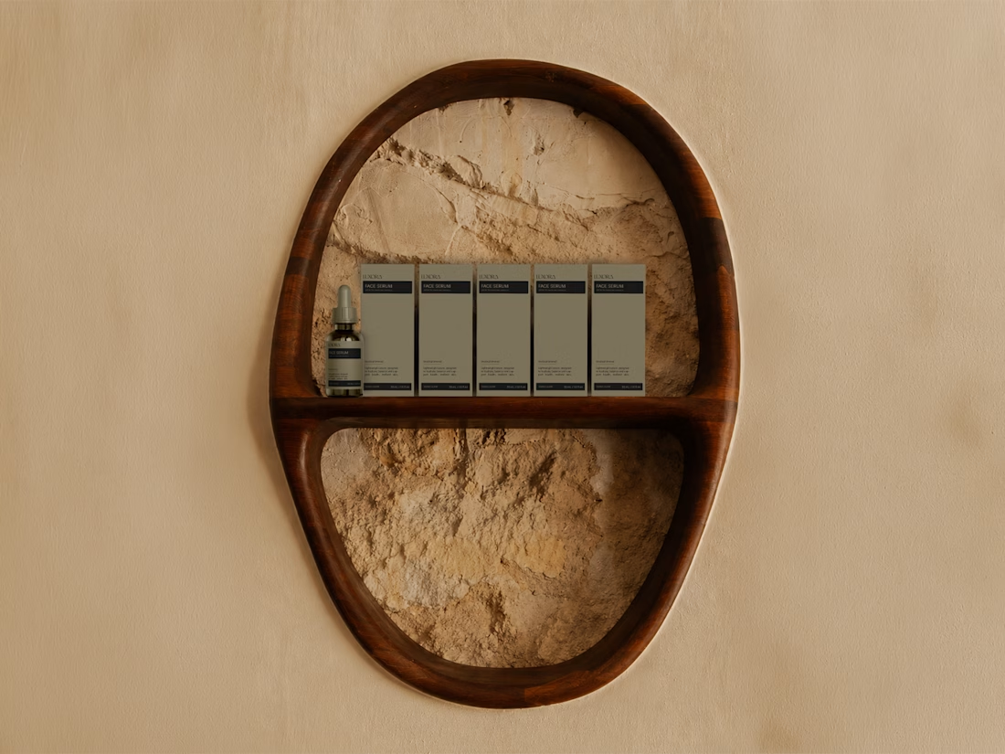
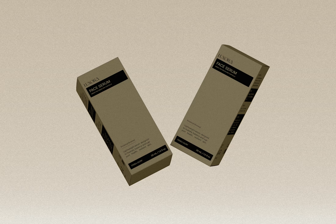
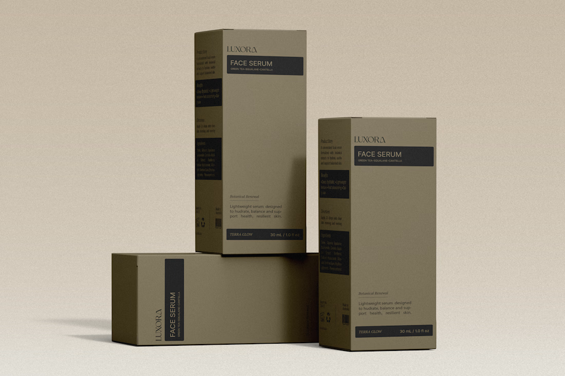
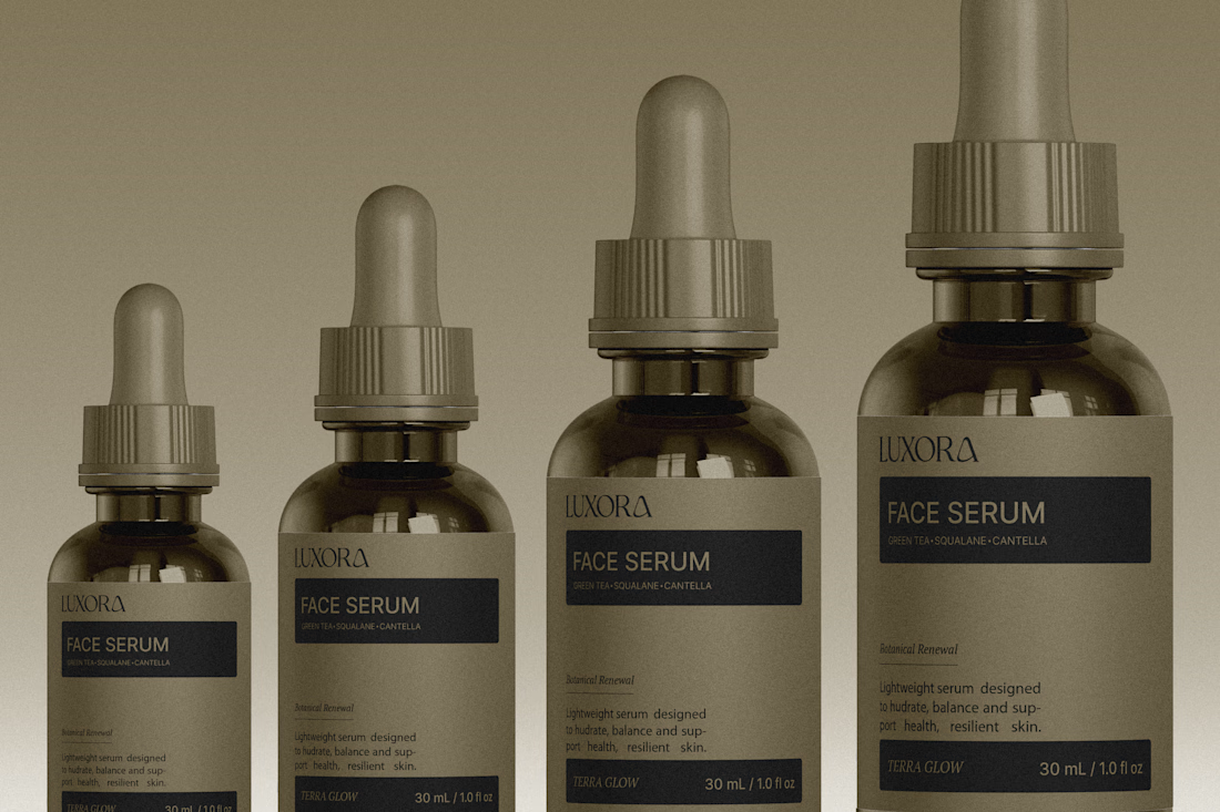
The olive droppers and FACE SERUM label stay in one calm palette, which is what makes the set feel expensive. The powder backdrop keeps it tactile instead of glossy-ad.