The network for creativity
Join 1.25M professional creatives like you
Connect with clients, get discovered, and run your business 100% commission-free
Creatives on Contra have earned over $150M and we are just getting started
Back to feedPost

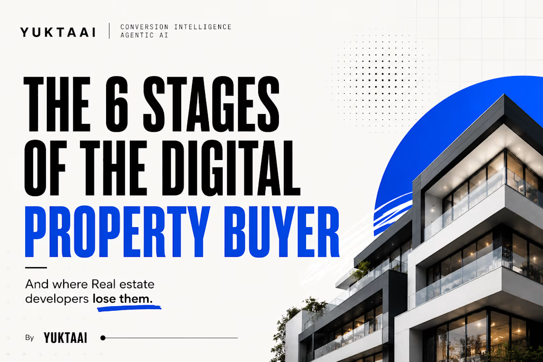
The 6 Stages of the Digital Property Buyer
And where real estate companies lose them.
A property buyer rarely goes from seeing an ad → visiting a website → submitting an enquiry → buying.
The journey is far more complex.
For our latest YUKTAAI Research, we analyzed and synthesized findings across 29 industry reports, studies and research sources covering digital buying behaviour, UX, conversion psychology and real estate buyer behaviour.
The research draws on work from organizations including Baymard Institute, Microsoft, Nielsen Norman Group, CXL and the National Association of REALTORS® (NAR).
What emerged was a clear 6-stage digital property journey:
Awareness → Search → Evaluation → Inquiry → Verification → Closing
And buyers can disappear at every stage.
Outdated pricing during search.
Hidden fees or unclear payment plans during evaluation.
Long forms and gated information when they're ready to enquire.
Slow responses after they've already shown intent.
The interesting part?
The problem isn't always generating more traffic.
Sometimes the buyer is already on the website.
The real problem is helping them move confidently from one decision to the next.
We mapped the full journey and the major friction points below. Want the deeper research behind this framework? Reach out to YUKTAAI.
yuktaairealestateagenticaiAI Agent OrchestratorMarket ResearchClaudeGoogle GeminiManus AIUX Research


The network for creativity
Join 1.25M professional creatives like you
Connect with clients, get discovered, and run your business 100% commission-free
Creatives on Contra have earned over $150M and we are just getting started





Related posts

Then: 1 month, 1 template.
Now: 1 week, 15 templates.
Same designer, different workflow.
I wrote up how I built no-code.supply: fifteen website templates, each with its own brand, in HTML and React, and some in Framer too. Claude Code did most of the typing. I did the directing.
no-code.supply
How I built 15 website templates with an AI coding agent in a week
How I built 15 AI-ready website templates with Claude Code in a week: the workflow, the quality bar, and why a template is only the starting point.

Going from one template a month to fifteen a week is wild. How much of the design direction did you still do by hand?

Same prompt. Same concept. Two AI tools. 👀
I gave ChatGPT and Gemini the exact same prompt to create a luxury perfume ad creative.
No changes. No extra instructions.
Now I want to know what YOU think:
Which creative did it better?
🔵 A— Gemini
🟣 B— ChatGPT
Look at the overall concept, visual quality, composition, typography, and how “ad-ready” it feels.
Who wins this round? 👀
Vote below and tell me what made you choose your answer.
#AIContent #AIAdvertising #AdCreative #CreativeStrategy #ChatGPT #Gemini #SocialMediaManager #SocialMediaStrategy #SocialMediaMarketing #MarketingStrategy #DigitalMarketing #ContentCreation
11 voted
39%

17 voted
61%

28 votes
Closed

I will go with Chatgpt on this.
It looks more luxurious and eye catching 🔥

Take a vampire, a grim reaper and a bat for a midnight ride through a haunted town. Hold to boost over broken track, brake before the big hills, and grab candy to refill your boost. Push your luck too far and your passengers end up splattered across the screen.


Cute!!