The network for creativity
Join 1.25M professional creatives like you
Connect with clients, get discovered, and run your business 100% commission-free
Creatives on Contra have earned over $150M and we are just getting started
Back to feedPost

Not everything has to be figured out at once.
Some chapters are about building.
Some are about becoming.
I’m somewhere in between.
Same mind. New goals. Better perspective.

The network for creativity
Join 1.25M professional creatives like you
Connect with clients, get discovered, and run your business 100% commission-free
Creatives on Contra have earned over $150M and we are just getting started







Related posts


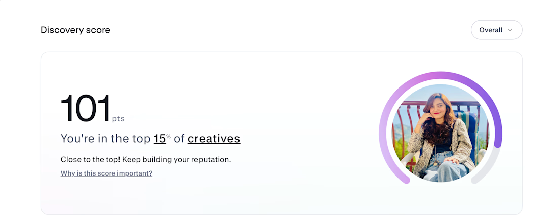
Hey @Contra HQ , my Discovery Score just hit 101, and I want to share something with anyone starting from scratch. 🚀
I didn't get here overnight. I started with zero, not knowing when things would finally work out.
But I kept showing up. Kept putting myself out there. Kept believing that something would eventually click.
I stopped waiting for the perfect moment. Stopped doubting every step. And started trusting the process.
Show up.
Share your work.
Keep building.
Keep going.
I'm still far from where I want to be. But seeing my progress today reminds me why I never gave up.
You don't need to know when it'll happen. You just need to keep going until it does.
Sometimes, everything starts changing right after you decide not to quit. ❤️






Same brand. Same palette. Two completely different proposals for a real estate developer.
A: An isotype built from blocks. Geometric, precise, the language of construction. It says we build.
B: Custom lettering with movement. Warmer, more editorial. It says we build places you’d want to live in.


15 votes
Ends in 1d