The network for creativity
Join 1.25M professional creatives like you
Connect with clients, get discovered, and run your business 100% commission-free
Creatives on Contra have earned over $150M and we are just getting started
Back to feedPost
Taste Test
What if I change first version button design? Which one is better for you now?
8 voted
25%
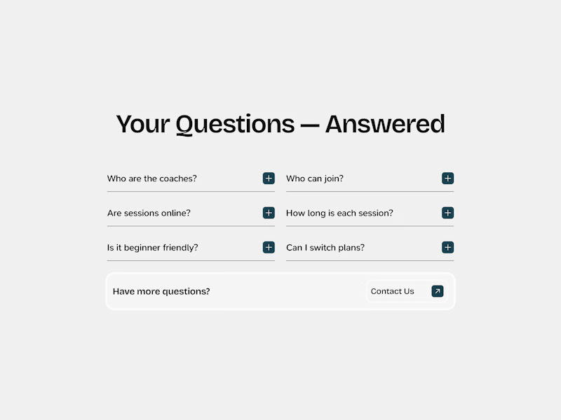
24 voted
75%
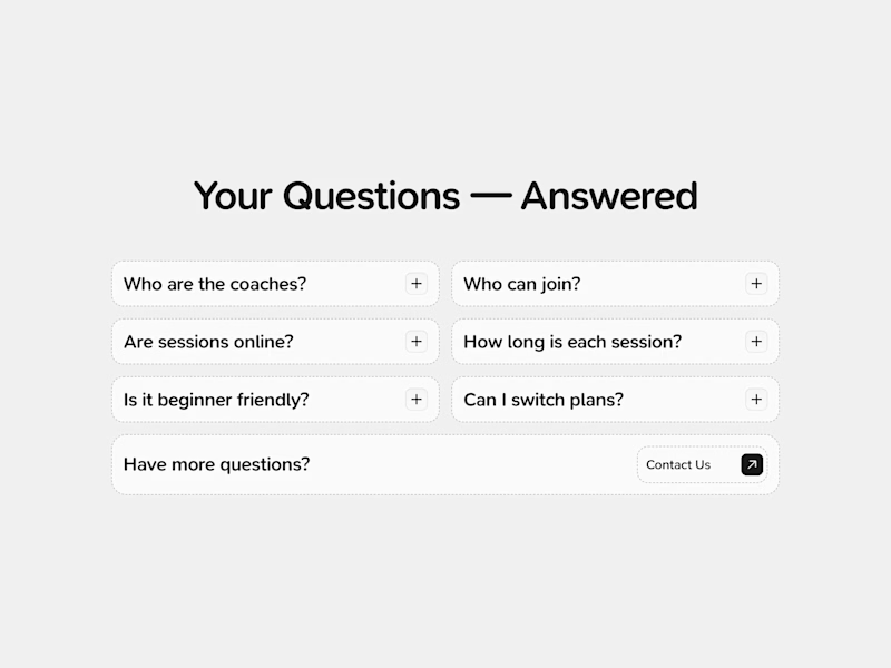
32 votes
Closed

I belive First is well executed

Great!

Definitely going with second
Why?

Second — pill shape reads as a tappable chip more than a form field 👌
Got it!


The second version is nice
Thanks!
You are welcome


I don’t know, bro! I like the design of the right buttons, but I still find the left ones more appealing because they’re easier to notice + it feels like the whole button is clickable, unlike the right one where it feels like you have to hover over the small black area
hope I explained the idea clearly =)
That's valid, Nikita. You explained it perfectly!

I am going with second one
Got it, Babatunde!

Second
Okay :)

First version makes more sense!
Why?
Outstands the CTA and draws the user's attention to the button!
Valid!

second looks good
Thanks!
The network for creativity
Join 1.25M professional creatives like you
Connect with clients, get discovered, and run your business 100% commission-free
Creatives on Contra have earned over $150M and we are just getting started
Related posts

A or B? 👀
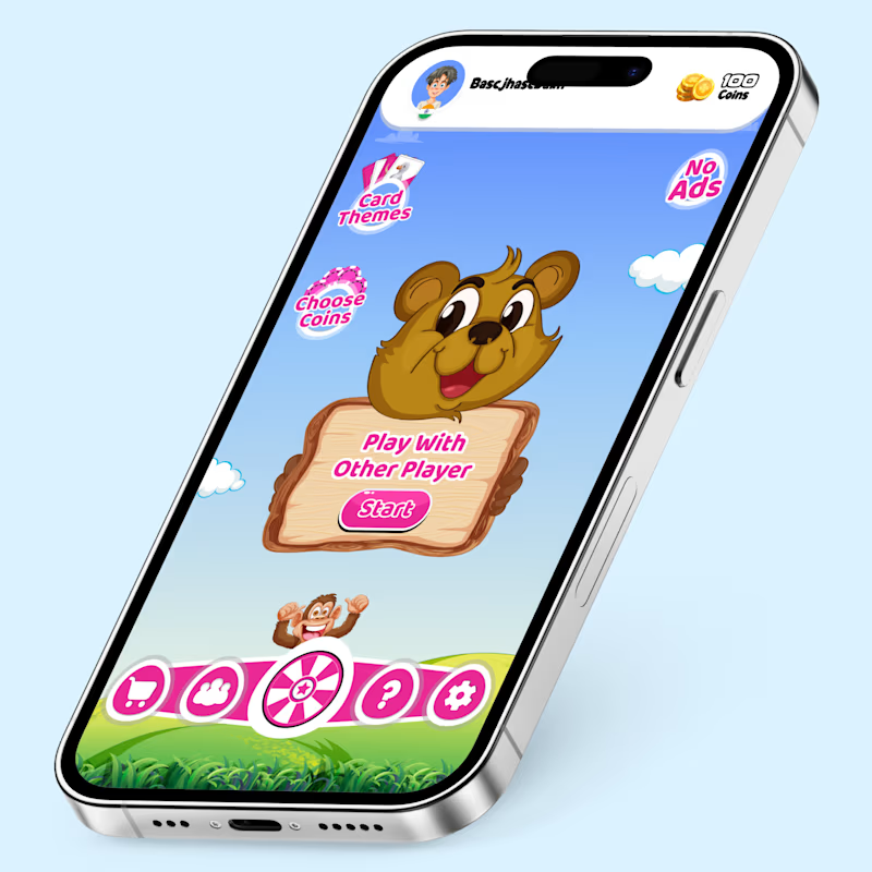
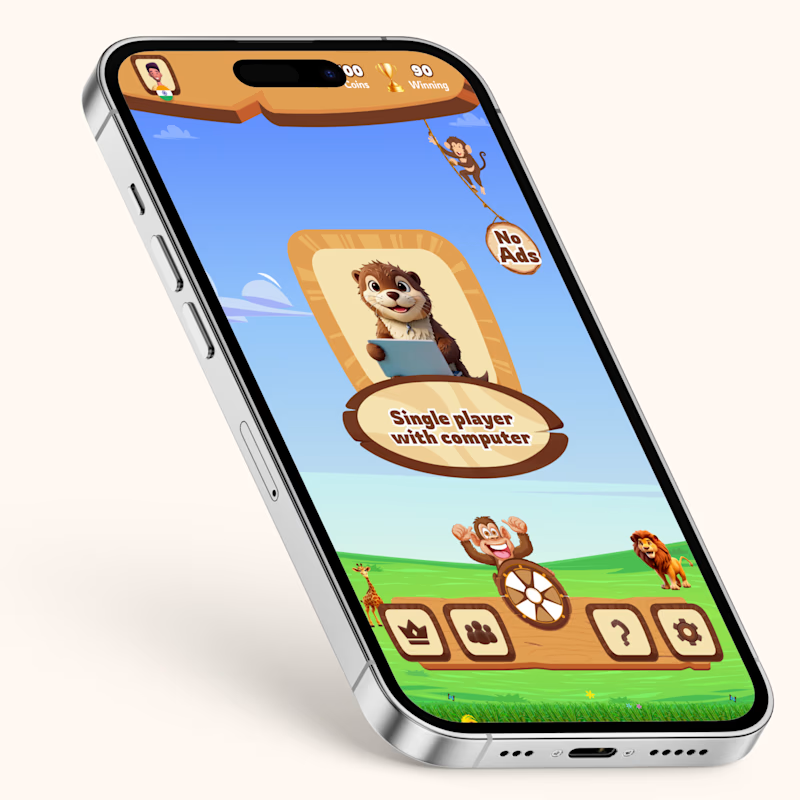
Two game UI concepts. Two different vibes.
🎮 A — Fun Multiplayer Theme
🎮 B — Adventure Theme
Which one would you tap first?
Drop your vote below 👇
3 votes
Ends in 1d

both version are good👍


Wich one looks better?
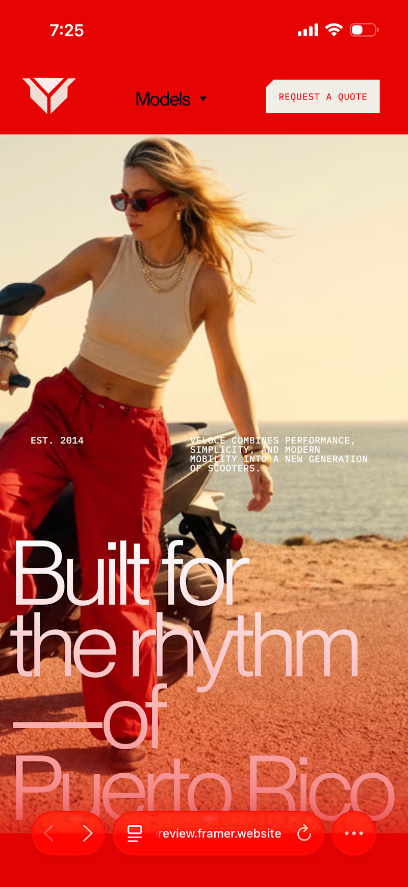
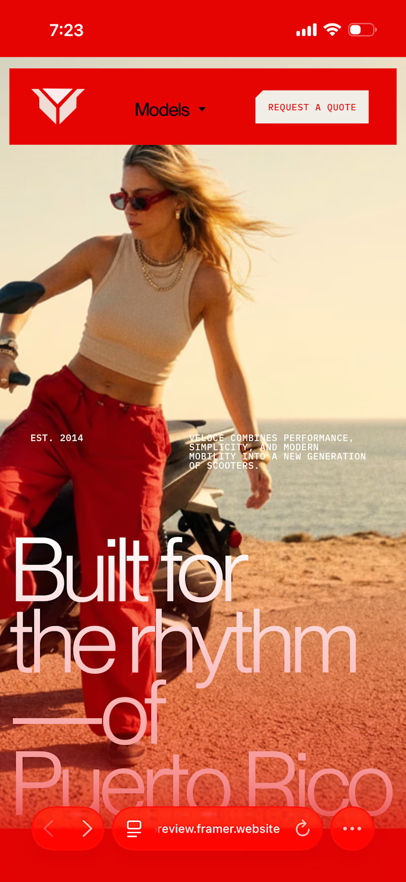
13 votes
Ends in 14h
without padding ofc



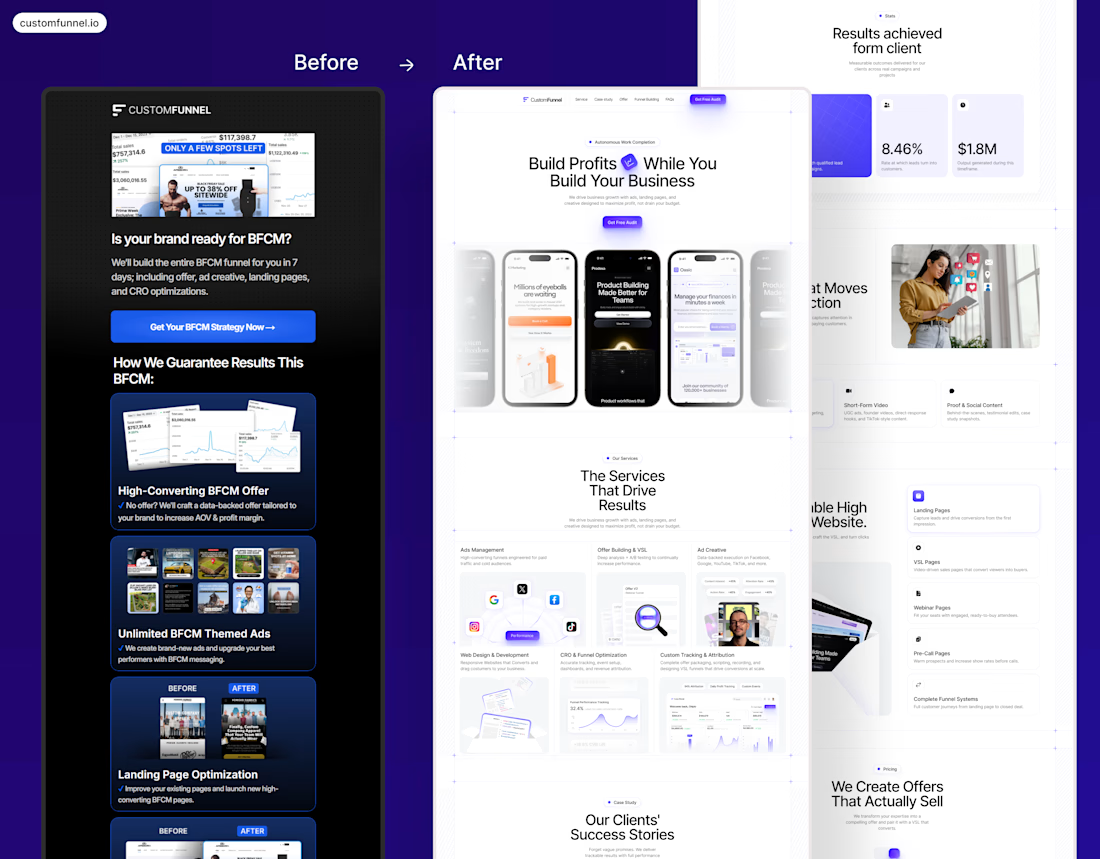

This is an absolutely incredible Before vs After transformation!






Trending

Claude
Claude has entered the design space. How are you using Claude Design?

Contra University
Learn from expert creatives how to earn more using next-gen AI tools.
creativeaiflow
Creative AI workflows are evolving. What tools do you use, and what are their strengths and weaknesses?
portfolioreview
The best portfolios tell a story, not just show a grid. Share yours for feedback.
freelancerlife
Freelancer life is wins, pivots, and everything in between. What’s yours right now?