The network for creativity
Join 1.25M professional creatives like you
Connect with clients, get discovered, and run your business 100% commission-free
Creatives on Contra have earned over $150M and we are just getting started
Back to feedPost
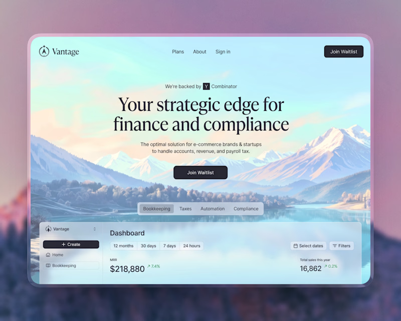
Taste Test
Which one stands out more — Light or Dark? Inviting popup for SaaS app!
61 voted
55%
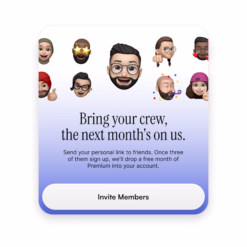
50 voted
45%
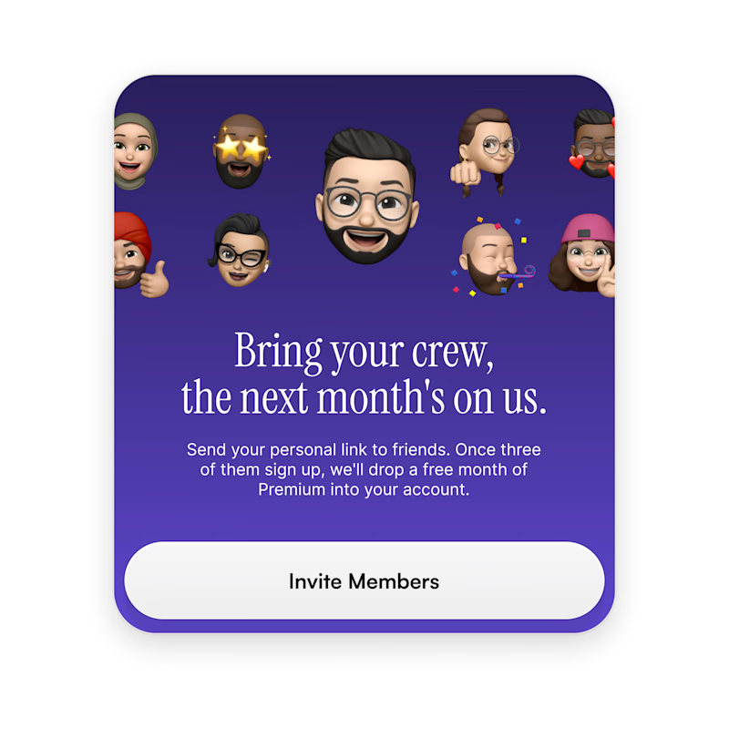
111 votes
Closed
I love a dark theme. The contrast is 🔥
I was gonna say "rich" but juicy is so right
Dark mode hits different. 🎯 That gradient has serious depth and feels premium without trying too hard. The contrast makes the CTA pop instantly. The light version is clean, but the dark one wins on visual hierarchy and that "can't look away" factor.
good job
Dark one is better for me, the contrast is not much on the light one, text vs background.
Nice!
2 versions looks cool
Light
The light version makes more impact!
wow very nice post
dark
Both look amazing
light for me ;)
The network for creativity
Join 1.25M professional creatives like you
Connect with clients, get discovered, and run your business 100% commission-free
Creatives on Contra have earned over $150M and we are just getting started
Related posts
Three founders this week: "Should we go hand-drawn?"
No.
That trend works for beauty and fashion because the product is
actually handmade. Your SaaS dashboard is not a jar of cream.
AI didn't kill aesthetics. It killed aesthetics as a differentiator.
The answer isn't rougher textures. It's a sharper position.
Designed two variations of a hero UI for a client.
would love your take - A or B?
37 voted
44%
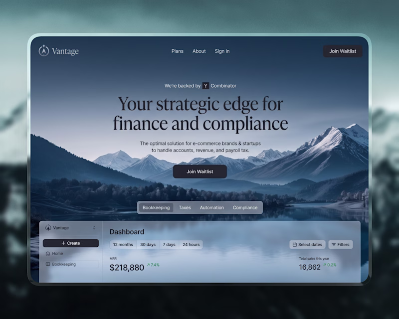
48 voted
56%
85 votes
Closed
looks awesome
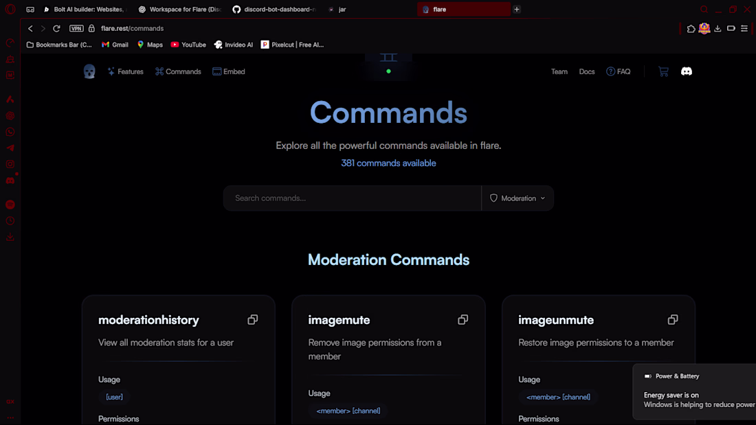
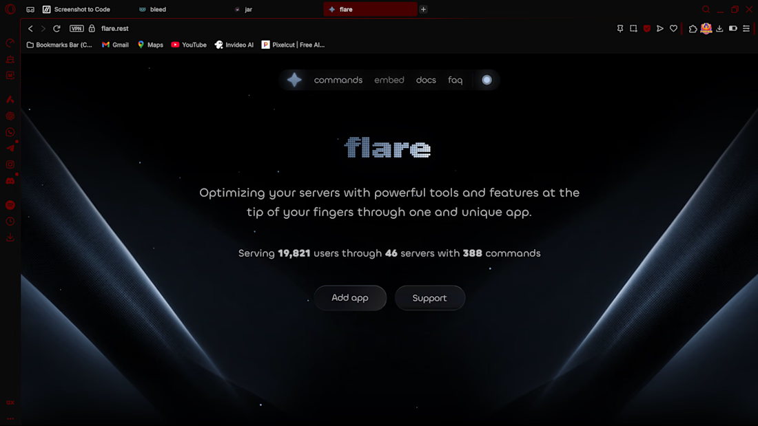
Designed and developed a responsive SaaS website with clean UI, intuitive navigation, and optimized layout for better user experience and engagement.
Challenges
View allFuser Co-create
$5K6h 29m left344 participants
Morphic Workflows
$10K3d left271 participants
Zo Computer Challenge
$10K3d left561 participants
Anything Ship & Sell Remixathon
$10K10d left187 participants
Impossible UI with Rive
$10K10d left121 participants
Runway $100k Big Pitch Challenge
$100K10d left193 participants
Trending
Runway
AI video generation is exploding. What are you dreaming up in Runway?
Contra University
Learn from expert creatives how to earn more using next-gen AI tools.
creativeaiflow
Creative AI workflows are evolving. What tools do you use, and what are their strengths and weaknesses?
portfolioreview
The best portfolios tell a story, not just show a grid. Share yours for feedback.
freelancerlife
Freelancer life is wins, pivots, and everything in between. What’s yours right now?